Logo
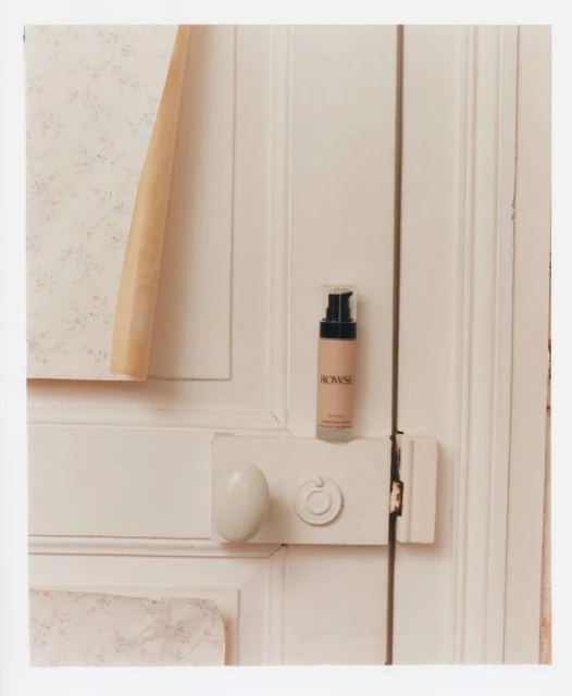
Rowse skincare pump bottle resting on a white painted door latch next to peeling floral wallpaper.
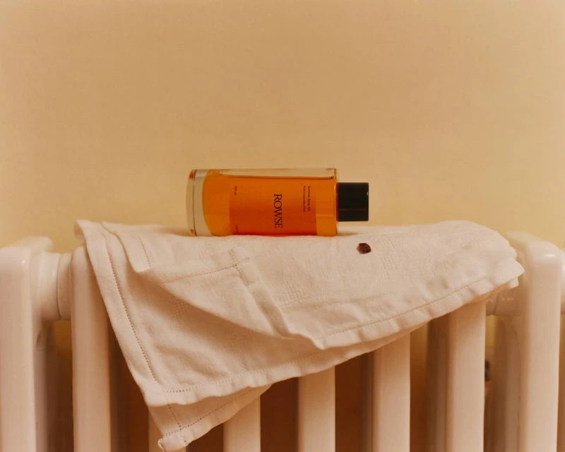
An orange glass bottle of body oil resting on a white folded towel over a radiator
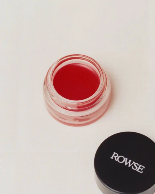
Open glass cosmetics jar filled with red lip tint next to a black cap with white Rowse branding on a neutral surface
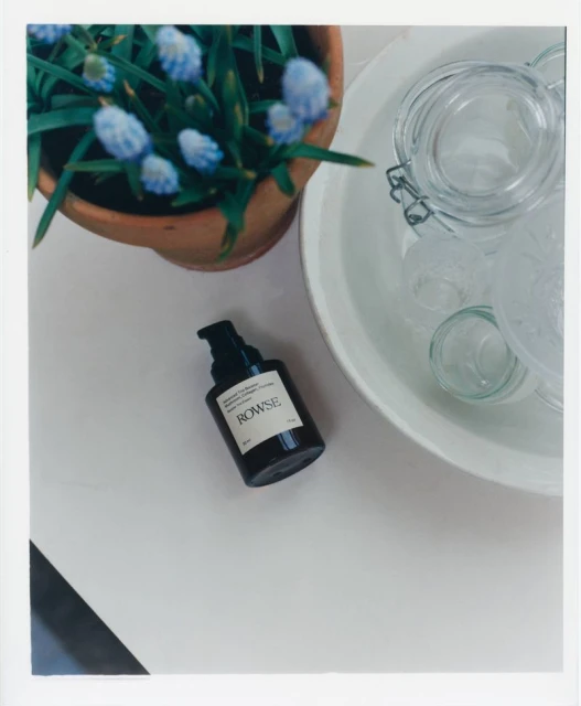
Rowse skincare product bottle next to a potted plant and glass jars on a white surface
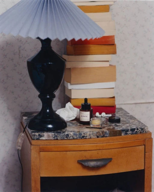
Black pleated lamp and Rowse skincare products on a marble-topped wooden nightstand with stacked books.
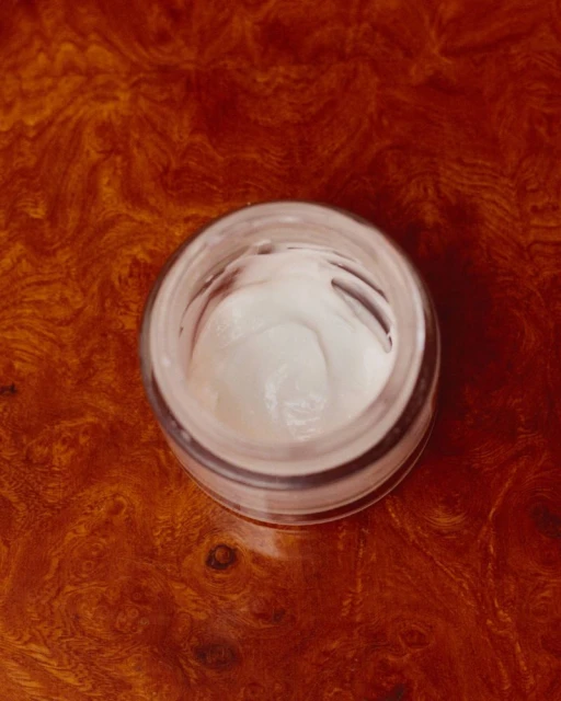
Top-down view of an open glass jar filled with white skincare cream resting on a rich brown wood grain surface.
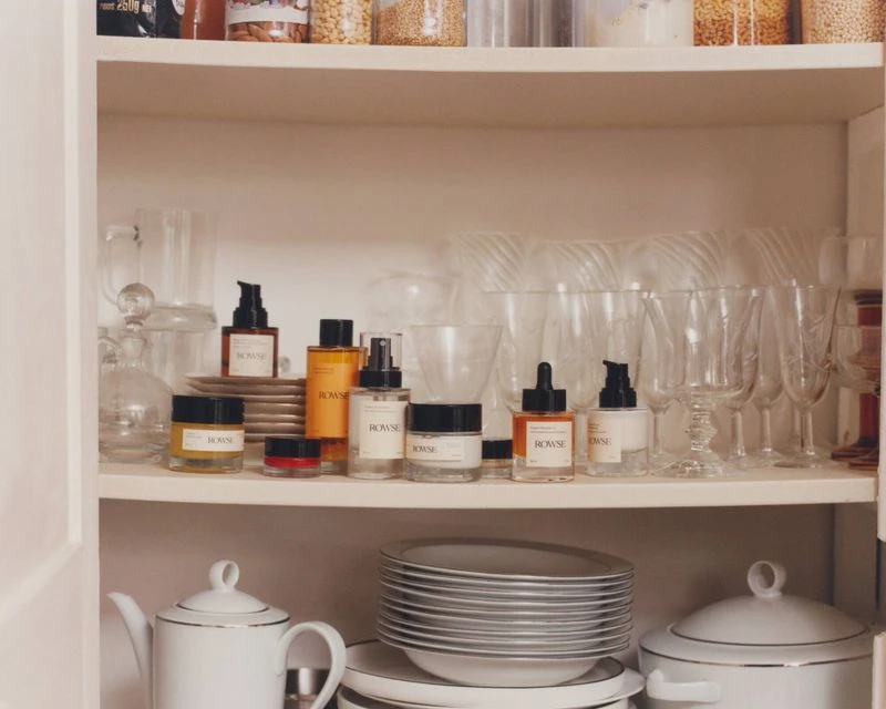
Rowse skincare and beauty products arranged neatly on shelves inside a white cupboard alongside glassware and porcelain dishes.
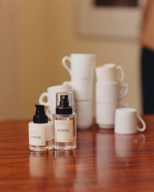
Two glass cosmetic bottles with black pumps sit on a polished wooden table with stacked white mugs in the background.
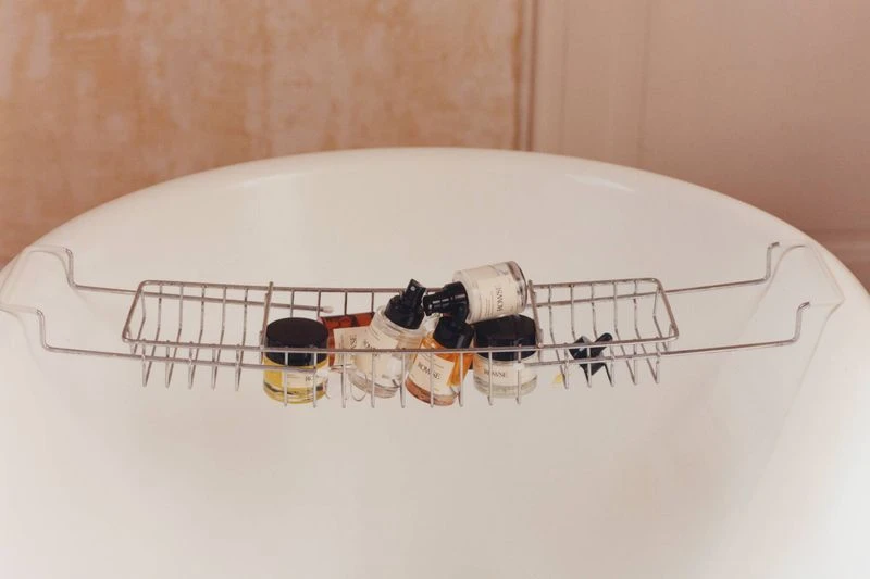
Several skincare bottles arranged in a metal caddy resting across a white porcelain bathtub.
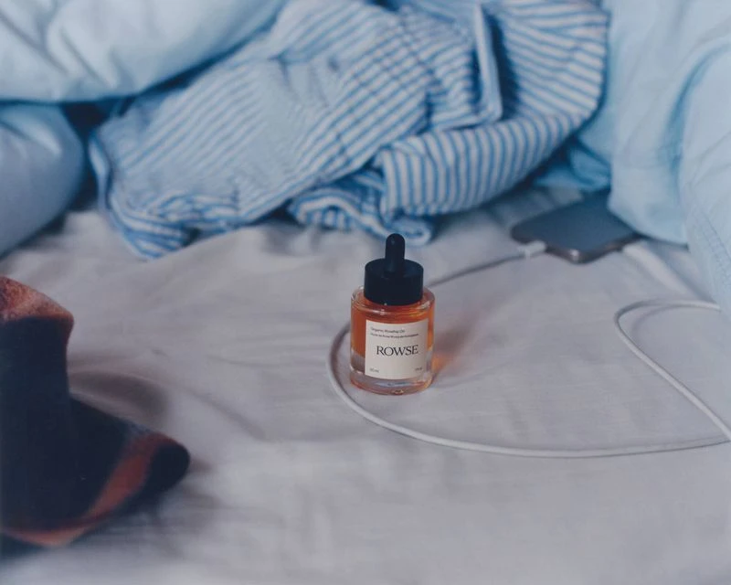
Rowse skincare dropper bottle resting on rumpled white bedsheets with blue striped pyjamas
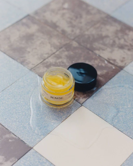
Rowse skincare glass jar with yellow balm and black cap resting on patterned tiled surface
Rowse skincare pump bottle resting on a white painted door latch next to peeling floral wallpaper.
An orange glass bottle of body oil resting on a white folded towel over a radiator
Open glass cosmetics jar filled with red lip tint next to a black cap with white Rowse branding on a neutral surface

Various Editorials Rowse 2026

About

In this evocative series of skincare editorials for Rowse, photographer Clémentine Passet masterfully captures the intersection of daily ritual and intentional design. The collection channels a serene, domestic narrative that positions Rowse products not merely as functional beauty objects, but as essential elements within a curated lifestyle. Across these varied vignettes, the photography leans into a minimalist aesthetic, utilizing natural light to accentuate the tactile qualities of the packaging, from smooth glass surfaces to the rich, organic textures of the balm inside. Passet employs a clean, editorial approach to composition, seamlessly integrating the brand into domestic environments that feel both intimate and aspirational, whether the products are perched on a weathered bedside table or arranged with precision on a sun-drenched pantry shelf. The work effectively employs macro and lifestyle techniques to highlight the product performance and packaging, all while maintaining a consistent, quiet color palette that bridges the gap between commercial clarity and artistic sensibility. By framing these skincare staples against a backdrop of classic architecture, vintage-style wallpapers, and organic materials like burr wood and terracotta, the project elevates the brand experience, inviting the viewer into a soft-focus world of everyday beauty. This collection stands as a testament to the power of thoughtful art direction in the beauty industry, where every frame serves to reinforce a cohesive, sophisticated brand identity.

Brand

Credits

Industries

Styles

Techniques

5000+ creatives to discover

Sign up to gain access to the entire directory. It’s free.

Visie is a curated library of creative professionals.
Trusted by