
TXO: TXO Flex Launch
Mar 2026
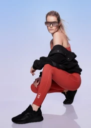
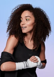
The TXO Flex launch masterfully merges high-performance sportswear utility with a vibrant, editorial-leaning aesthetic that demands attention. Under the sharp creative direction of Sarah Downton, the campaign pivots away from traditional, gritty gym imagery in favor of a clean, minimalist visual language that places the focus squarely on individual expression and bold color. By utilizing studio strobe lighting to achieve an impeccably even and bright finish, the photography establishes a crisp, commercial atmosphere that elevates simple activewear staples into must-have fashion items. The juxtaposition of high-waisted red athletic silhouettes against a serene light blue backdrop creates a refined palette, while the unexpected addition of neon yellow eyeliner and tactical boxing bandages introduces a stylized, modern edge. These lifestyle portraits succeed by balancing the functional demands of athletic apparel with a polished, high-fashion sensibility. Every frame feels deliberate and intentional, stripping away unnecessary environmental noise to emphasize the intersection of movement and personal style. Through this focused execution, TXO effectively communicates a brand identity that is as comfortable in a boutique fitness studio as it is in a trend-conscious, urban environment, ultimately proving that performance gear can be inherently expressive without compromising on its core technical promise.
Vertical, Commercial, Clean
Gradient
Advertising Campaign
