
Transmission Roundhouse: Brand Identity

Aug 2019
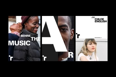
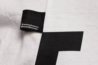
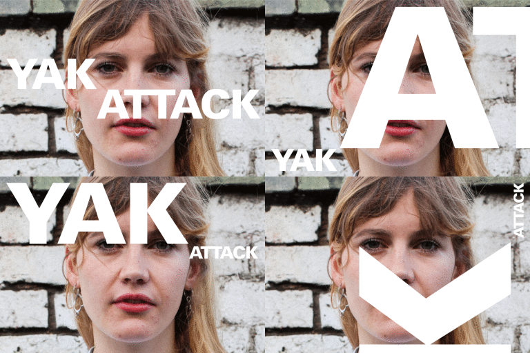
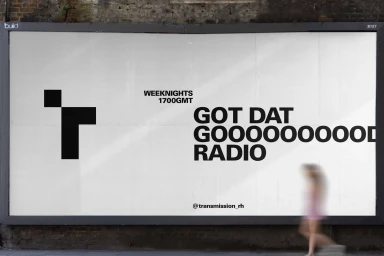
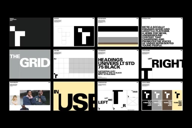
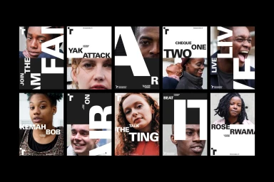
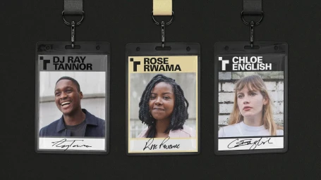
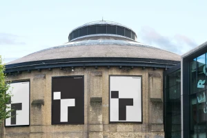
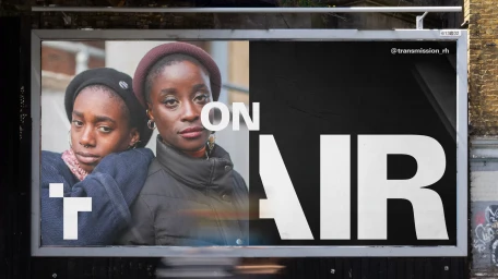
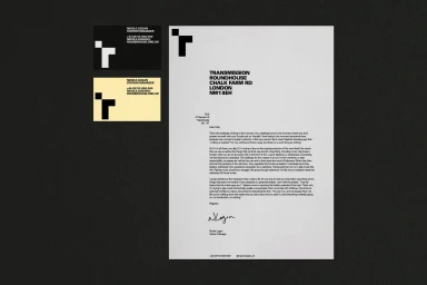
In the fast-paced realm of digital media and entertainment, the Transmission Roundhouse brand identity project serves as a masterclass in modern, minimalist communication. Orchestrated by the design house Only, the visual language prioritizes a strict, high-contrast black-and-white color palette that anchors the organization within an urban, industrial aesthetic. The identity system leans heavily into bold sans-serif typography and modular grid structures, creating a rhythmic visual hierarchy that feels both clinical and punchy. Across a diverse array of applications—ranging from outdoor billboards mounted on historic masonry to tactile garment tags and corporate letterheads—the design remains consistently legible and authoritative. The project effectively utilizes macro studio photography and candid portraiture to humanize the brand, while the integration of artistic typography and motion graphics underscores a commitment to dynamic, evolving content. Whether presented in twelve-panel instructional grids or captured through natural light in environmental settings, the work reads as a cohesive ecosystem of functional design. By juxtaposing stark graphic elements against textured, organic backgrounds, the team has crafted a versatile identity that feels at home in the bustling streets of London’s Roundhouse location. This execution proves that simplicity, when coupled with a rigorous typographic system, can command significant attention in a crowded media landscape, ultimately establishing Transmission Roundhouse as a refined, recognizable entity in the cultural sphere.
Horizontal, Commercial, Clean
Typography
