
TR Studio: Brand Identity
Mar 2026
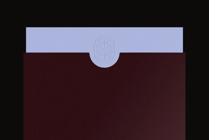
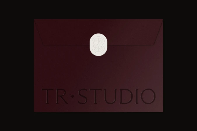
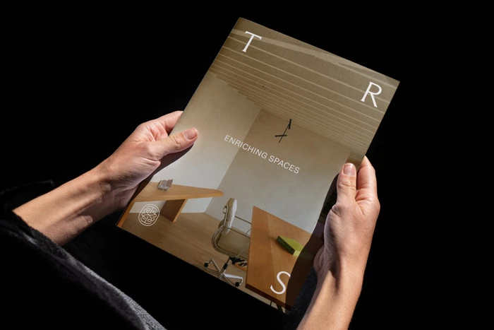
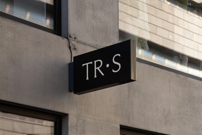
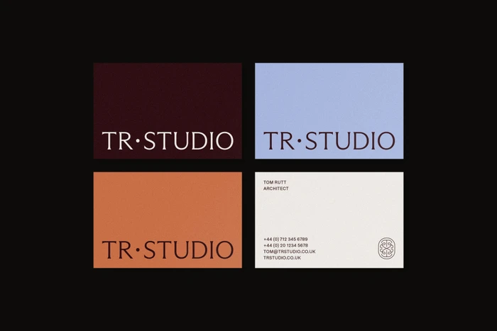
The new brand identity for TR Studio establishes a sophisticated visual language that masterfully balances architectural rigor with tactile warmth. By leaning into a palette of deep burgundy, pale blue, and stark white, the design system creates a premium commercial presence that feels both timeless and contemporary. The project showcases an expert application of corporate branding, where minimalist sensibilities are elevated through high-end production techniques. Key assets include stationery finished with textured matte paper and intricate wax seals, which contrast beautifully against the sharp, industrial application of signage on raw concrete walls. This cohesion is achieved through the meticulous design work of Middle Name, supported by Natalie Holmes, who ensure that every element—from the elegant, embossed logos to the structured grid layouts—communicates a clear professional hierarchy. Utilizing studio strobe lighting and live-action techniques to emphasize material quality, the identity successfully bridges the gap between high-concept aesthetics and functional utility. The resulting brand world is one of deliberate restraint, where the interplay of serif typography and vector geometry speaks to the precision inherent in architectural practice. It is a masterclass in environmental design, proving that a brand identity is most powerful when it translates seamlessly from the digital screen to the physical environment, creating a sense of luxury that feels entirely grounded and purposeful.
Commercial, Clean, Horizontal
Brand Film / Corporate Video


