
Totally Fine
Brand Identity
Jul 2026
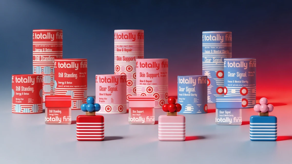
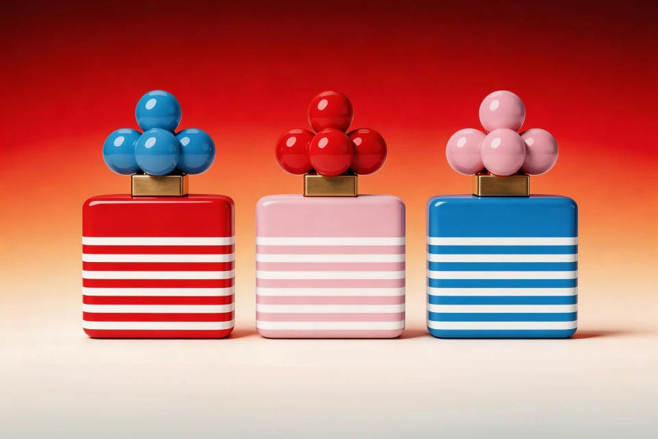
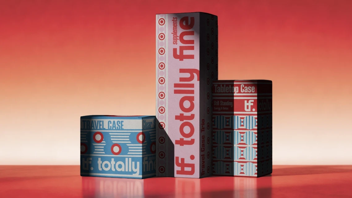
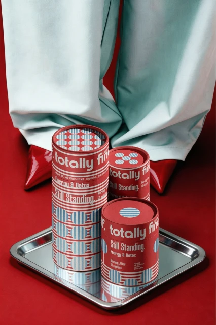
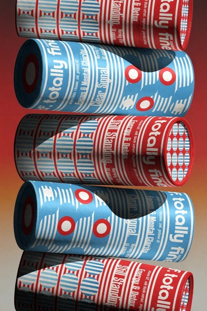
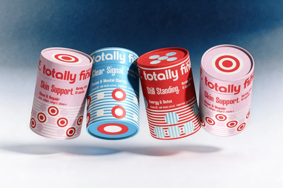
The brand identity for Totally Fine serves as a masterclass in cohesive visual storytelling, balancing structural precision with a playful, high-contrast graphic language. By leveraging a vibrant palette of red, light pink, and soft blue, the design team at MISAMI has successfully elevated standard supplement packaging into an exercise in editorial minimalism. Each project asset, from the sleek cylindrical canisters to the symmetrical fragrance bottles, leans into a disciplined geometry defined by bold horizontal stripes and target-like circular patterns. The execution relies heavily on the technical sophistication of studio strobe lighting, which casts deliberate, crisp shadows to emphasize the matte textures and sharp architectural edges of the containers. This commercial work manages to bridge the gap between utilitarian product design and high-fashion aesthetics, particularly in compositions that integrate deliberate styling choices like sharp patent leather heels against monochromatic backdrops. The typography is kept intentionally clean, ensuring that product names like Still Standing and Clear Signal remain the focal point amidst the rhythmic repetition of shapes and colors. By prioritizing a symmetrical, balanced arrangement across all media, the identity establishes a confident, modern presence that feels both accessible and distinctly premium within the competitive health and wellness landscape. Every element works in concert to solidify a brand identity that is as visually arresting as it is structurally sound.
Horizontal, Commercial, Graphic
Gradient
