
Tony Blanco: Brand Identity

Jun 2021
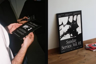
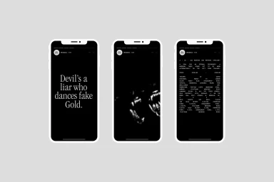
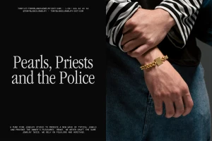
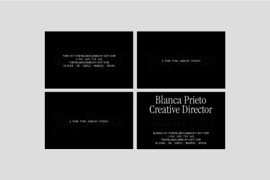
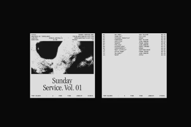
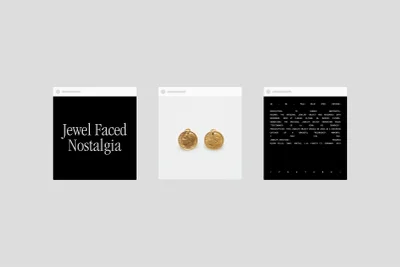
The brand identity for Tony Blanco captures the aesthetic of a punk fine jewelry studio through a series of monochrome editorial assets. The project leans into minimalist design, utilising high-contrast halftone graphics and clean, serif typography to establish a distinct visual language. Executed across both print and digital collateral, the work focuses on the textures of gold jewellery, denim, and structured paper goods. Graphic design for the project was led by Sergio Abstracts, with photography contributed by Pablo Gómez, Alejandro Carrillo, and Lucía Peralta. The identity balances structured product data with abstract editorial imagery, maintaining a consistent aesthetic through the use of natural light and clean, minimalist compositions.
Horizontal, Clean, Commercial, Monochrome
Typography
Grey Seamless
Advertising Campaign

