Logo
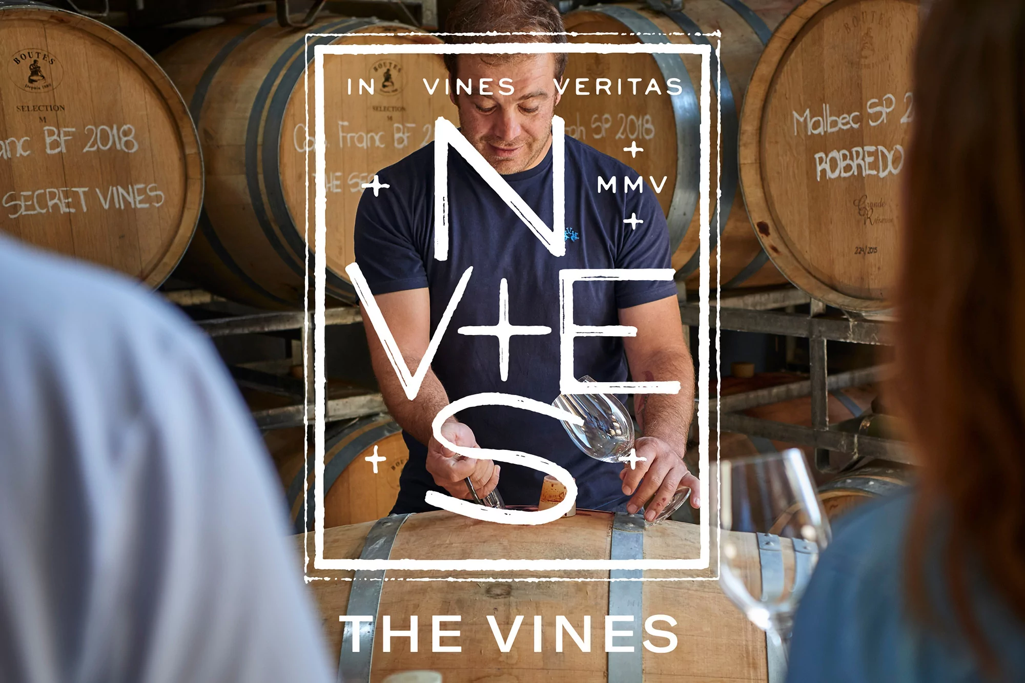
Winemaker working in a cellar with wooden barrels, framed by graphic lettering overlay for The Vines brand identity
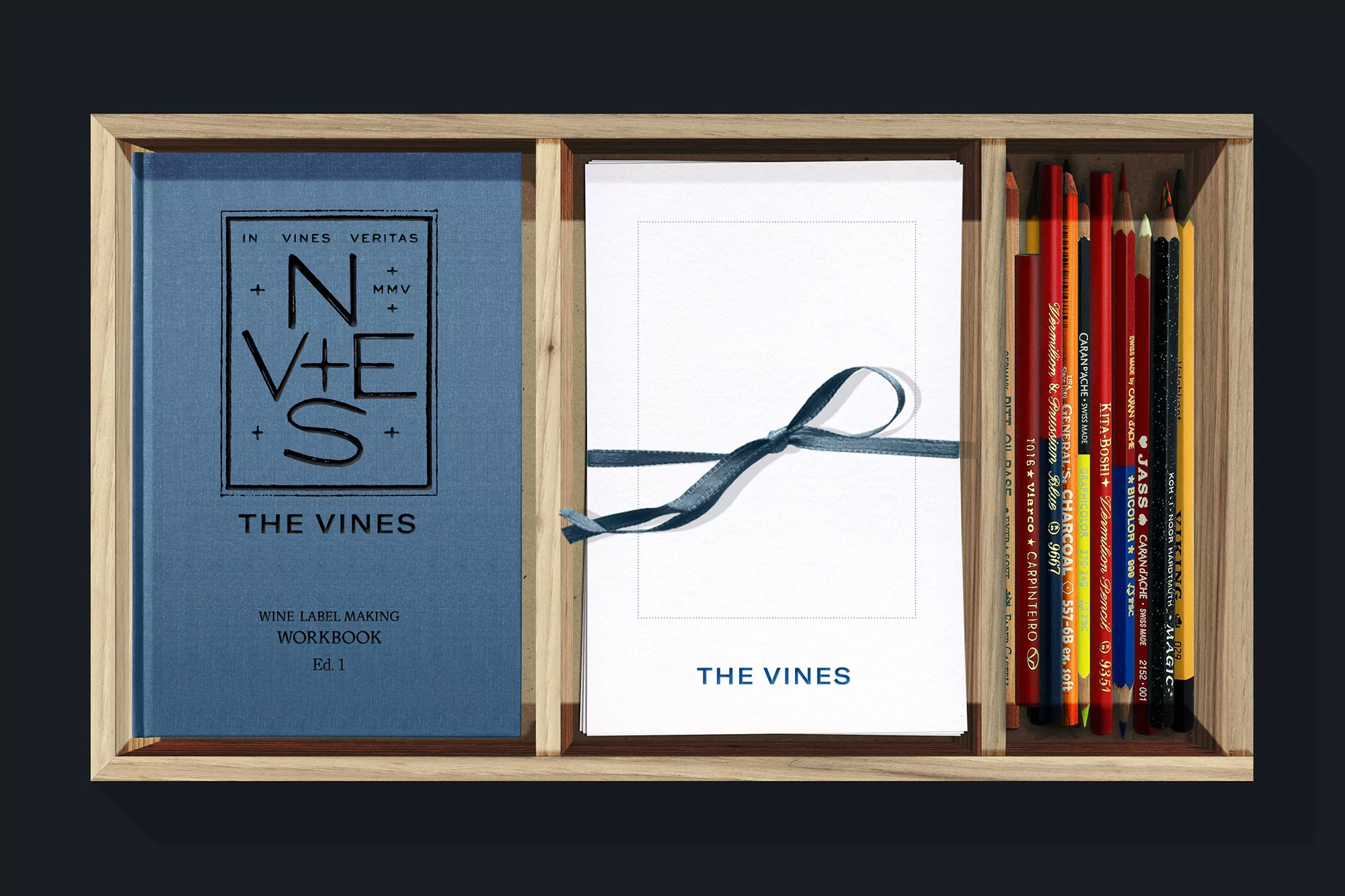
Wooden box containing a blue workbook, a stack of white paper tied with a blue ribbon, and assorted coloured pencils.
An open workbook titled The Vines displayed inside a wooden compartment alongside a vertical row of colored pencils.
Web page layout for The Vines displaying three green illustrated circular and rectangular wine region badges for Mendoza, Montalcino, and Priorat.
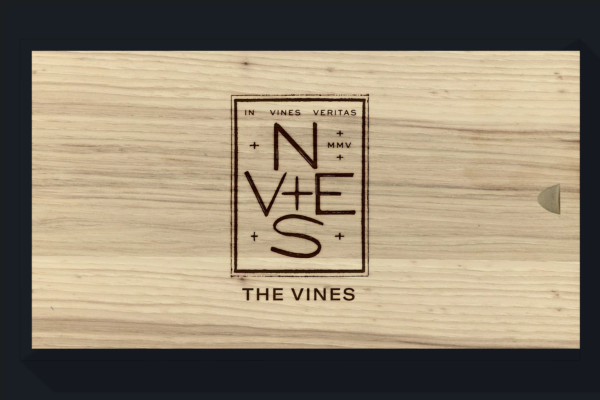
Branded wooden wine box featuring a rectangular logo stamp and the text THE VINES on a light wood grain texture
Web page screenshot for The Vines brand identity featuring a smiling man in glasses, a cluster of grapes, and text columns.
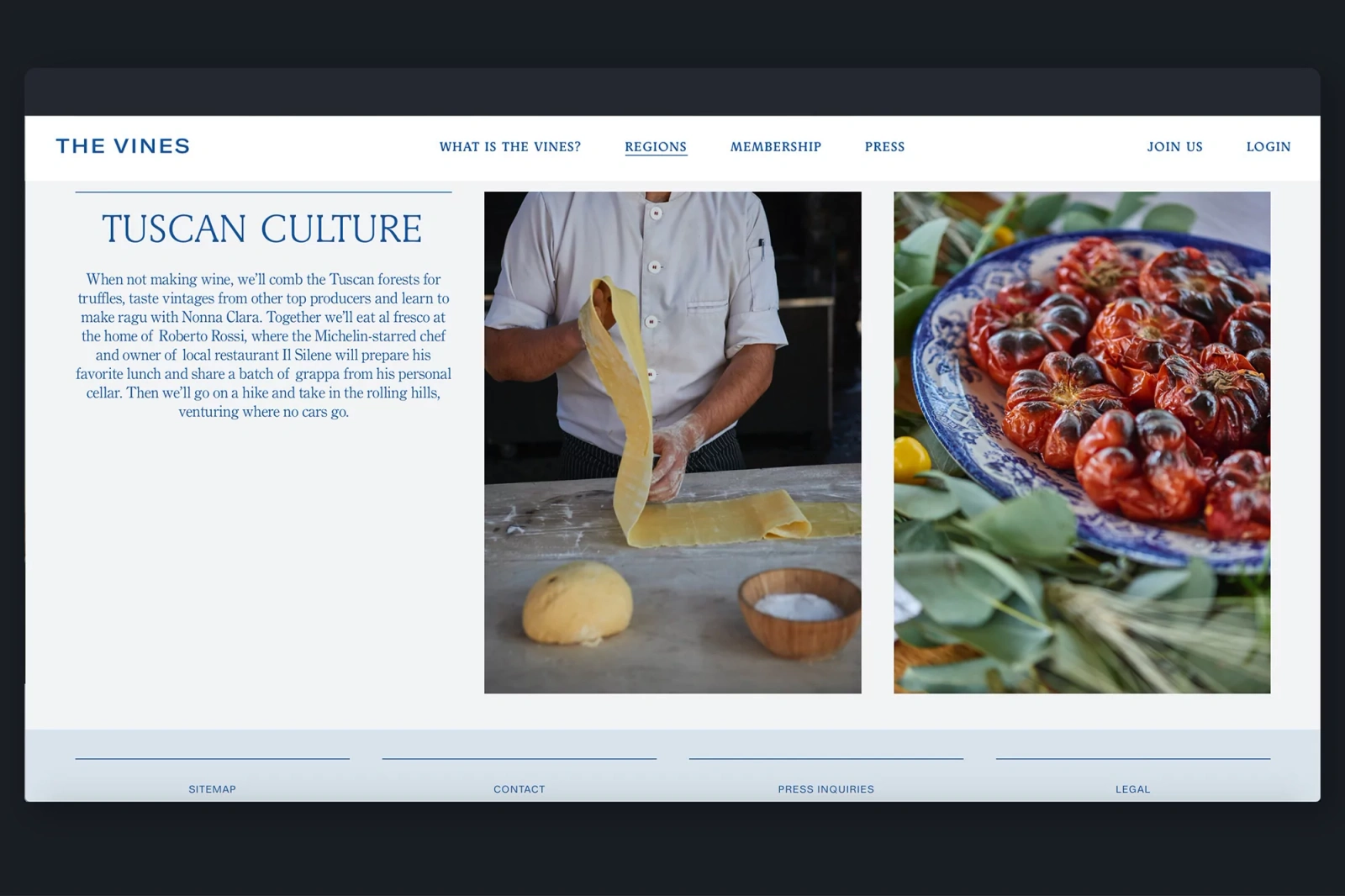
Website interface screenshot for The Vines featuring a chef preparing fresh pasta and a platter of tomatoes
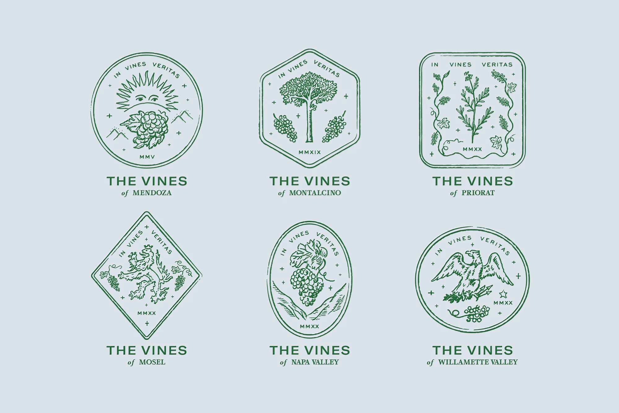
Set of six green botanical and wildlife line art badge logos for The Vines brand identity on light blue background.
Woman in white dress drinking wine outdoors with a man playing guitar in the background for The Vines brand identity
An open workbook detailing label making design elements next to a compartment of coloured pencils inside a wooden box.
Winemaker working in a cellar with wooden barrels, framed by graphic lettering overlay for The Vines brand identity
Wooden box containing a blue workbook, a stack of white paper tied with a blue ribbon, and assorted coloured pencils.
An open workbook titled The Vines displayed inside a wooden compartment alongside a vertical row of colored pencils.

The Vines Brand Identity 2020

About

The Vines brand identity project exemplifies a sophisticated approach to luxury viticulture through a cohesive and artisanal design language. Spearheaded by the design firm Mythology, the branding initiative establishes a premium, global narrative for the winemaking community. The execution leans heavily into editorial minimalism and classic typography, creating a visual system that feels both academic and deeply rooted in tradition. Sophie Mascatello contributes intricate, ink-style illustrations that punctuate the identity, ranging from delicate botanical motifs to heraldic emblems that frame various wine regions like Mendoza and Montalcino. This commercial project masterfully balances the tangible nature of the craft—seen in the tactile, wood-encased label-making workbooks—with a sleek, modern digital presence. The use of soft light and warm, natural tones across the lifestyle photography grounds the high-end graphic elements, reinforcing a sense of intimate, professional winemaking. By utilizing a refined green line-art style and structured geometric frames, the identity achieves a timeless quality that translates seamlessly from physical packaging to expansive UI illustrations. The project functions as an educational and aspirational toolkit, successfully marrying the heritage of global viticulture with the precision of contemporary corporate design. Every element, from the deliberate color theory charts to the curated stationery, ensures that the brand resonates as an authoritative and cultured voice in the world of fine wine.

Brand

Credits

Industries

Styles

5000+ profiles to discover

Sign up to gain access to the entire directory. It’s free.

Visie is a curated library of creative professionals.
Trusted by