
Taco Mesa: Brand Identity
May 2024
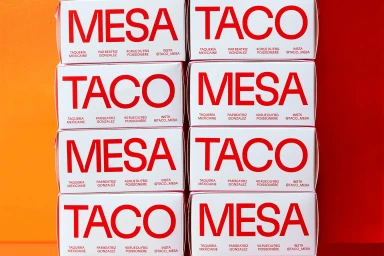
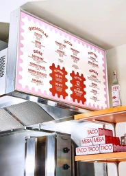
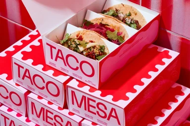
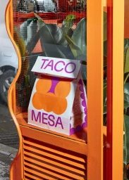
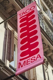
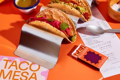
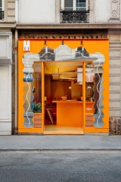
Taco Mesa introduces a cohesive brand identity that blends modern graphic design with high-contrast color palettes. The project encompasses packaging, signage, and interior aesthetics, characterized by bold typography and a vibrant use of red, orange, and pink hues to establish a distinct commercial presence in the food and beverage space. Studio Furious led the graphic design, integrating clean lines with playful geometric patterns across takeaway boxes, menu displays, and storefront signage. The execution relies on a minimalist approach to structure, often set against clean, graphic backgrounds or natural daylight to accentuate the brand's visual identity. Whether through the application of custom takeaway packaging or the architectural facade of the storefront, the work focuses on consistent color-blocking and high-impact typography to create a cohesive restaurant experience.
Vertical, Commercial, Clean
Advertising Campaign
