
Sunski: Brand Identity




Aug 2026
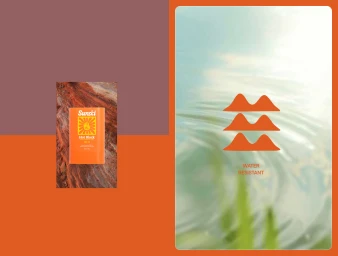
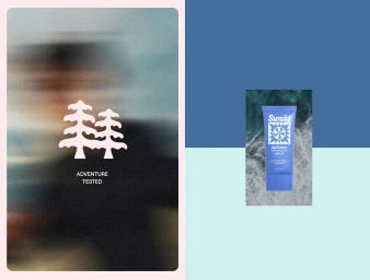
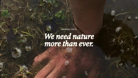
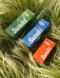
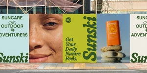
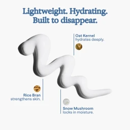
Sunski’s latest brand identity refresh successfully bridges the gap between high-performance sun care and the visceral, sensory experience of the outdoors. Designed by TUX Creative House, the visual system leans into a modern, minimalist aesthetic that feels both clinical and inherently natural. By utilizing a vibrant, high-contrast palette of forest green, burnt orange, and muted blues, the brand establishes a clear, recognizable hierarchy that resonates across diverse media formats. The project employs a range of sophisticated techniques, including fluid motion graphics that explore geometric grid structures and macro lifestyle photography that captures the tactile, intimate reality of a skincare ritual. This duality is central to the identity; it is as much about the scientific efficacy of the SPF—highlighted through clean UI illustration and clear, sans-serif typography—as it is about the raw, untamed spirit of adventure. Whether through abstract animation or natural light product photography set against rugged stone and mossy terrain, the identity channels a consistent narrative of protection and exploration. By blending professional corporate visual language with a grounded, earthy editorial sensibility, the work positions Sunski as an essential companion for the active individual, proving that thoughtful, modular design can elevate utility products into a cohesive and memorable lifestyle brand.
Commercial, Graphic
Typography
Advertising Campaign
