
Studio Blackbird: Brand Identity



Jan 2022
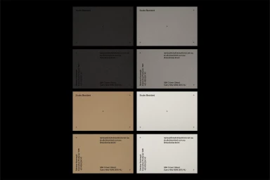
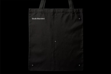
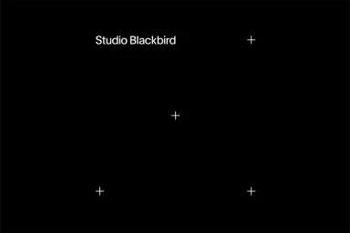
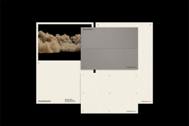
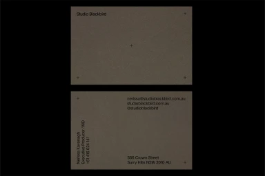
The brand identity for Studio Blackbird, executed by design studio HOLT, centres on a minimalist and structured corporate aesthetic. The visual system utilises a restrained palette of muted greys, soft whites, and deep blacks, punctuated by occasional pale pink accents and textured cream paper stock. The project incorporates clean, precise typography and functional graphic elements, such as registration crosshairs, to establish a professional and modern look. These motifs are applied across a suite of business stationery, tote bags, and digital interfaces. The execution prioritises generous negative space and rigid typographic hierarchy, consistently applied through vector design and clean, minimalist framing techniques.
Commercial, Clean, Minimalist
Typography
