
Sfermion: Brand Identity


Oct 2025
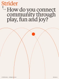
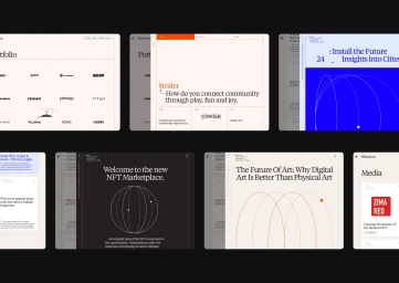
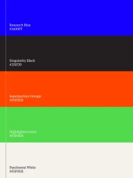
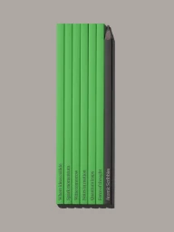
Sfermion’s brand identity centers on a structured, minimalist aesthetic that integrates typography with a precise vector-based visual system. Developed by Visie Admin and Heart, the project spans across Apps & Digital Platforms and technology-focused digital media, utilizing a sophisticated color palette of parchment, research blue, and high-contrast black accents. The system is defined by its clean, editorial approach to layout and motion graphics. By employing minimalist typographic hierarchy and geometric orbital motifs, the identity balances scientific precision with functional web design. The execution encompasses everything from business cards and pencil sets to dynamic, pulse-driven animations that animate the brand's dotted logo across various digital interfaces.
Commercial, Clean, Minimalist, Vertical
Vector
