
Seve: Brand Identity
May 2026
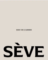
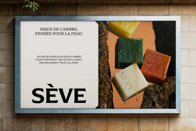
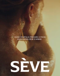
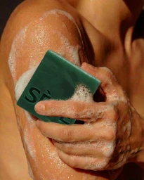
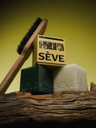
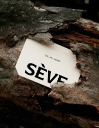
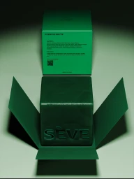
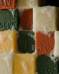
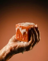
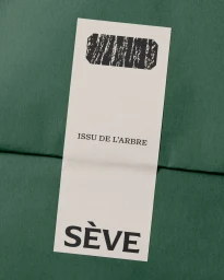
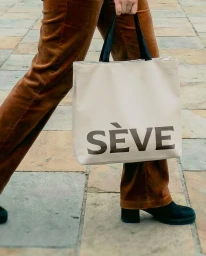
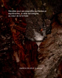
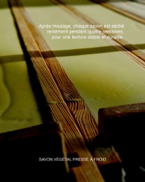
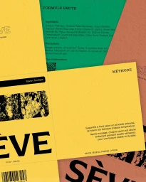
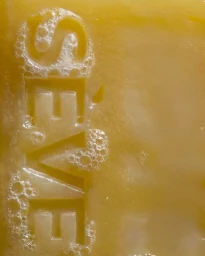
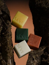
The brand identity for Seve establishes a compelling visual narrative that bridges the gap between raw botanical origins and sophisticated, modern skincare. Developed with creative expertise from bleucoeur studio and Dysign, the project leans into a minimalist aesthetic to articulate the brand's commitment to natural ingredients and artisanal craftsmanship. The design execution relies heavily on high-contrast typography and intentional negative space, often juxtaposing the refined geometry of soap bars against the rugged, organic textures of tree bark. By incorporating macro-style photography and soft natural light, the visual language emphasizes the tactile qualities of the product—from the glistening moisture on skin to the thick, frothy lather of the cleansing bars. Each asset, whether a studio-lit product shot or an editorial lifestyle image, reinforces a consistent color palette of earthy terracotta, deep forest green, and vibrant yellow. This project successfully channels a premium, artisanal feel, using balanced, symmetrical layouts to highlight essential ingredient details and brand heritage. Ultimately, the Seve brand identity creates a cohesive and tactile experience that elevates the perception of everyday skincare, merging functional, clean graphic design with the raw, sensory beauty of the natural world to create a memorable and highly distinct market presence.
Vertical, Commercial, Tactile

