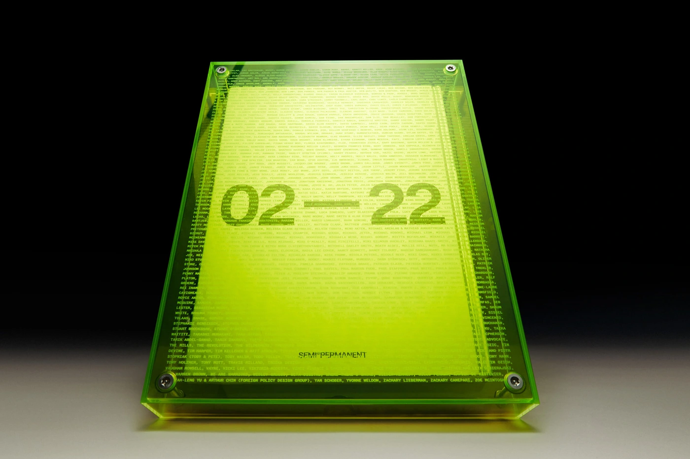
Semi Permanent’s brand identity project establishes a visual language centered on structured archival curation and editorial precision. The work spans diverse print and digital collateral, utilizing a clean, grid-based layout that prioritizes high-contrast typography and minimalist hierarchies.
Techniques such as 3D render / CGI and motion graphics are integrated alongside traditional publication design, resulting in a cohesive aesthetic that balances monochromatic surfaces with vibrant, neon-accented textures. Designed by Visie Admin, the project emphasizes clarity and spatial organization across both flat and dimensional media.