
River House: Brand Identity
Jul 2026
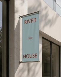
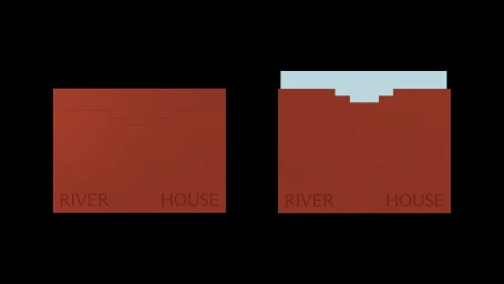
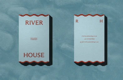
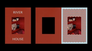
The new brand identity for River House, developed by Studio Lisca, establishes a sophisticated visual language for the building company that deftly balances architectural precision with high-concept editorial minimalism. Eschewing the conventional tropes of the construction sector, the identity leans into a refined, curated palette of terracotta-red, pale blue, and stark black, which together forge an image of timeless authority. The execution is defined by a meticulous attention to tactile detail, best seen in the custom stationery suite. Here, the use of geometric die-cut designs, including tiered, stepped cut-outs and distinctive serrated, wavy edges, transforms utilitarian business cards and envelopes into sculptural objects of design. By utilizing vector graphics and a 3D render / CGI approach, the branding maintains a sterile, high-end commercial aesthetic that feels both contemporary and grounded. The typography serves as the project's anchor; it shifts seamlessly from an elegant, classic serif for primary signage to a clean, understated sans-serif for secondary applications, ensuring that the brand voice remains consistent across diverse media touchpoints. From the soft, natural light captured in the minimalist building signage to the abstract, multi-panel layouts of the collateral, River House presents as a forward-thinking entity that views structural integrity as a canvas for elevated, intentional creative expression. This project is a masterclass in how rigid corporate identities can be softened through thoughtful, rhythmic graphic systems.
Commercial, Clean, Minimalist, Horizontal
