REVIVR
Brand Identity
Apr 2026
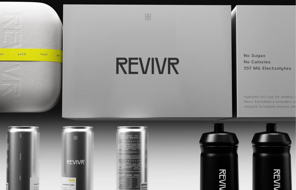
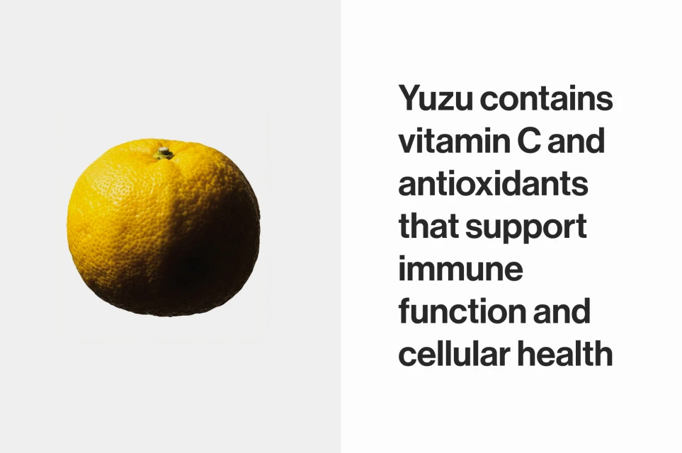
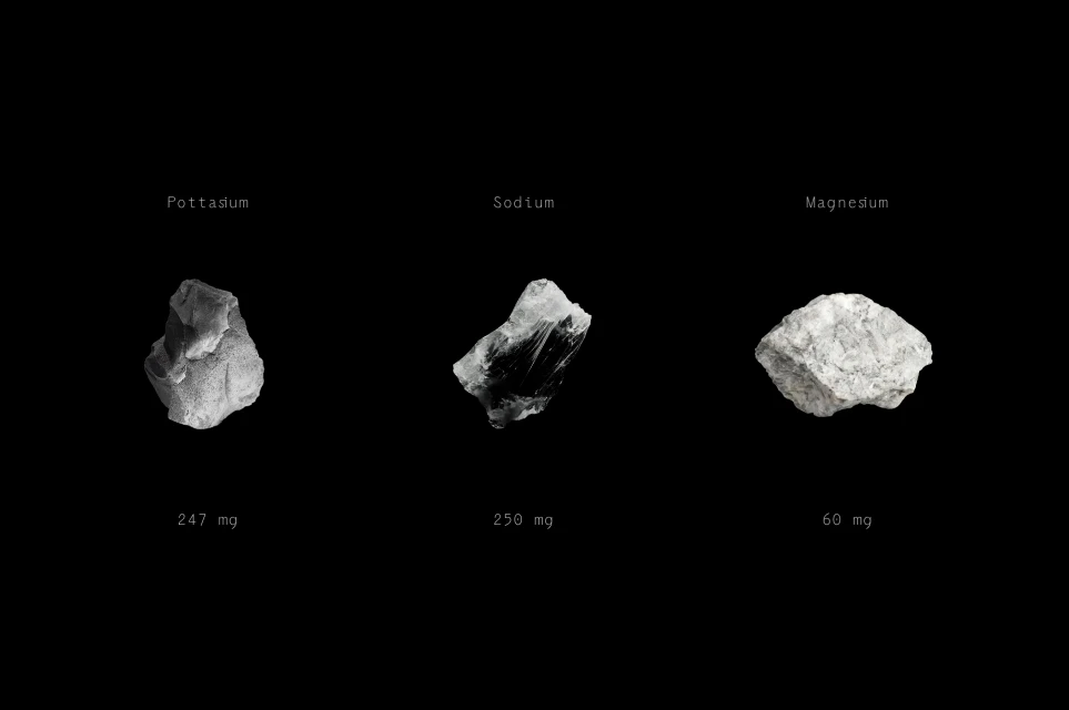
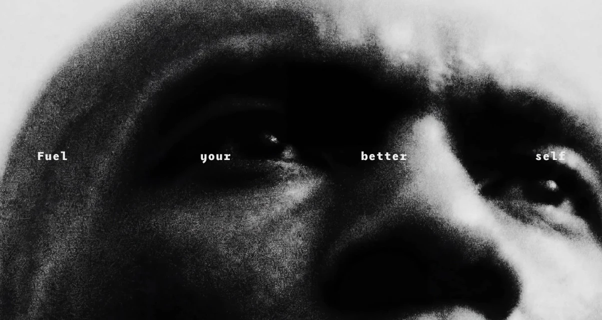
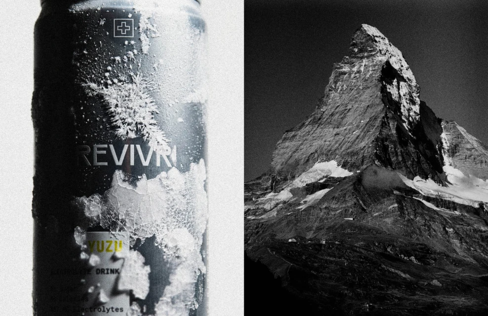
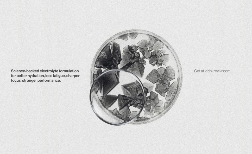
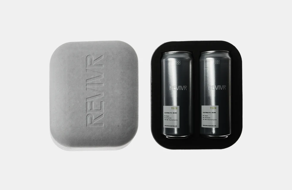
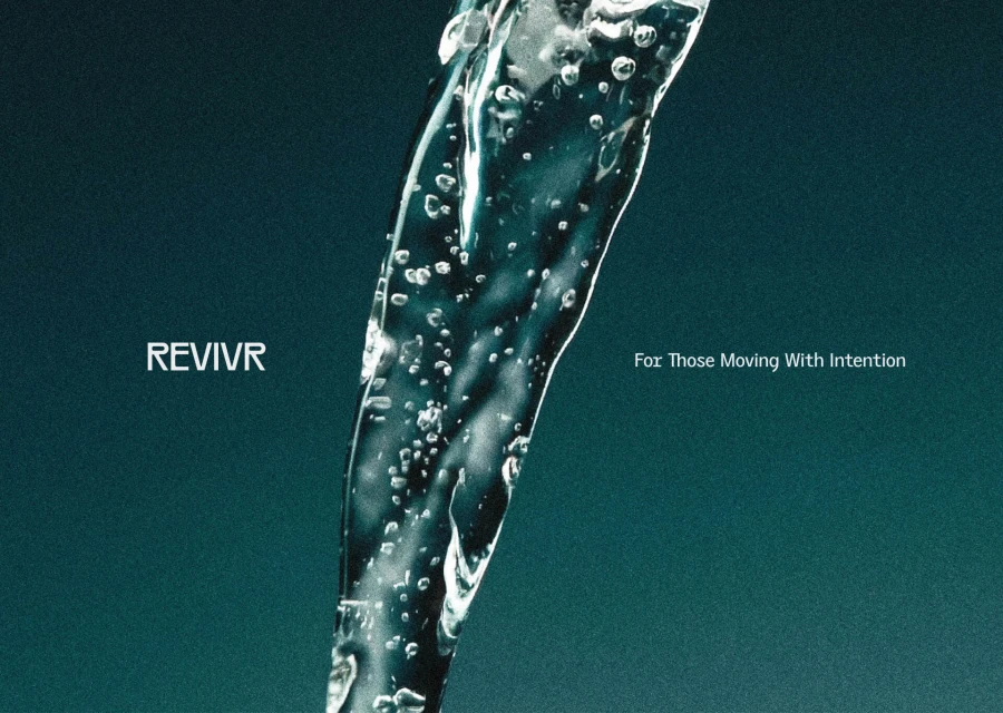
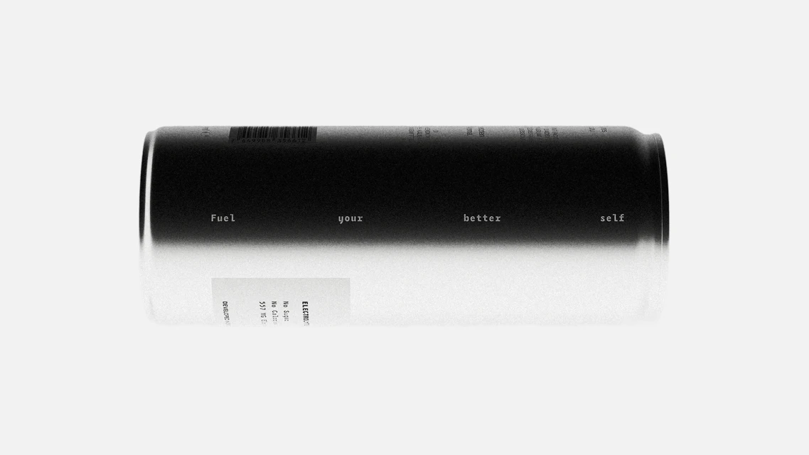
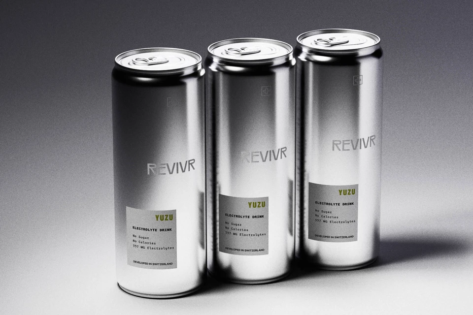
The brand identity for REVIVR stands as a masterclass in clinical minimalism, bridging the gap between high-end beverage design and scientific precision. Developed by ADDRESS ARTS, the visual system leans into an aesthetic that is as much at home in a laboratory as it is in a premium retail environment. By utilizing a restrained monochromatic palette punctuated by sharp, vibrant yellow accents, the branding communicates efficacy and energy with surgical clarity. The execution utilizes a sophisticated array of techniques, including studio strobe photography and 3D render CGI, to establish a language of purity and structural integrity. Through the frequent use of macro-level detail—whether capturing the pebbled skin of a yuzu fruit or the crystalline structure of electrolytes—the project underscores a commitment to raw ingredients and performance-led formulation. The typography remains consistently sans-serif and utilitarian, reinforcing a message of scientific intent and intentionality. High-contrast, cinematic compositions, such as the use of low-key chiaroscuro lighting on extreme close-ups, elevate the brand from simple hydration to a lifestyle of human optimization. This identity successfully balances the cold, metallic sheen of aluminum packaging with the organic textures of nature, ultimately framing REVIVR as a sophisticated tool for those looking to fuel their better selves through precision, data, and uncompromising design.
Horizontal, Commercial, Minimalist
Beverages
Advertising Campaign