Logo
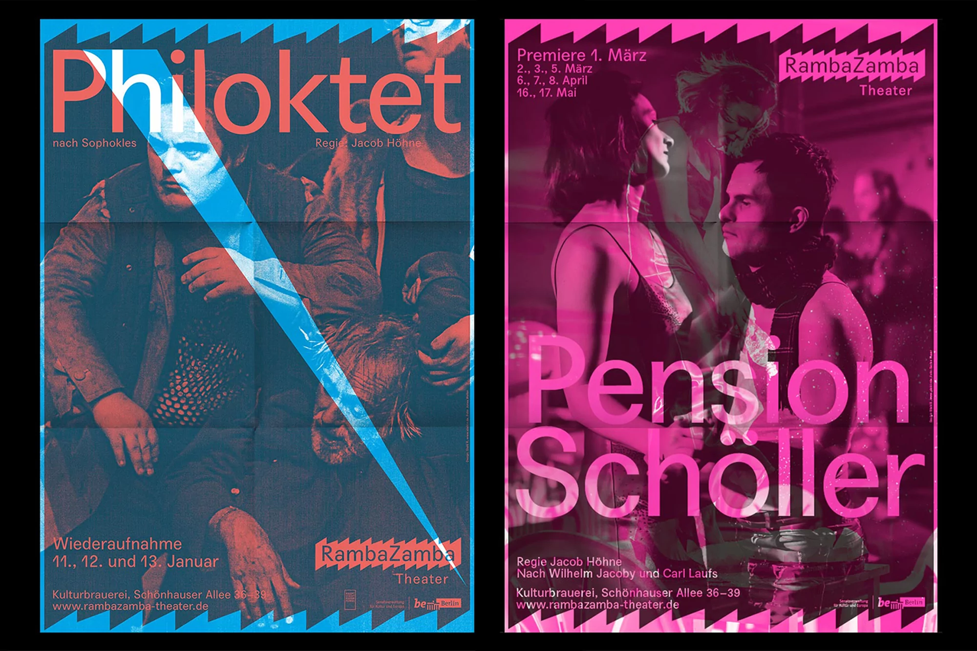
Two theater posters for Philoktet and Pension Schöller with bold typography, layered monochrome imagery, and distinct blue and pink color palettes.
Open pages of a typewritten theatre programme with columns of text and cast credits on off-white paper.
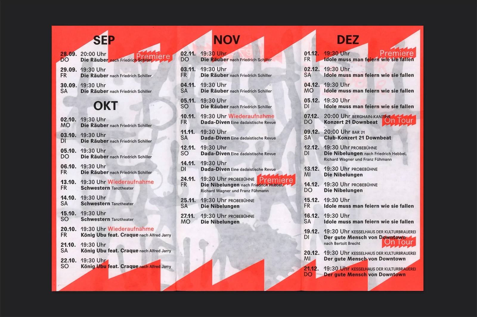
RambaZamba theatre schedule graphic design with red zig-zag borders, typography schedule, and textured black background layer
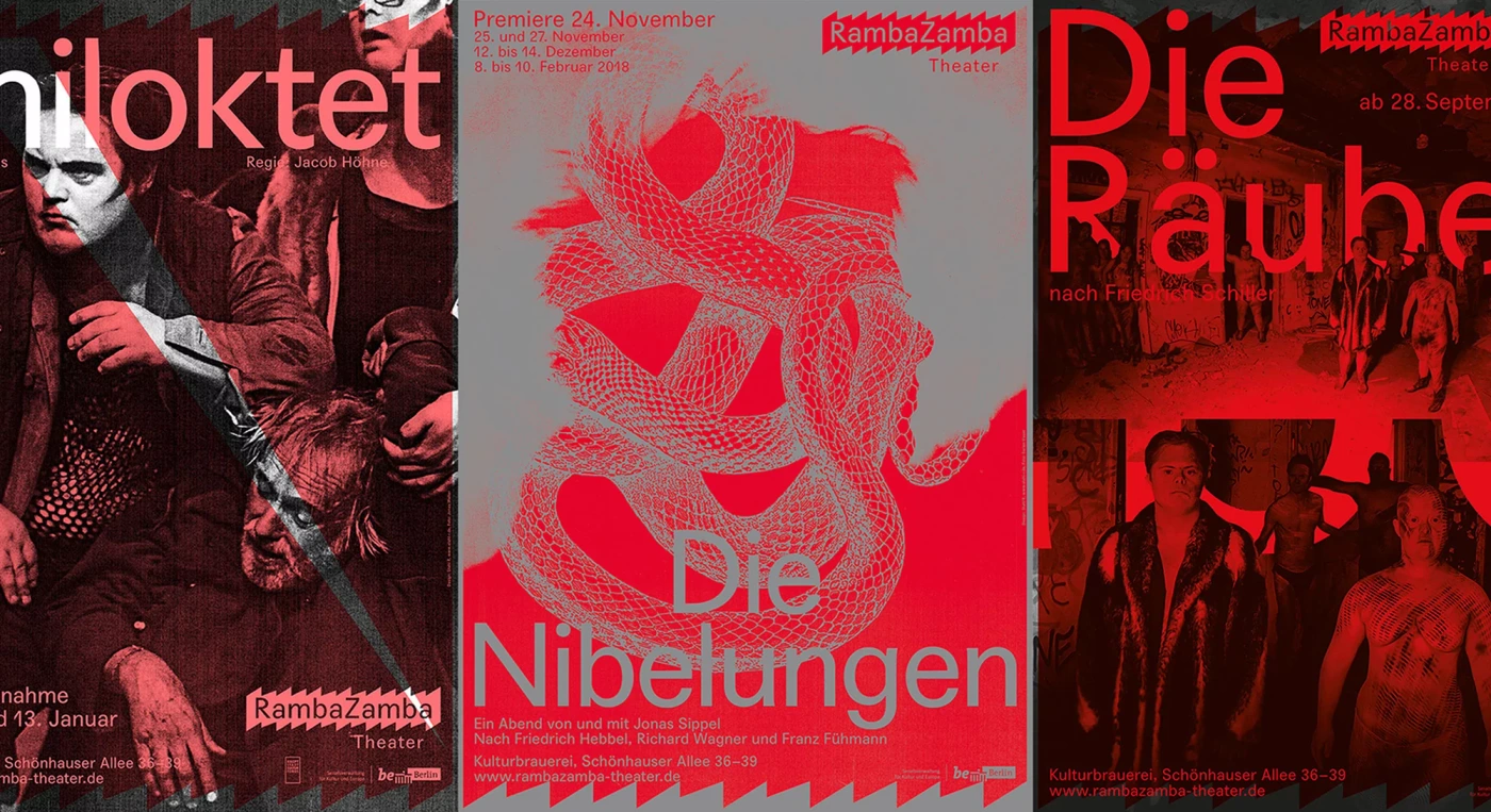
Three theater poster designs in red and grey featuring bold typography, photography, and graphic illustrations for RambaZamba.
Three vertical graphic posters for RambaZamba featuring bold typography, jagged white banner shapes, and vibrant red, orange, and pink colors
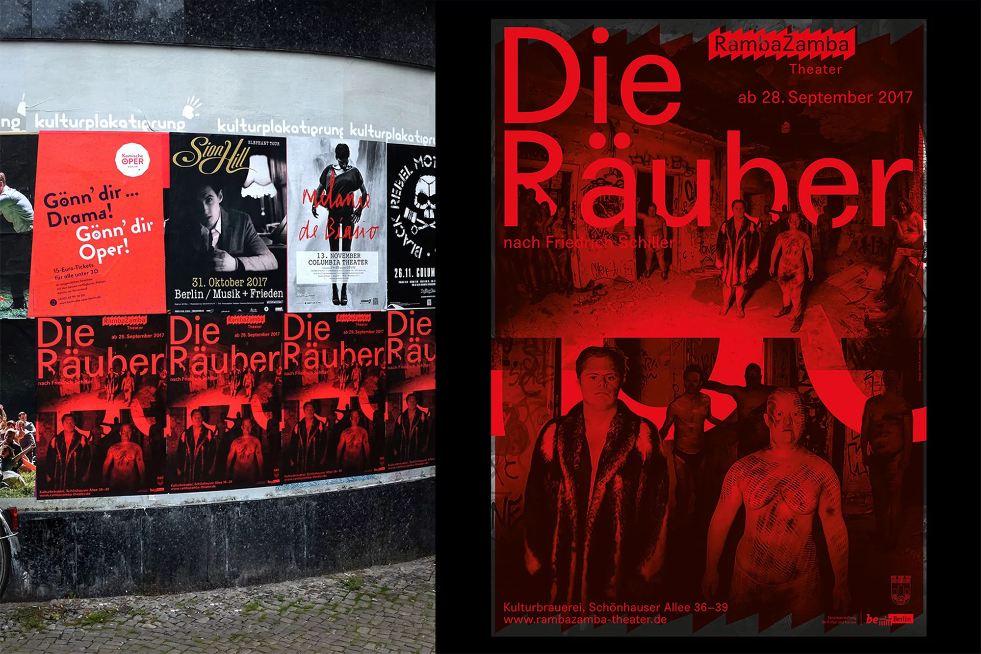
RambaZamba Theater poster for Die Räuber pasted on an urban wall alongside other event posters in Berlin.
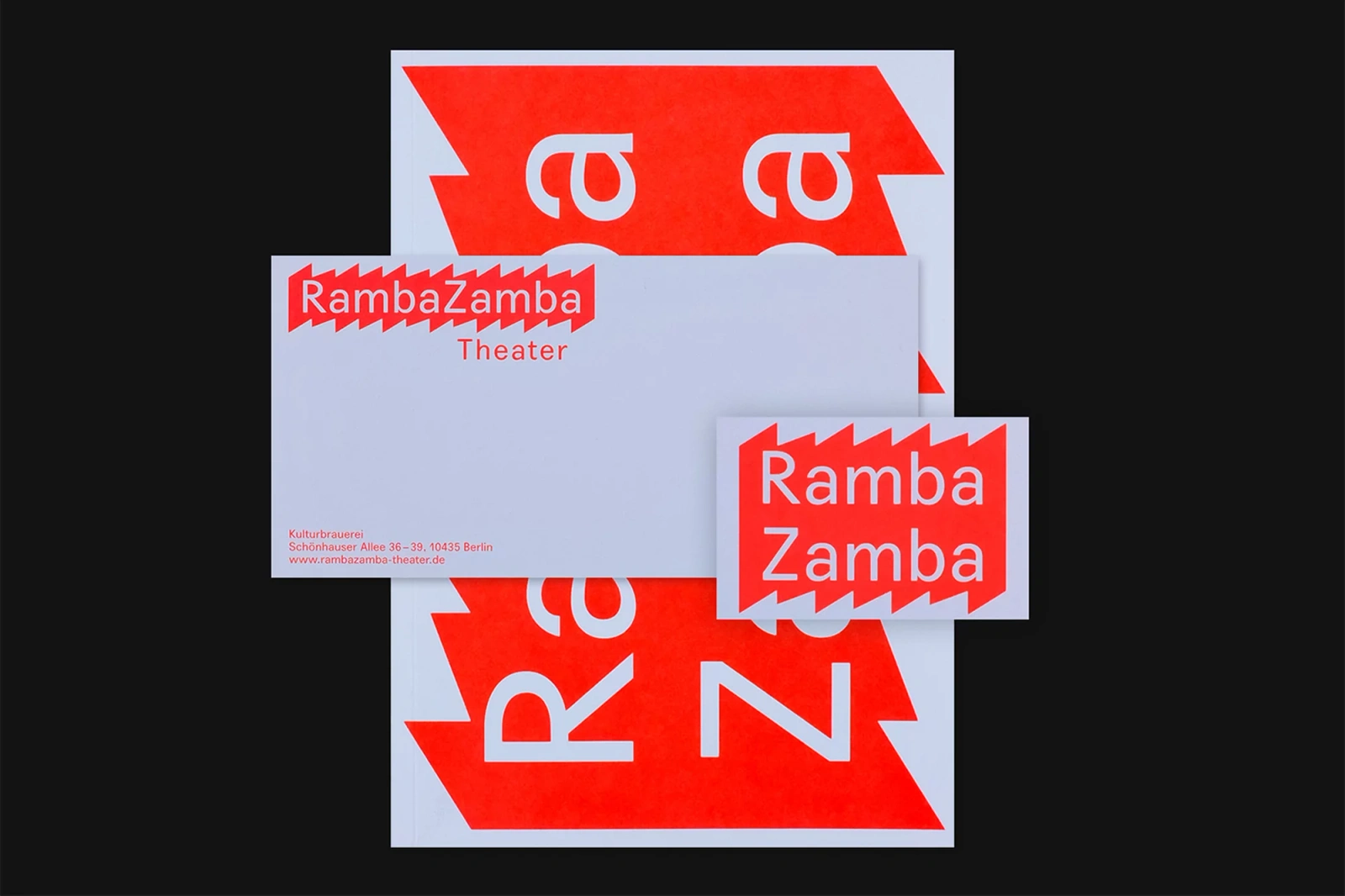
Graphic identity mockup for RambaZamba featuring bold red and white typography on stationery items against a dark background.
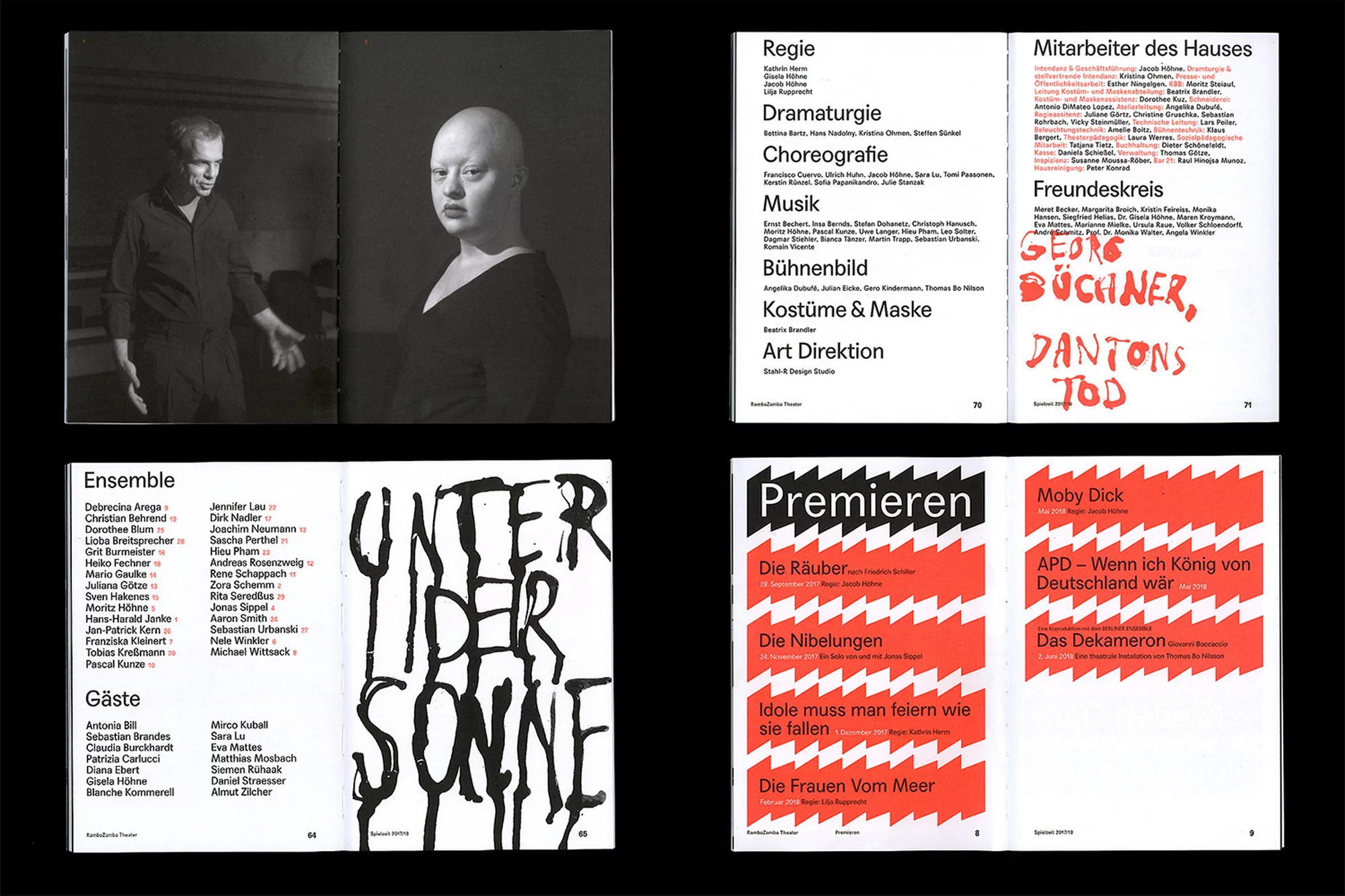
Four printed booklet spreads arranged in a grid featuring black-and-white portraits, bold red geometric shapes, and expressive typography.
Close-up graphic design pattern featuring overlapping black and white elements with bold RambaZamba typography.
White geometric brand identity logo with the text RambaZamba on a solid black background.
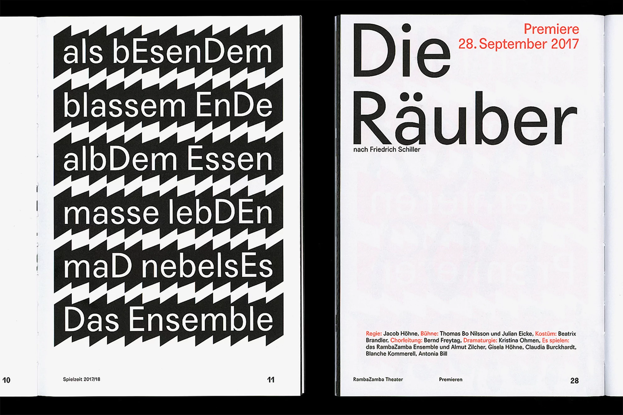
Open book spread showing bold black-and-white typography on the left and title text for Die Räuber on the right page.
Two theater posters for Philoktet and Pension Schöller with bold typography, layered monochrome imagery, and distinct blue and pink color palettes.
Open pages of a typewritten theatre programme with columns of text and cast credits on off-white paper.
RambaZamba theatre schedule graphic design with red zig-zag borders, typography schedule, and textured black background layer

RambaZamba Brand Identity 2018

About

The brand identity for RambaZamba Theater stands as a masterclass in high-contrast visual communication, effectively blurring the lines between corporate formality and the raw energy of performance art. Developed with precision by graphic designer Stahl R, the identity system leans into a bold, avant-garde aesthetic that anchors the institution within the competitive landscape of media and entertainment. Central to this visual language is a recurring serrated, saw-tooth geometric device that creates a rhythmic, tactile quality across both digital and physical touchpoints. The project utilizes a rigorous grid structure to balance experimental, layered typography with clinical, minimalist layouts. This interplay between raw ink textures and clean sans-serif type reflects the theatrical nature of the brand, while high-saturation color blocking—ranging from vibrant pinks and oranges to stark red-and-black pairings—ensures maximum impact in urban environments. Whether applied to formal stationery, multi-page editorial spreads, or public performance posters, the design consistently prioritizes clarity of information hierarchy. By integrating elements like vector-based geometry and hand-lettered calligraphy, the system achieves a distinct duality that feels both academic and deeply expressive. The result is a cohesive brand narrative that captures the movement and depth of the stage, transforming simple scheduling and promotional collateral into a compelling, cohesive artistic statement that resonates with a modern, design-conscious audience.

Brand

Credits

Styles

Techniques

5000+ profiles to discover

Sign up to gain access to the entire directory. It’s free.

Visie is a curated library of creative professionals.
Trusted by