
Premolar Grains: Brand Identity



Brand
Date
Apr 2024
Description
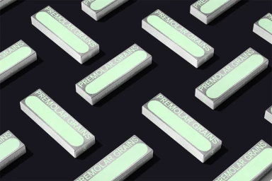
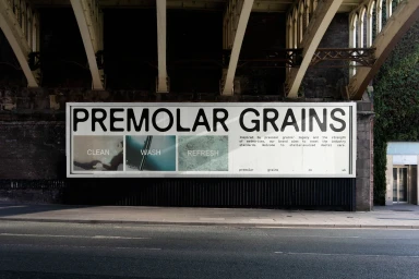
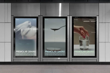
Premolar Grains introduces a refined brand identity focused on clean, minimalist aesthetics. The project, designed by Gabrielle Adam, translates the brand's visual system across diverse touchpoints, from physical product packaging featuring metallic finishes to large-scale urban signage and digital displays. The execution relies on precise typography and a restrained color palette to establish a modern presence. Utilizing 3D render and CGI techniques, the identity highlights geometric layouts and industrial textures, contrasting the brand’s technical elements with sleek, urban environments and public transit hubs.
Style
Horizontal, Commercial, Minimalist, Clean
Color
Pure White
Associated creatives

5000+ creatives to discover
Sign up to gain access to the entire directory. It’s free.
Visie is a curated library of creative professionals.