
Perpetual
Brand Identity

May 2026
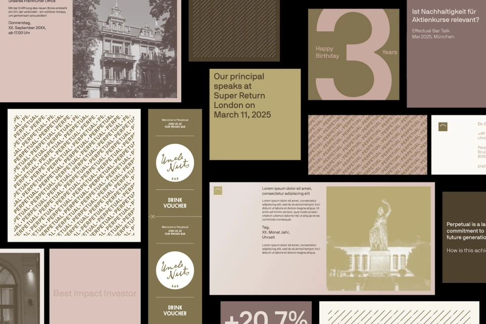
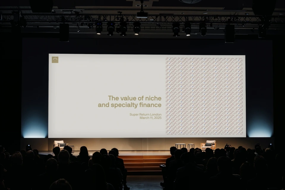
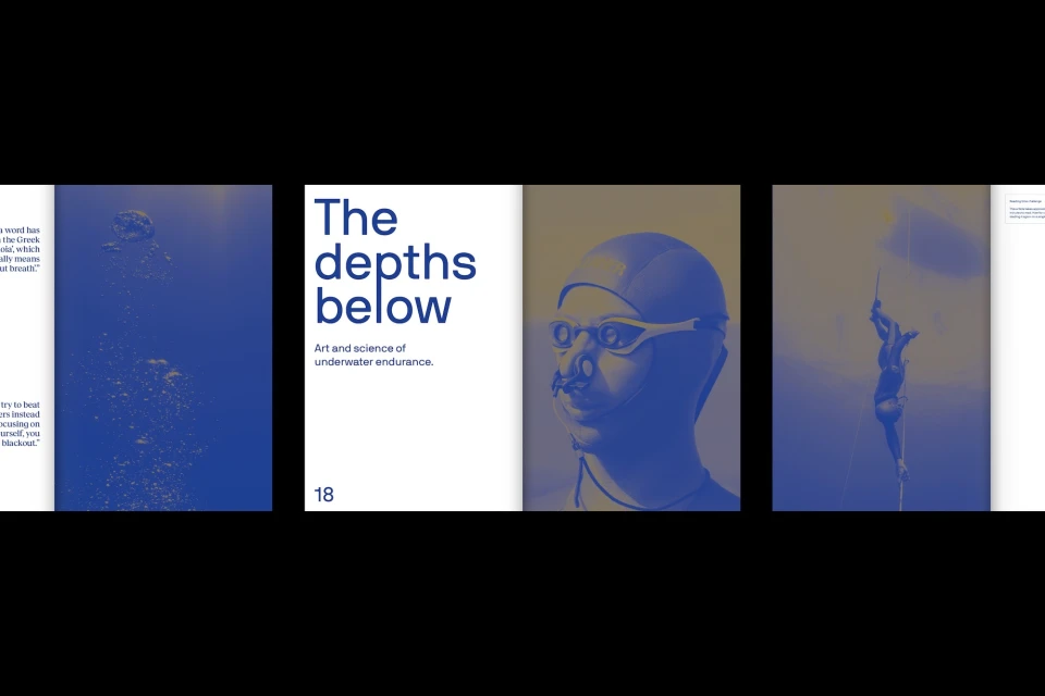
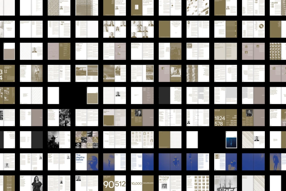
The brand identity for Perpetual serves as a masterclass in modular corporate design, transcending the typical constraints of financial communications to establish a sophisticated, multi-faceted visual language. By balancing the rigid requirements of investment category documentation with an adventurous editorial sensibility, the identity manages to feel both institutional and distinct. Under the strategic design leadership of NAMENAME Creative Partners, the system employs a clean, modern serif typography that anchors its diverse applications—from structured financial grids and data visualization charts to more evocative, fine art-inspired editorial spreads featuring deep-sea motifs. The project seamlessly integrates motion elements through the work of Marek Glogowski and Juan Cruz Caamaño, adding a layer of fluid interactivity that elevates the brand beyond static collateral. Complementing this, Saskia van der Meer brings a tactile, illustrative quality that softens the corporate edge, allowing the brand to pivot between high-stakes investment seminars and nuanced, performance-driven storytelling. Throughout, the design leans into a refined, muted palette of taupe, olive, and deep blue, which grounds the expansive layout. By prioritizing visual consistency through systematic grid structures and purposeful white space, the Perpetual identity achieves a sense of clarity that is essential for the finance industry, while maintaining the bespoke, intentional aesthetic of a luxury editorial publication. This is a comprehensive identity that successfully communicates the value of specialty finance through a marriage of rigorous organization and creative experimentation.
Horizontal


