
Pangram Pangram Foundry: Brand Identity
Jul 2026
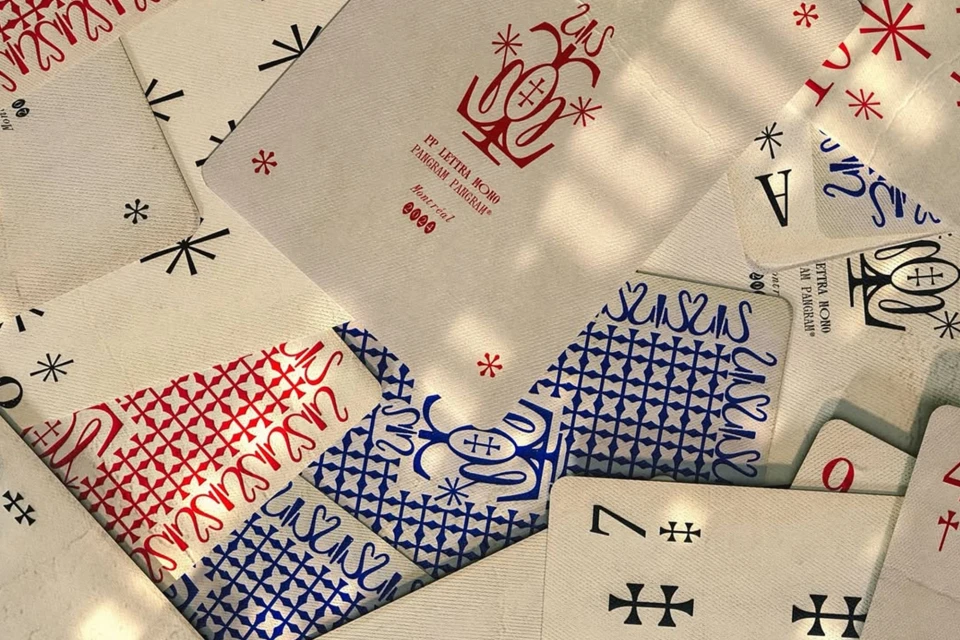
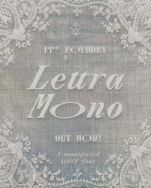
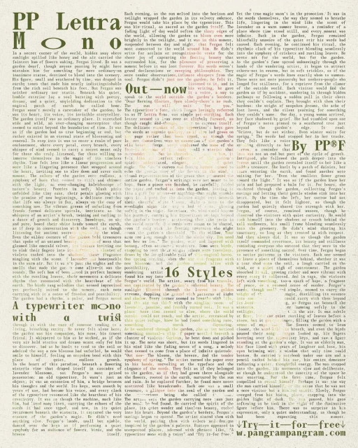
In a masterclass of modern brand identity, Pangram Pangram Foundry has once again pushed the boundaries of visual language, bridging the gap between digital precision and tactile history. Through their latest project, the foundry demonstrates a sophisticated approach to the Digital Media and Publishers space, meticulously crafting custom typography that feels as weighted as physical media. The execution leans into editorial minimalism, utilizing natural light to accentuate the nuanced textures of paper grain and linen, effectively transforming digital assets into tangible, artisanal experiences. With design direction from Adoratorio, the project oscillates between the structured, academic layouts of traditional specimen sheets and the chaotic, dynamic rhythm of scattered custom playing cards. This interplay of form is particularly evident in the presentation of the Lettra Mono typeface, where clean, monospace functionality meets the ornate, symmetrical charm of vintage lace borders. By integrating these elements, the work maintains a high-end commercial polish while retaining a distinct, thoughtful character. Each frame serves as a testament to the power of bespoke letterforms, proving that even within a digital-first industry, there is an enduring elegance in the intentional pairing of bold, modern typography with a curated, textured aesthetic that invites the viewer to lean in and engage with the details of the brand architecture.
Artistic, Vertical
Apps & Digital Platforms
Brand Film / Corporate Video
