
Palomino
Brand Identity




Dec 2025
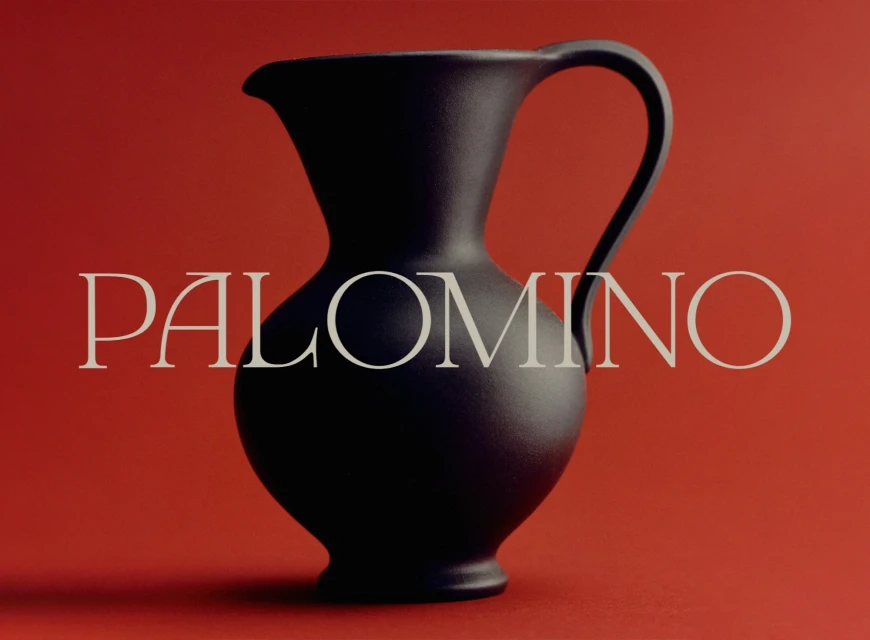
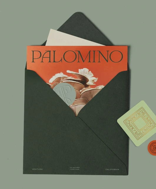
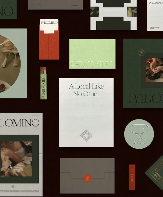
Palomino’s brand identity system establishes a cohesive visual language tailored for the hospitality sector. Developed by FORNER with strategy and writing by Allison Dobkin, the project balances refined typography with a restrained earth-toned palette of sage green, terracotta, and cream. The system employs minimalist design principles to unify a wide array of collateral, ranging from tactile stationery and wax-sealed envelopes to sculptural bronze signage. Across both static graphic design assets and commercial motion pieces, the work leans into a clean, organic aesthetic. Techniques such as emboss & deboss and precise serif typography appear throughout the system, creating a focus on texture and layered materiality. The brand identity maintains a modern, polished presence through careful material choices and consistent, deliberate composition.
Commercial, Clean, Minimalist
Advertising Campaign

