
OTTIMO: Brand Identity

Brand
Date
Dec 2024
Description
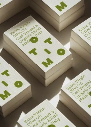
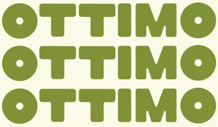
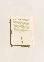
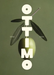
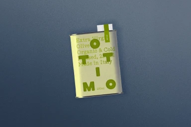
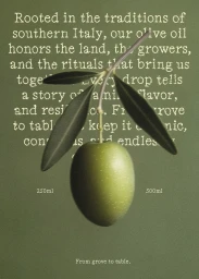
The brand identity for OTTIMO, a food and beverage producer specializing in cold-pressed extra virgin olive oil, centers on a clean, minimalist aesthetic. Developed by SOMEKIND Studio, the project spans packaging, graphic design, and motion assets that emphasize earthy tones and tactile, paper-based textures. The visual system integrates bold, rounded typography with natural light photography to establish a consistent look across physical product containers and digital brand communications. Key techniques throughout the identity include clean vector-based animation, minimalist composition, and layered graphic design, balancing structured product information with organic, artistic elements.
Style
Vertical, Commercial, Clean, Minimalist
Associated creatives

5000+ creatives to discover
Sign up to gain access to the entire directory. It’s free.
Visie is a curated library of creative professionals.