
Ners: Brand Identity
Jan 2021
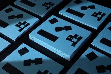
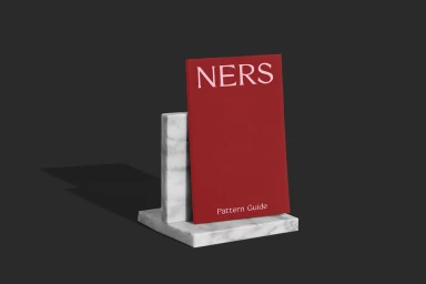
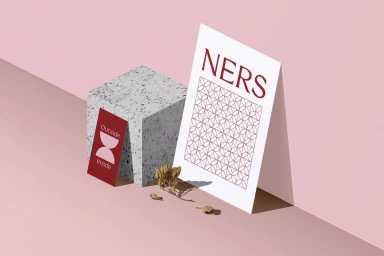
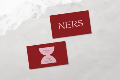
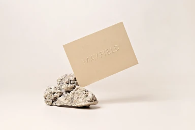
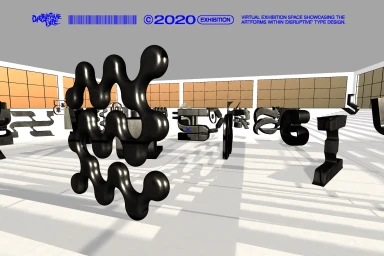
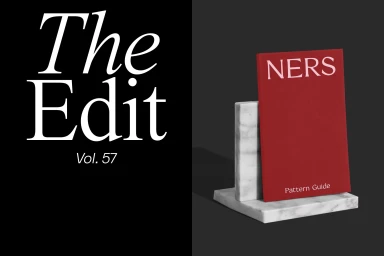
Ners develops a comprehensive brand identity system that translates across physical collateral, editorial design, and spatial installations. The visual language centers on a minimalist aesthetic, utilizing monochromatic palettes with deep burgundy and red accents, paired with serif typography and intricate geometric patterns. Executed through a mix of clean graphic layouts and 3D render / CGI visualizations, the project establishes a cohesive corporate presence. The design system spans tactile print applications, including embossed business cards, publication covers, and pattern guides set against marble and stone textures. This physicality is balanced by a futuristic, digital-first approach, characterized by sculptural typographic forms within expansive virtual gallery environments. The project was developed by MEK, Nowhere Studio, Felipe Souza, and Jonas Baun Andersen.
Horizontal, Commercial, Minimalist, Clean


