
moody
Brand Identity
Apr 2026
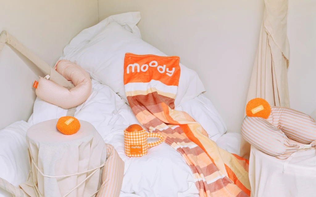
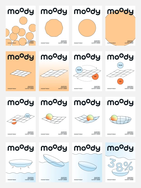
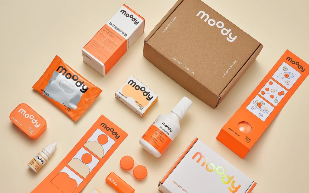
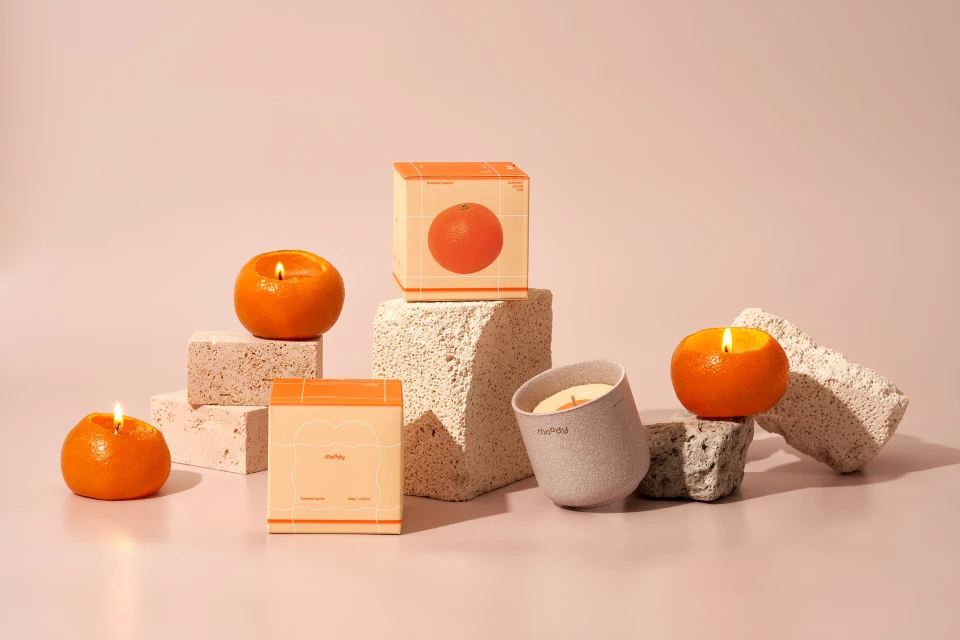
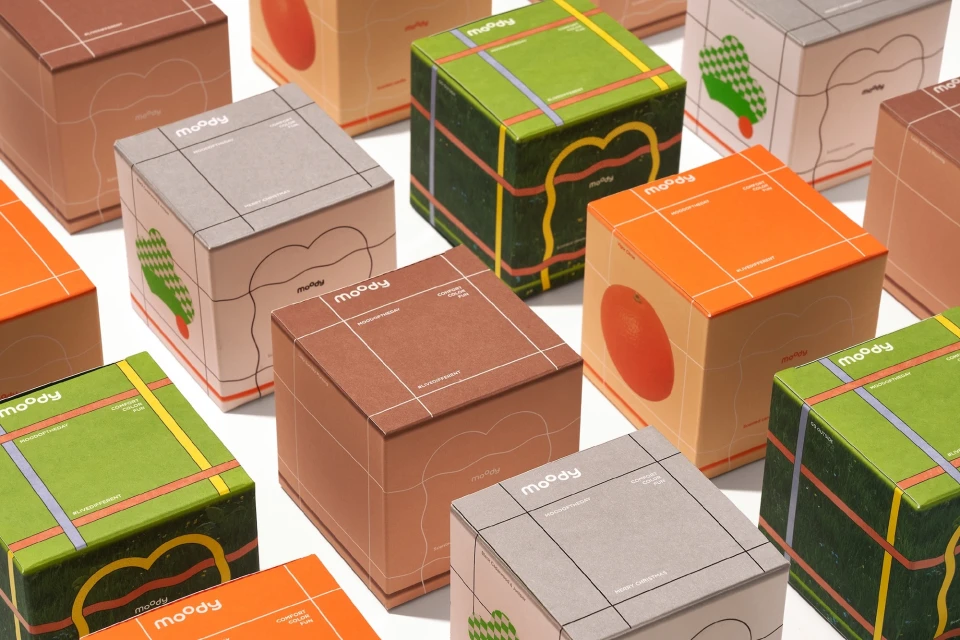
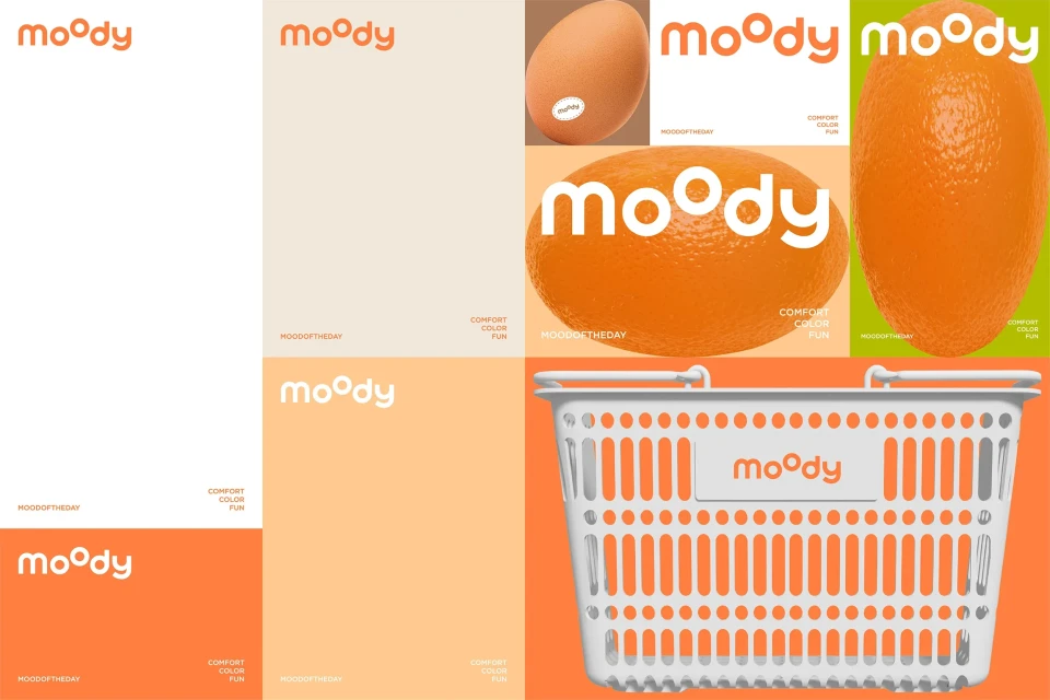
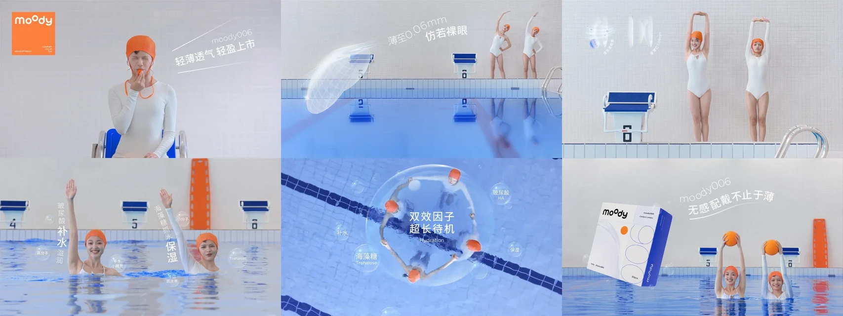
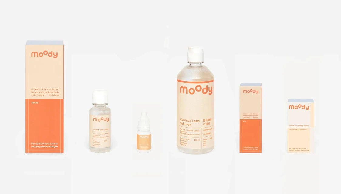
The brand identity for Moody marks a departure from traditional medical marketing, opting instead for a vibrant, playful ecosystem that leans heavily into modern lifestyle appeal. Conceived with creative vision from HO-use, this comprehensive identity system establishes a cohesive visual language that translates effortlessly across diverse touchpoints, from tactile lifestyle displays to technical product packaging. The design strategy employs a systematic grid-based approach, utilizing a distinctive, rounded typeface paired with a warm color palette of peach, forest green, and bright orange to create a sense of approachable comfort. By integrating vector graphics with high-contrast color blocks, the work effectively communicates the brand's core values of comfort and clarity while maintaining a minimalist edge. The execution is remarkably versatile; one moment it is captured through clean commercial studio strobe lighting for product-focused flat lays, and the next, it is brought to life through dynamic live-action techniques set in an aquatic environment to emphasize product hydration. This cross-medium consistency, bolstered by skillful use of 3D render and CGI elements, elevates the functional contact lens brand into a lifestyle destination. Through the strategic use of natural light and structured geometric layouts, the project successfully defines Moody as a brand that is as much about personality and fun as it is about eye care, demonstrating a sophisticated mastery of corporate design.
Horizontal, Commercial, Clean
E-commerce / Product
