

MJ2B Brand Identity 2018
About
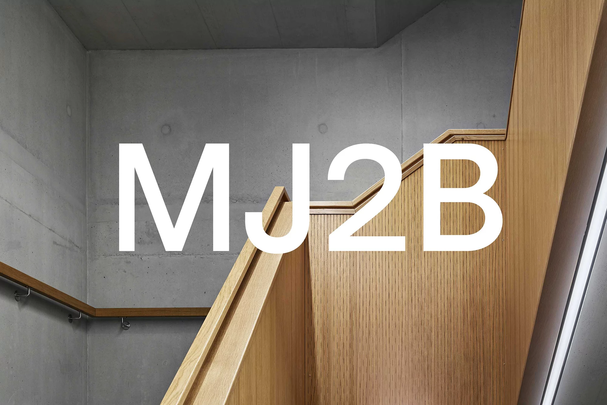
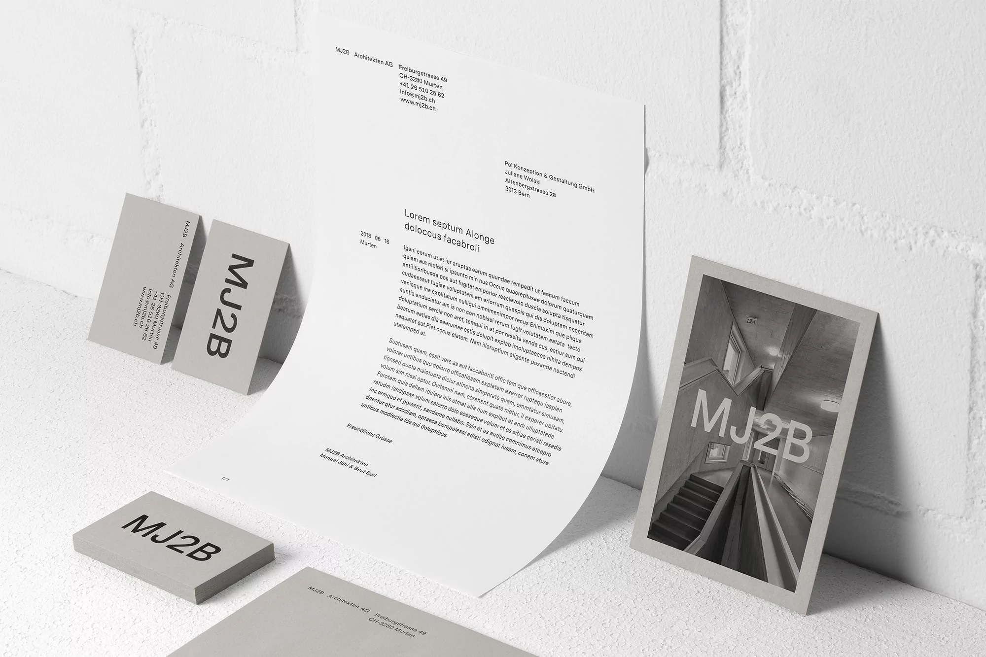
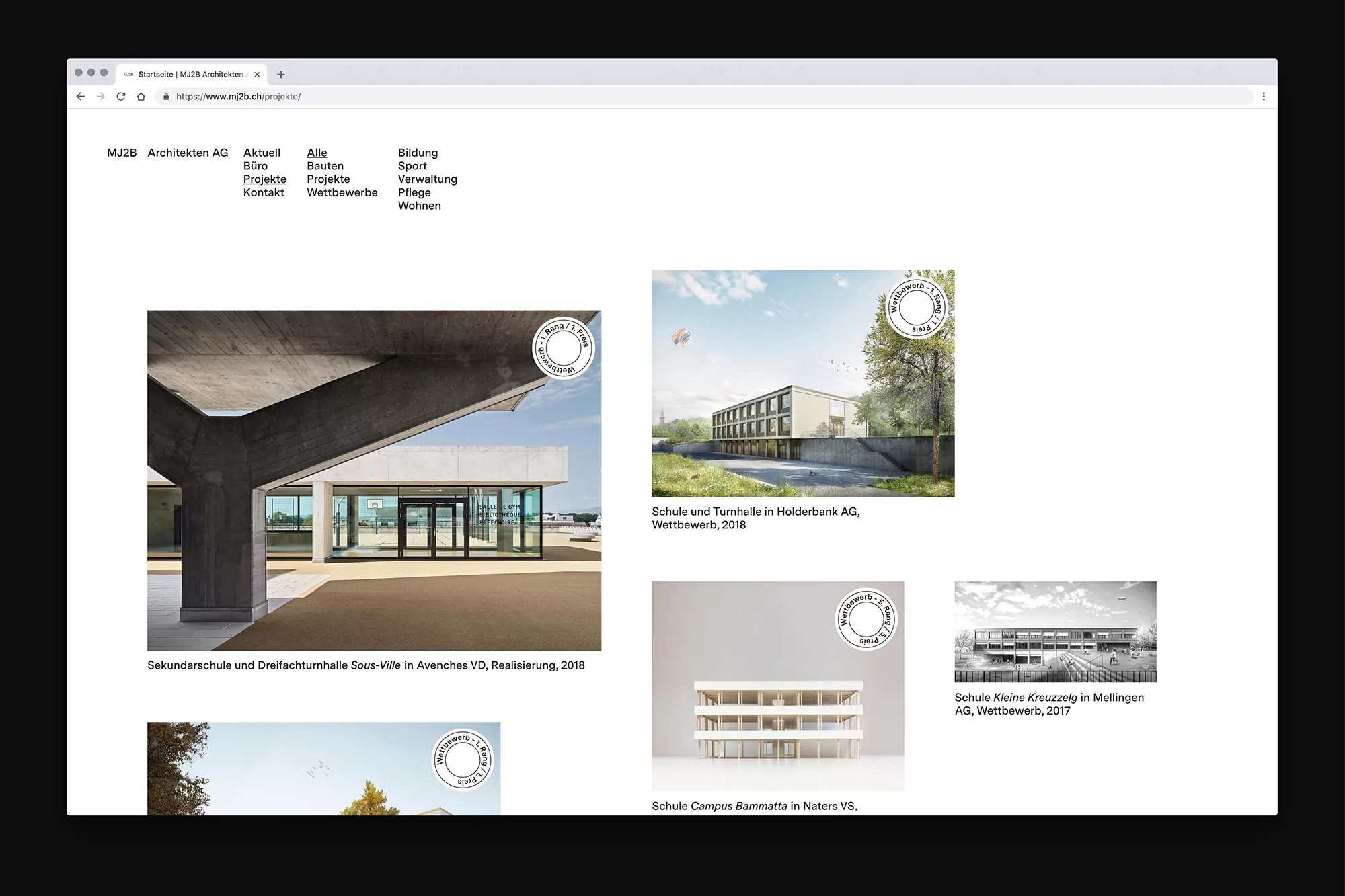
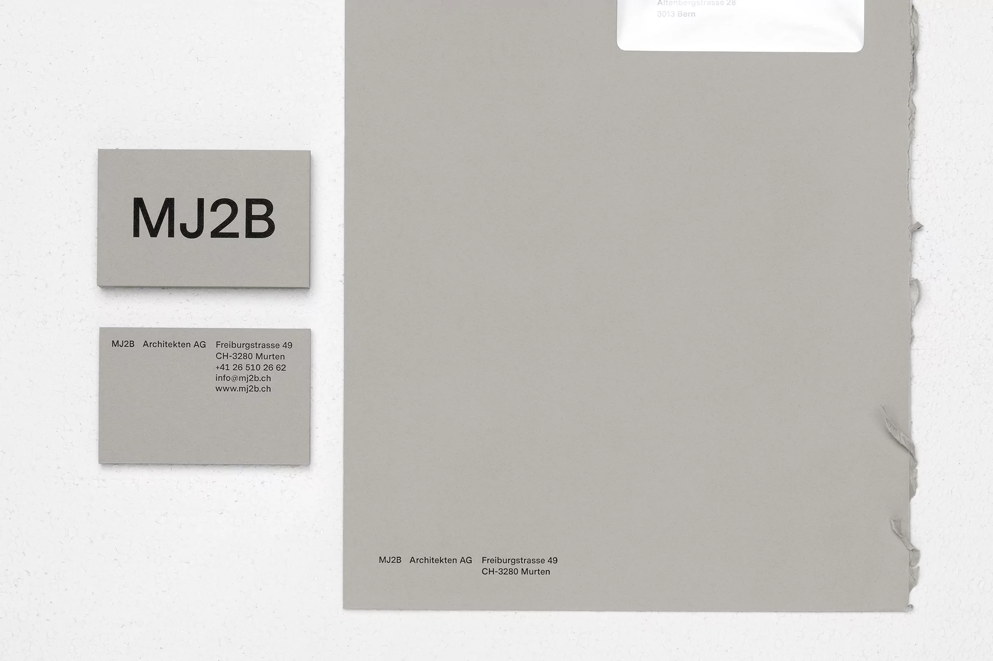
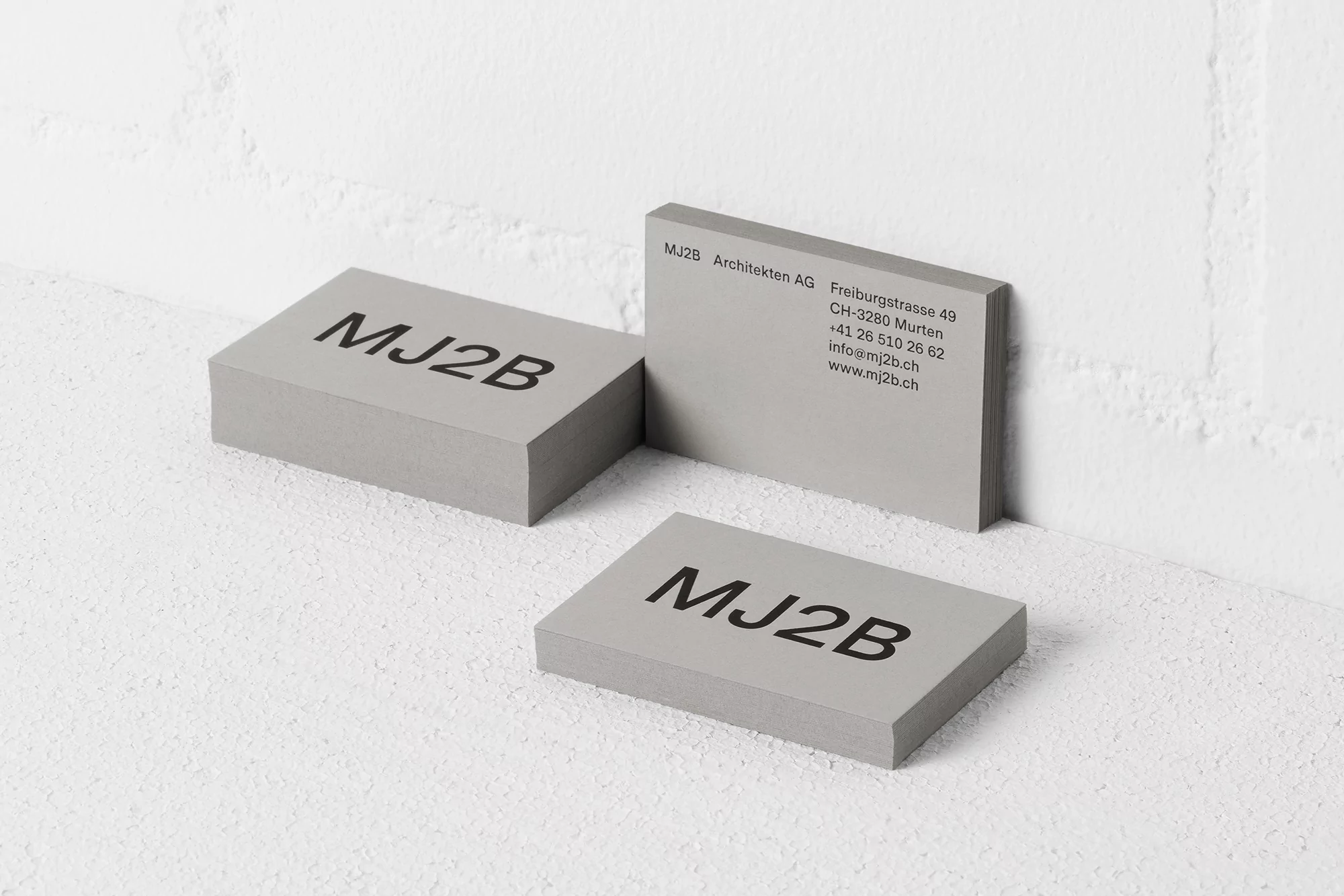
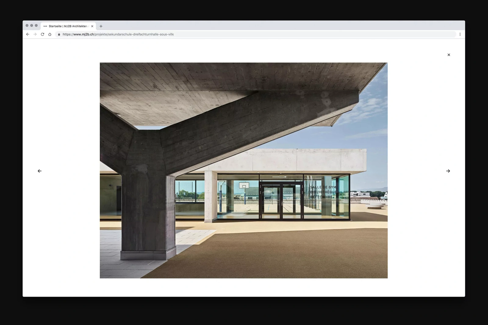
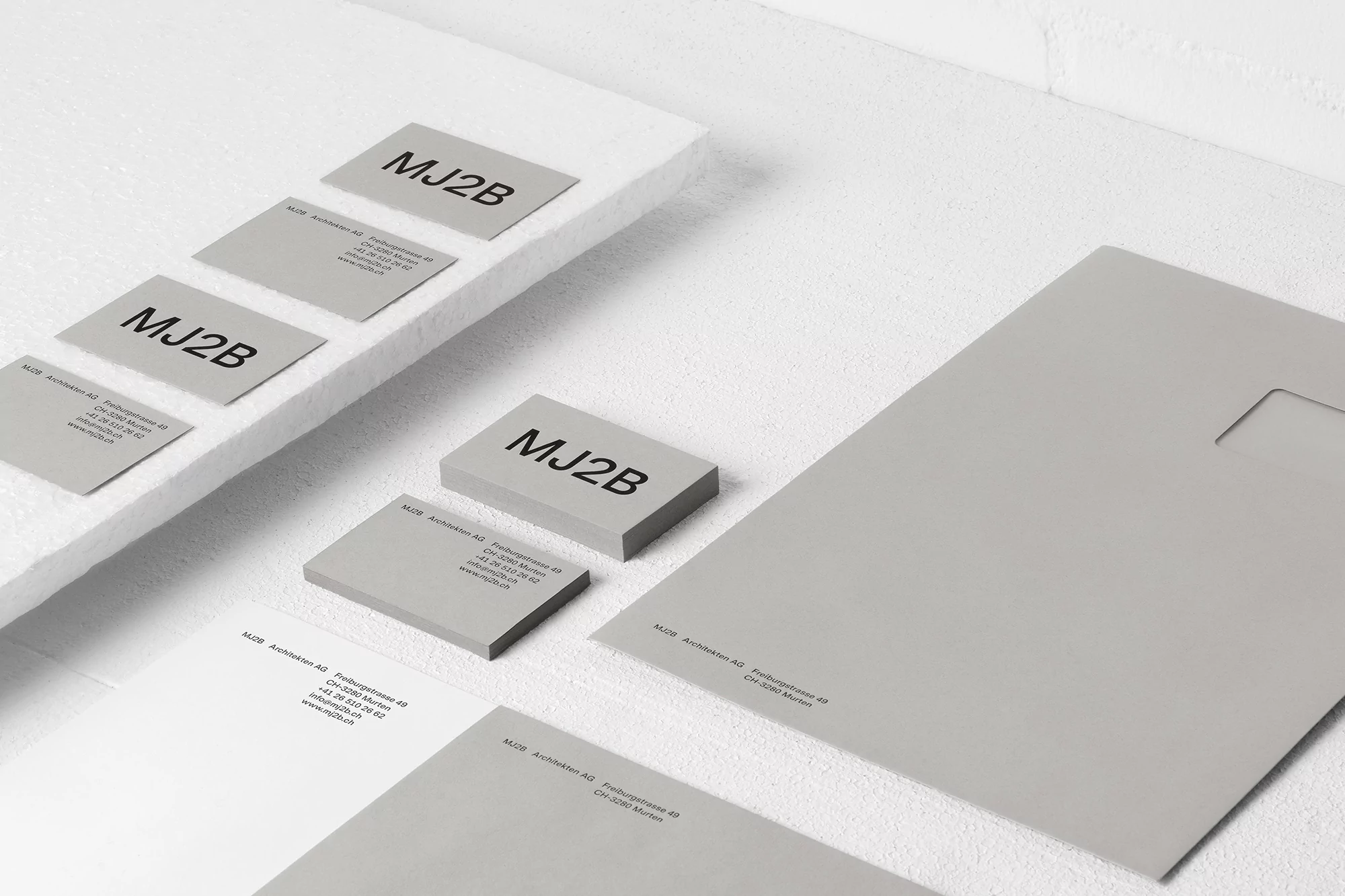
For MJ2B Architekten AG, the challenge of building a brand identity within the rigorous world of real estate and property architecture demands a visual language as structured as the buildings themselves. This project, executed with precision by Atelier Pol, successfully establishes a corporate aesthetic that favors editorial minimalism and a disciplined, grid-based approach. By weaving together a sophisticated monochromatic palette of grey, black, and white, the identity leans into a high-key, commercial sensibility that bridges the gap between physical materiality and digital presence. The branding elements—ranging from tactile stationery with deckled edges to a streamlined web interface—prioritize legibility and white space, mirroring the clean lines found in the firm’s contemporary school and sports facility projects. Utilizing natural light to accentuate the textures of raw concrete and wood, the photography creates a seamless dialogue between the architecture’s brutalist-inspired silhouettes and the brand’s refined, sans-serif typography. This cohesive system does not merely present information; it curates an experience of professional reliability. By balancing bold, oversized logotypes with the understated elegance of thick-stock paper, the identity captures the essence of modern architectural practice. The final result stands as a masterclass in corporate branding, where every interface choice and printed detail reinforces a narrative of structural integrity and balanced, forward-thinking design principles.