
Logo
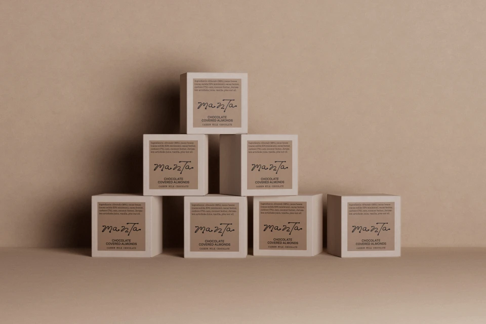
Stacked square Manta chocolate packaging boxes against a neutral beige background
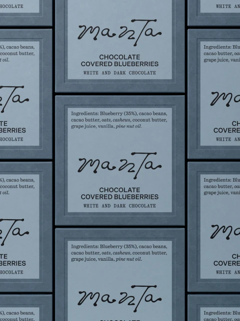
Repeating grid of Manta chocolate packaged boxes with dark grey typography on light labels.
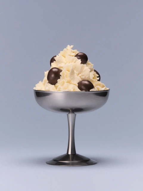
A metallic dessert goblet filled with whipped cream and dark chocolates on a light grey seamless background
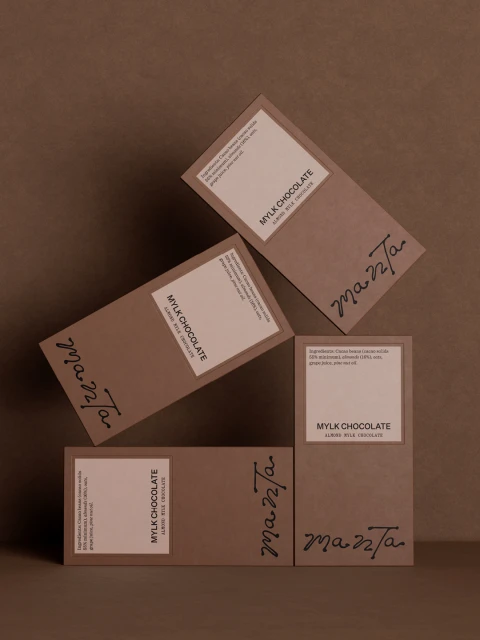
Four Manta mylk chocolate packaging boxes arranged artistically on a brown textured surface.
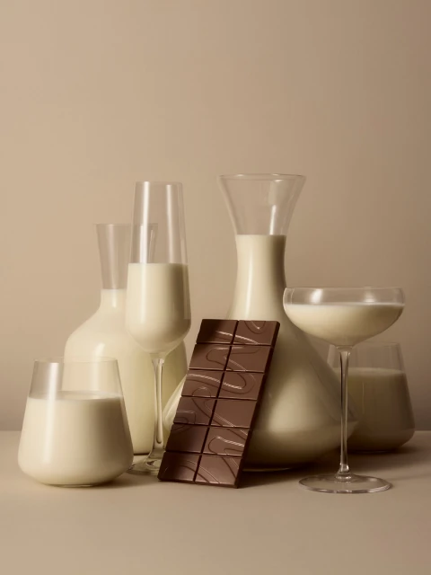
Glass glassware filled with milk and a bar of milk chocolate on a neutral beige background for Manta brand identity
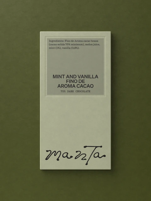
Manta chocolate bar packaging with sage green wrapper and dark typography on an olive green textured background
Close-up macro shot of sleek black sculptural forms curving across a textured sage green background.
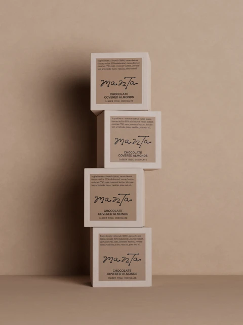
Four square product boxes stacked vertically in a tower against a neutral beige background
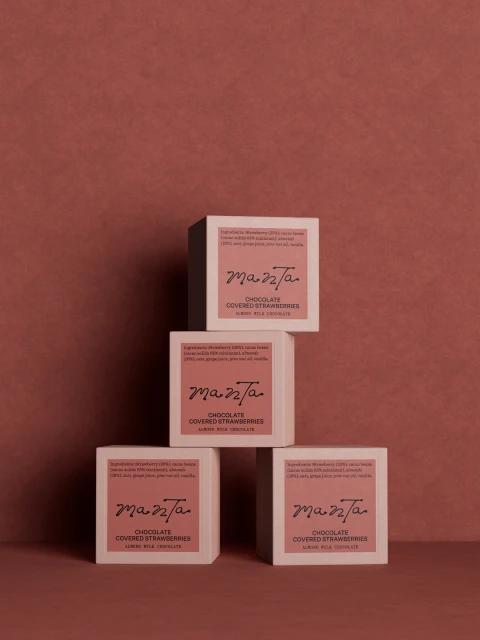
Four square Manta chocolate packaging boxes stacked symmetrically against a warm textured terracotta background.
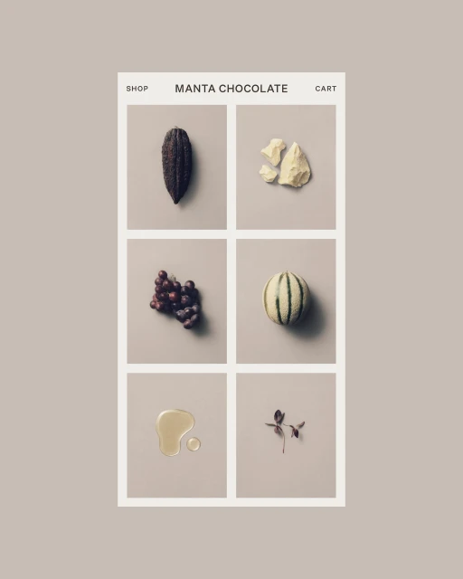
Web interface mockup for Manta Chocolate featuring a six-panel grid of ingredients on a neutral background
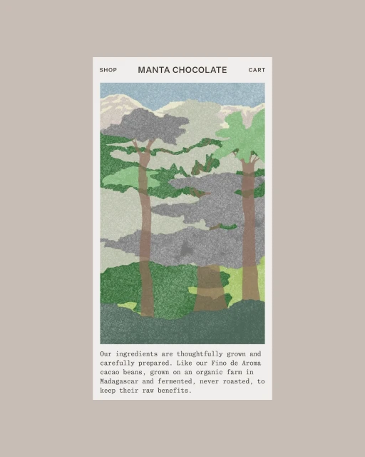
Manta chocolate website screen showing an illustrated landscape with tall trees, mountains, and descriptive text underneath.
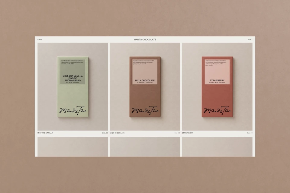
Web interface mockup showcasing three different Manta chocolate bar packaging designs against a neutral taupe background.
Stacked square Manta chocolate packaging boxes against a neutral beige background
Repeating grid of Manta chocolate packaged boxes with dark grey typography on light labels.
A metallic dessert goblet filled with whipped cream and dark chocolates on a light grey seamless background

Manta Brand Identity 2026

About

The brand identity for Manta spans a complete ecosystem of CPG packaging and digital touchpoints within the food and beverage sector. The design relies on minimalist principles, utilizing a palette of earth tones such as terracotta, sage green, and warm beige to ground the product presentation. Across the packaging, Studio Tyrrell implemented precise typography and tactile finishes, including emboss and deboss techniques that invite interaction with the physical product. The project incorporates professional 3D rendering by Elliott Barker to visualize packaging structures and organic textures. This CGI work is complemented by the studio photography of Jason Lewer, which captures the matte and metallic surfaces of the brand’s assets in soft, even light. Further visual depth is provided through UI illustrations from Lily Kong, which delineate the brand's connection to its raw ingredients and geographic origins. The final output is rounded out by web development from Rob Dove and high-quality print production by Generation Press, resulting in a cohesive, clean design language.

Brand

Credits

Industries

Styles

5000+ creatives to discover

Sign up to gain access to the entire directory. It’s free.

Visie is a curated library of creative professionals.
Trusted by