
Mangeat
Brand Identity
Jan 2018
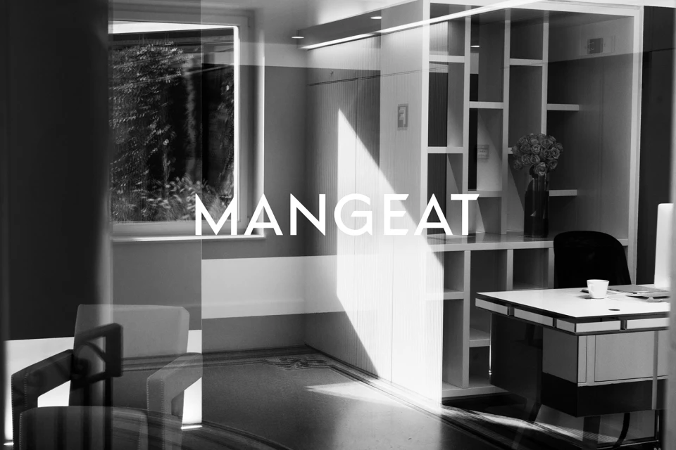
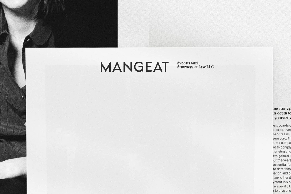
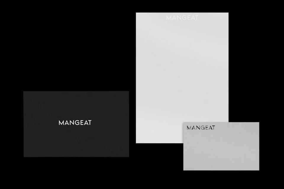
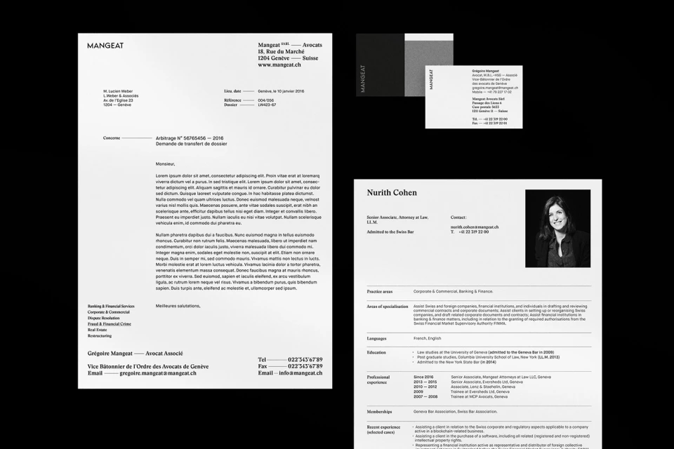
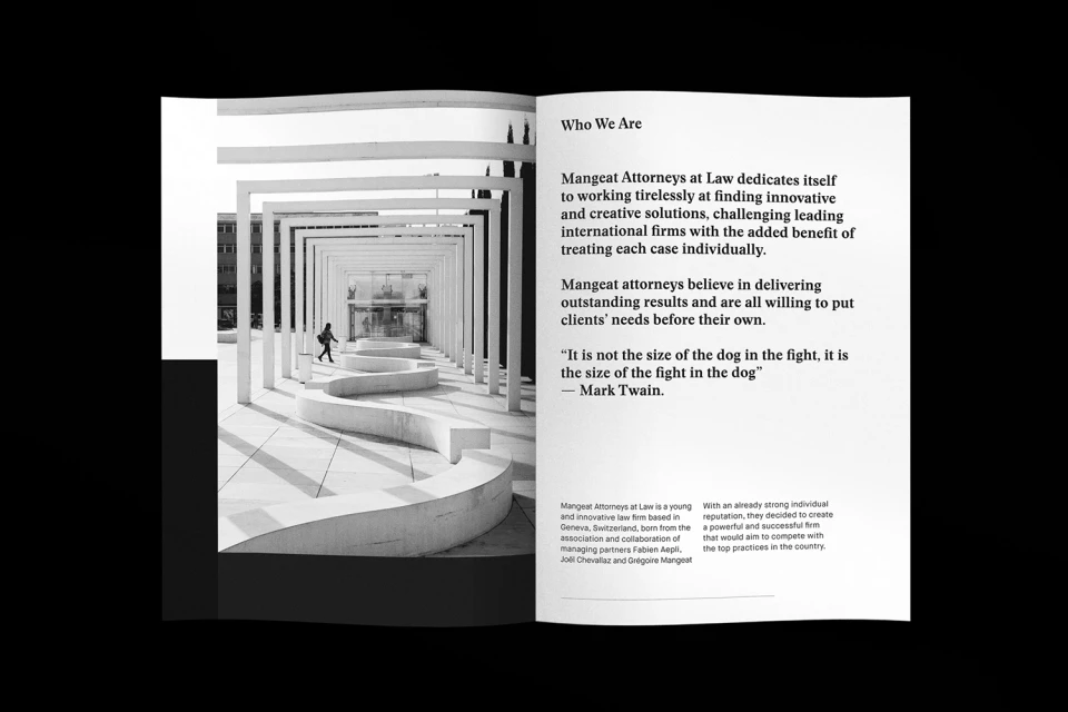
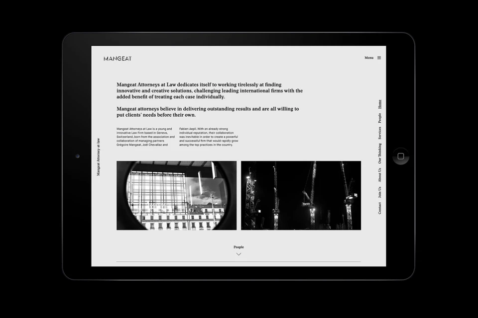
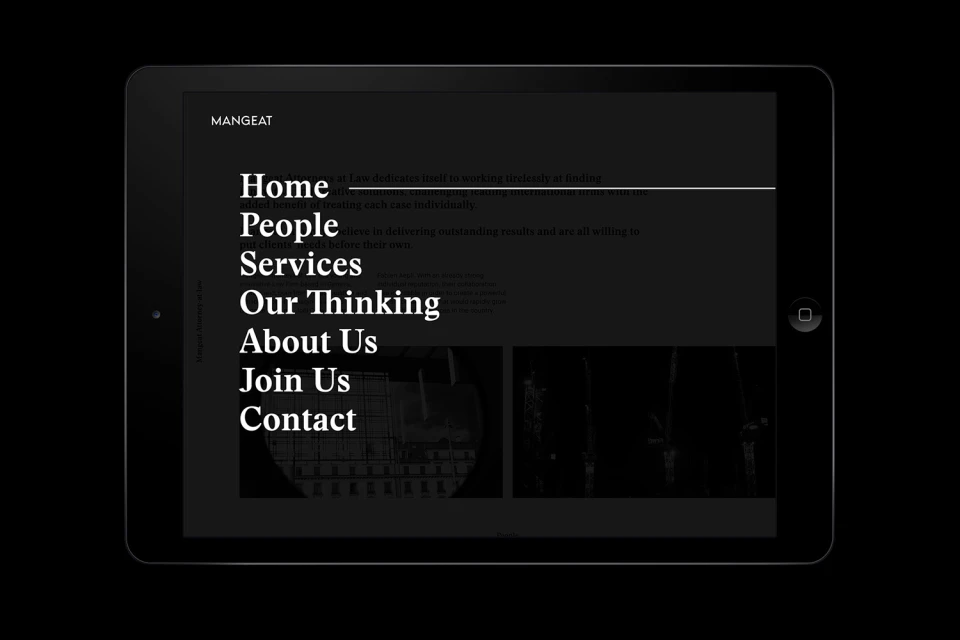
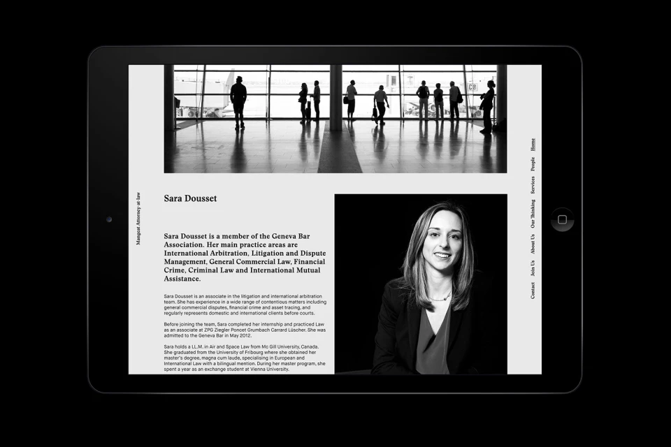
The new brand identity for Mangeat Attorneys at Law masterfully reconciles the traditional gravity of the legal sector with a sharpened, contemporary visual language. By stripping away visual noise in favor of a monochromatic palette, the project establishes a firm sense of architectural order. The identity relies on a restrained application of high-contrast typography and negative space, channeling a sense of editorial minimalism that feels both authoritative and approachable. Key to this cohesion is the integration of chiaroscuro-inspired photography, which uses sharp, angled light to emphasize the firm's focus on professional structure and modern workspace design. Graphic designer Bilal Sebei has successfully extended this visual logic across a comprehensive suite of touchpoints, from tactile, high-quality stationery to a sophisticated UI design for the firm’s digital presence. The branding effort is characterized by a disciplined use of clean, sans-serif fonts and a rigorous grid system, creating a versatile framework that supports both corporate communications and individual attorney profile sheets. By weaving together stark black-and-white portraits—including highlights of Nurith Cohen and Sara Dousset—with imagery of modern construction and geometric interiors, the design system avoids the sterility often found in corporate aesthetics. Instead, it leans into a refined, editorial layout that positions Mangeat as a forward-thinking player within the finance and legal landscape, prioritizing clarity and high-end professional standards in every visual detail.
Horizontal, Monochrome, Clean
Typography
