
Maltfabrikken: Brand Identity
Mar 2020
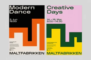
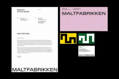
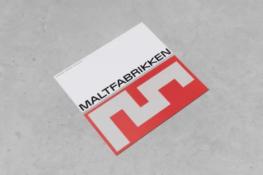
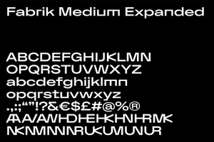
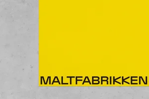
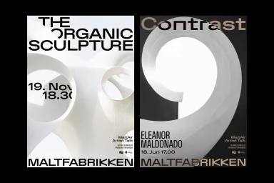
The new brand identity for Maltfabrikken, developed by the team at Mount Agency, functions as a masterclass in geometric abstraction and modern visual communication. Situated firmly within the Digital Media and Publishers landscape, this project delivers a cohesive design language that feels both institutional and experimental. By leaning into a minimalist aesthetic, the agency establishes a structured framework where bold, sans-serif typography acts as the primary anchor across diverse touchpoints. The visual narrative is defined by a rigorous use of negative space, juxtaposed against a vibrant, high-contrast palette of yellow, pink, and red, which grounds the otherwise corporate-facing assets in a tactile reality. From the flat-lay prints against textured concrete surfaces to the bespoke Fabrik Medium Expanded typeface, every element serves to reinforce the brand's versatility. The inclusion of artistic animation and abstract vector compositions further highlights how Maltfabrikken balances clean commercial utility with creative expression. By utilizing consistent geometric iconography and intentional layouts, Mount Agency has successfully crafted a brand identity that speaks to the intersection of media and entertainment. This project is a testament to how refined typography and systematic design choices can transform abstract concepts into a highly functional, enduring corporate presence that remains strikingly modern in every application, from stationery to large-scale event branding.
Horizontal, Minimalist, Commercial, Clean
Typography, Vector
