
Makt: Brand Identity
Aug 2019
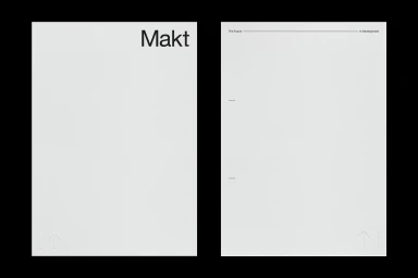
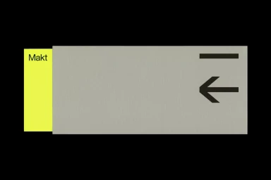
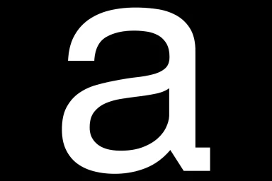
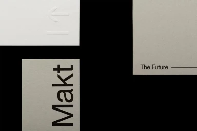
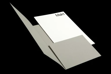
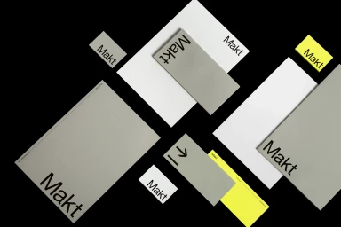
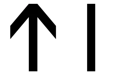
The new brand identity for Makt, executed with precision by Semiotik, signals a sophisticated pivot toward a highly systematic approach within the Apps and Digital Platforms industry. By embracing editorial minimalism and a restrained, high-contrast color palette of muted light grays, stark whites, and strategic neon yellow accents, the project establishes a visual language that feels both functional and timeless. The design system leans heavily into vector-based typography and geometric rigor, utilizing clean sans-serif typefaces that anchor the brand's presence across diverse touchpoints. Throughout the identity, the use of emboss and deboss techniques on high-quality paper stock introduces a necessary tactile dimension to an otherwise digital-first aesthetic, allowing the brand to exist confidently in both physical and virtual spaces. The composition strategy favors the expansive use of negative space, which effectively highlights the precise, signage-inspired motifs—such as directional arrows and rhythmic vertical bars—that define Makt as a forward-looking technological entity. By stripping away extraneous noise, Semiotik has created a cohesive, professional identity that reads as both intentional and authoritative, successfully balancing the fluidity of modern software branding with the concrete, physical presence of premium corporate stationery. The result is a rigorous, modular design system that feels less like a traditional logo package and more like a scalable architectural framework for a growing tech ecosystem.
Horizontal, Clean, Minimalist, Commercial
Typography
Black Seamless
Website / Web, Advertising Campaign
