
Magneting
Brand Identity
Mar 2017
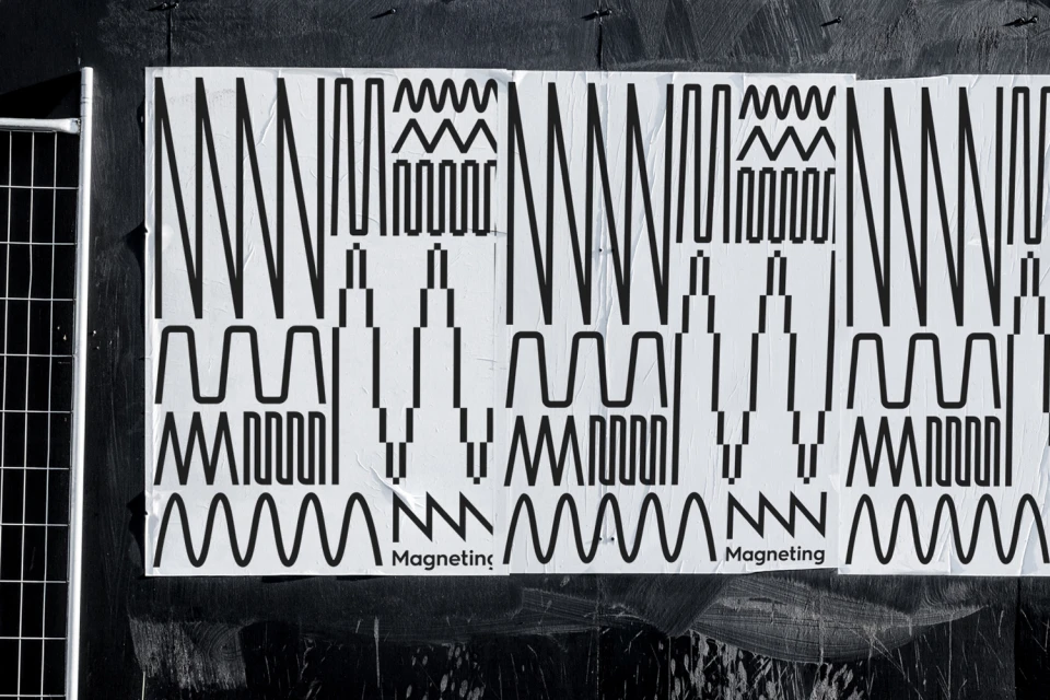
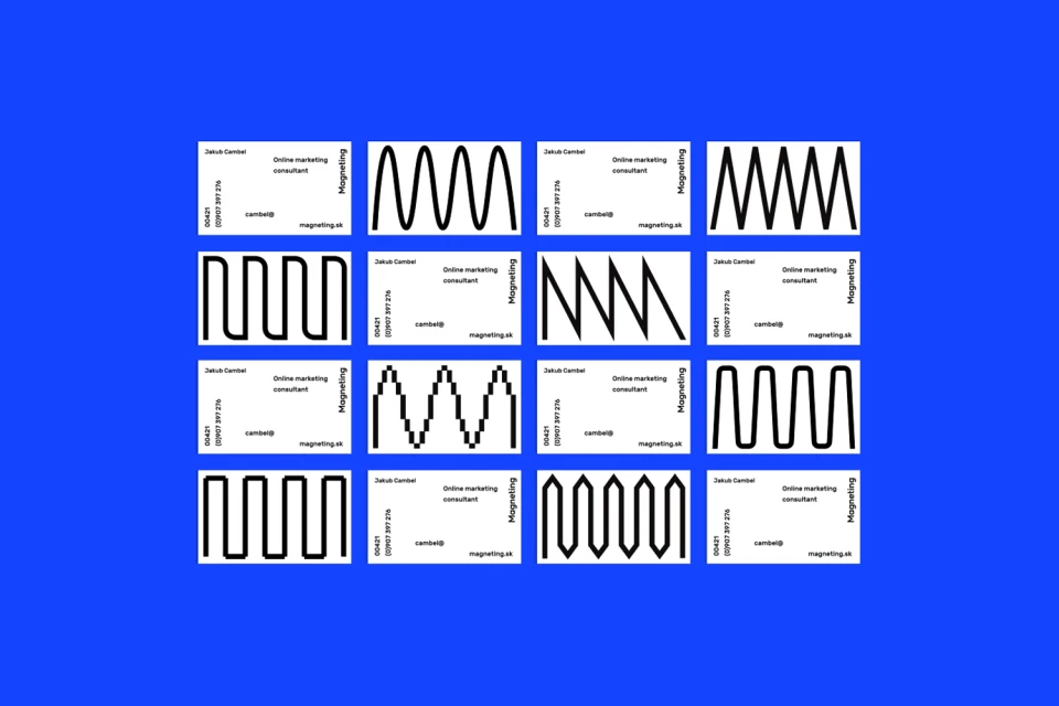
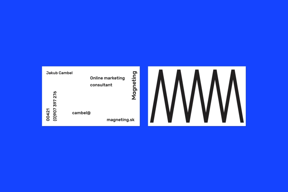
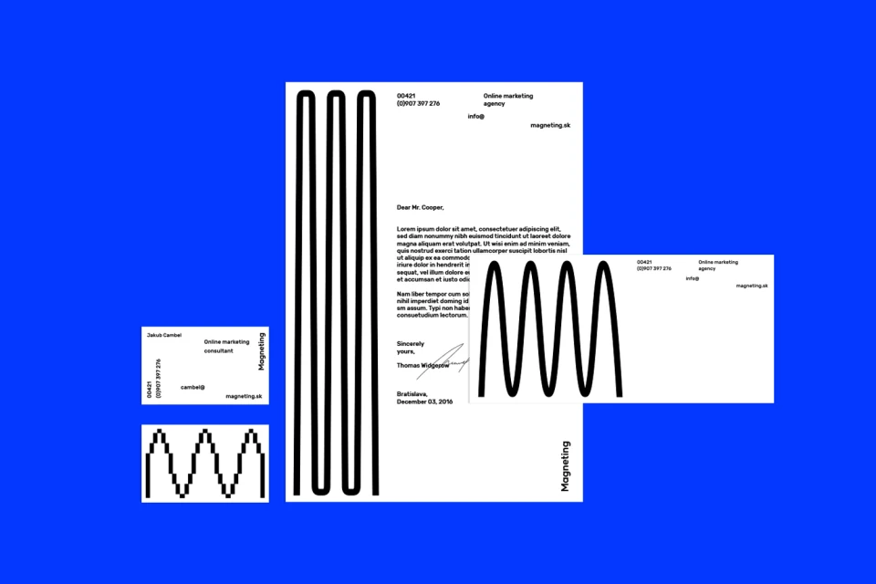
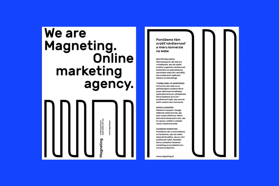
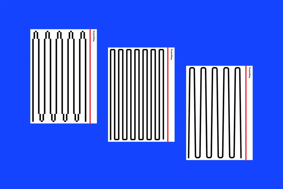
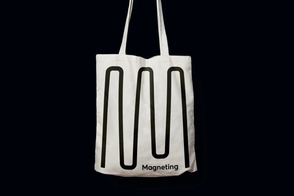
The brand identity for Magneting represents a masterclass in minimalist visual communication within the technology and digital platform sector. Through the expert graphic design lens of Lukas Vanco, the project leans into a highly structured, modern aesthetic that relies on the interplay between stark monochrome elements and a vibrant, saturated blue backdrop. The design system utilizes a series of repeating black linear motifs—incorporating saw-tooth, square, and sine waves—to establish a rhythmic, professional presence that feels both timeless and forward-thinking. This cohesive corporate branding suite effectively bridges the gap between traditional stationery and functional marketing assets, featuring everything from letterheads and business cards to utilitarian tote bags. By pairing high-contrast typography with deliberate, geometric line-art, the project achieves a sophisticated clarity that speaks to the agency’s focus on online marketing consultancy. The execution demonstrates a refined approach to commercial typography, where each asset functions as a canvas for the brand's core visual language. Whether rendered in digital formats or tactile applications like wheat-pasted posters and studio strobe product photography, the work maintains an unwavering commitment to technical precision. This identity design successfully projects the authority of a high-end creative agency while maintaining the flexible, modular design language essential for a digital-first organization in the current landscape.
Graphic, Horizontal, Commercial, Clean
Typography, Vector
Solid Colour
