
Le Labo: Brand Identity
Jul 2020
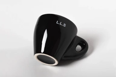
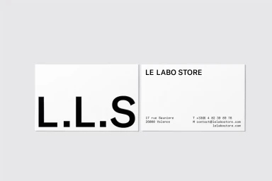
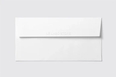
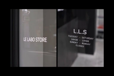
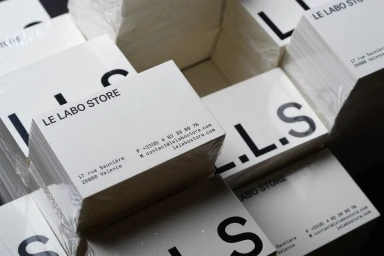
Le Labo elevates its retail presence through a sophisticated brand identity that champions the power of minimalist design and high-contrast aesthetics. By grounding the brand in a monochromatic color palette, the execution creates a sense of clarity and timelessness that resonates with the modern consumer. The project showcases a masterclass in corporate typography, utilizing bold sans-serif lettering that anchors every touchpoint, from the tactile debossed stationery to the clean, architectural glass facade of the store in Valence. Graphic designers Damien Berhelot and Nada Bennani have meticulously crafted a visual language that prioritizes functional information hierarchy while maintaining an elevated, luxury sensibility. Throughout the collection of assets, soft light serves to accentuate the physical quality of the materials, highlighting the contrast between glossy ceramics and the organic texture of paper. Whether observed in the macro-level detail of stacked business cards wrapped in film or the deliberate composition of a solitary espresso cup, the identity leans into a restrained, architectural approach to retail branding. This project perfectly balances the functional requirements of store operations with a clean, high-end design philosophy, resulting in a cohesive identity that feels both professional and distinct. By stripping away extraneous noise, the work ensures that the brand remains the primary focus, inviting customers into an environment defined by precision, tactile quality, and effortless, enduring sophistication.
Horizontal, Commercial, Clean, Minimalist
