
Le Garage Brand Identity 2019
About
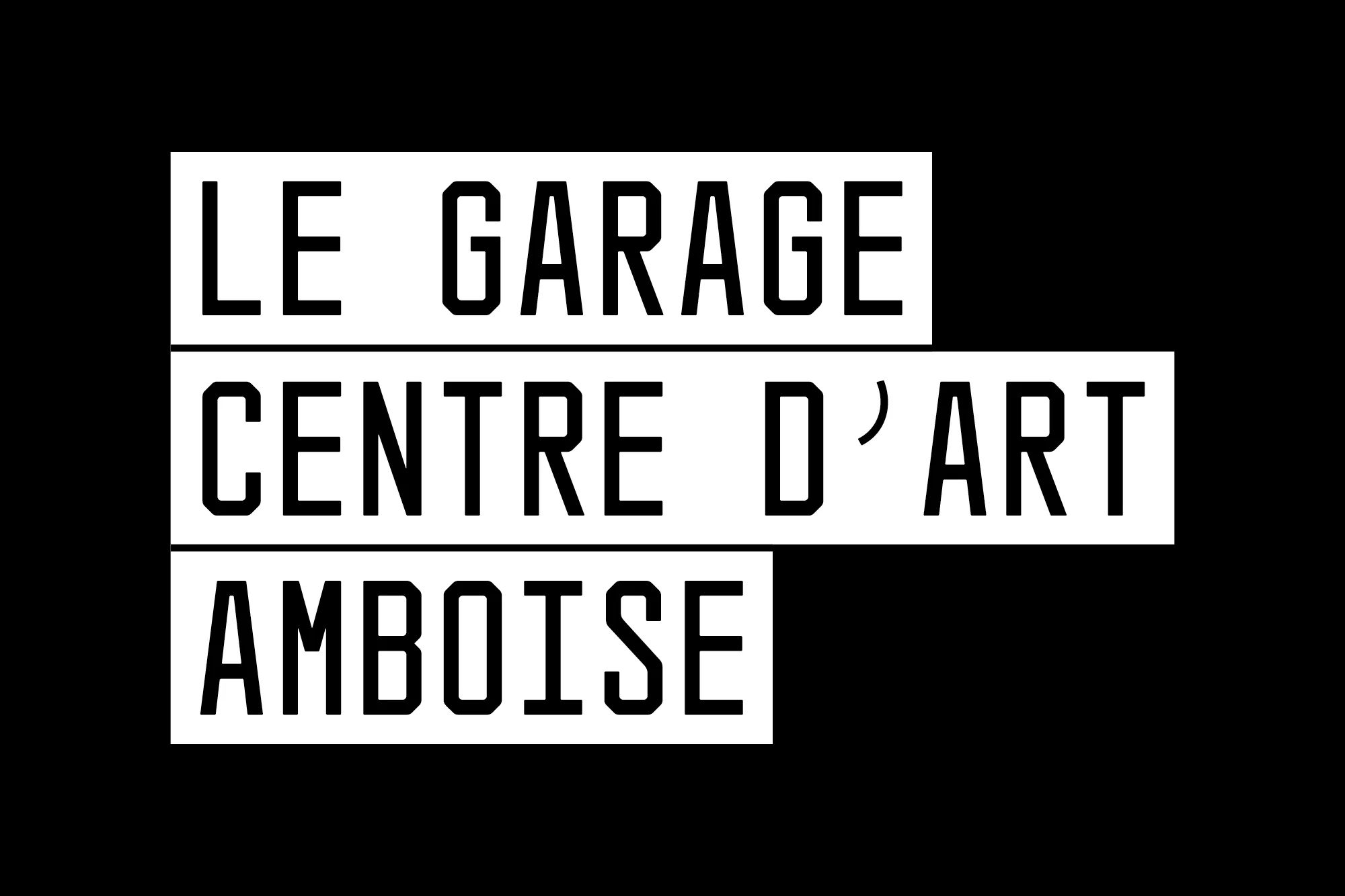
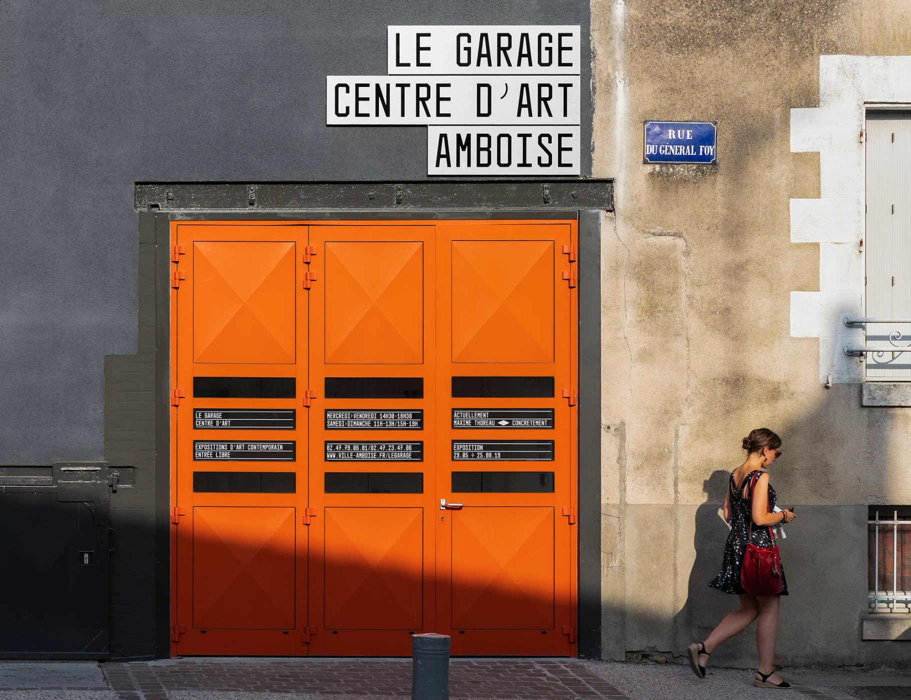
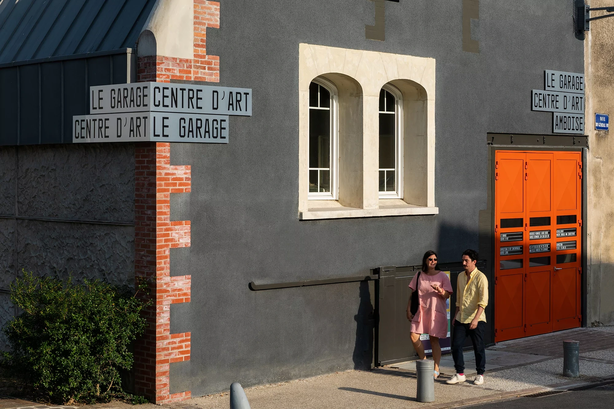
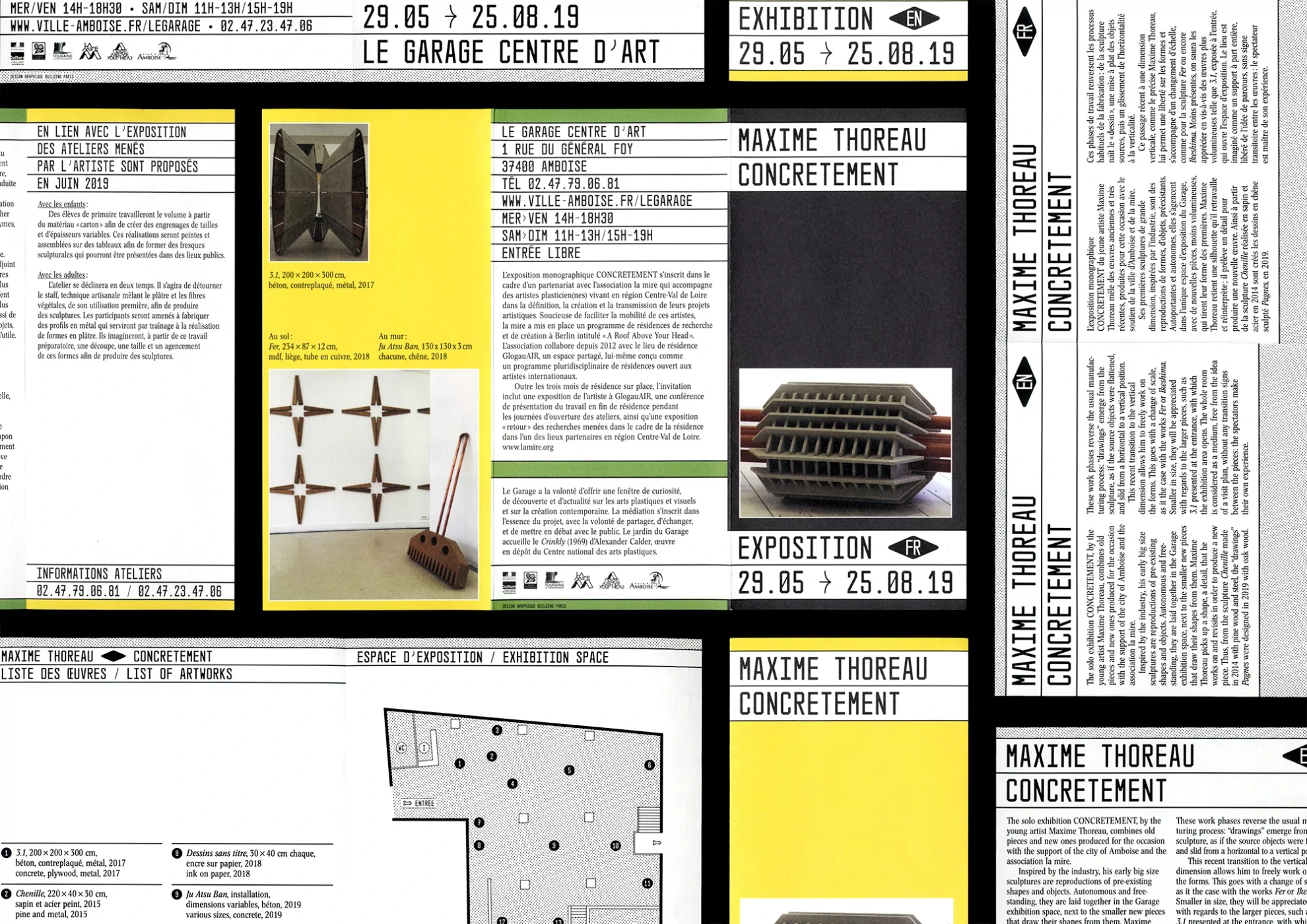
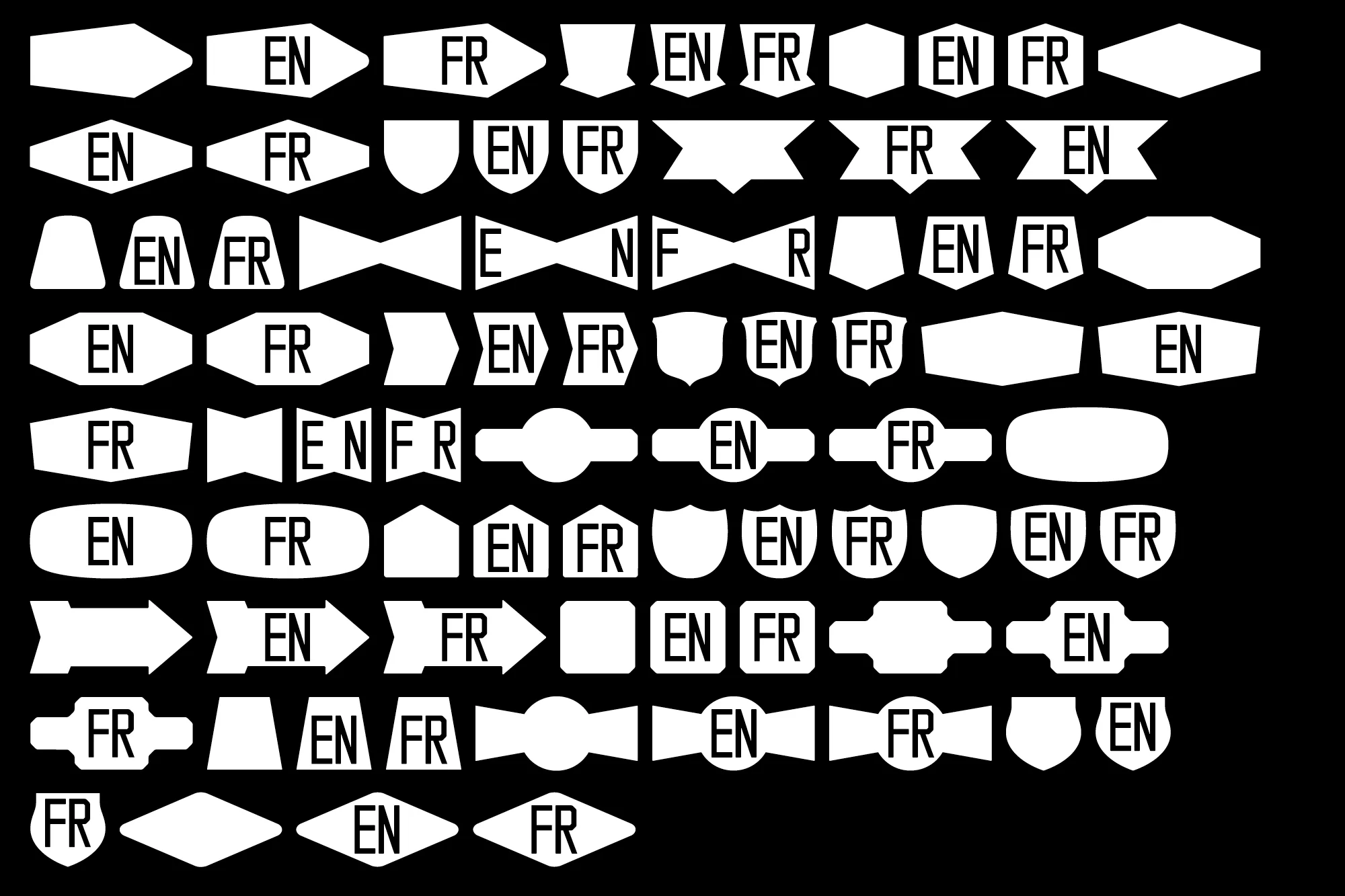
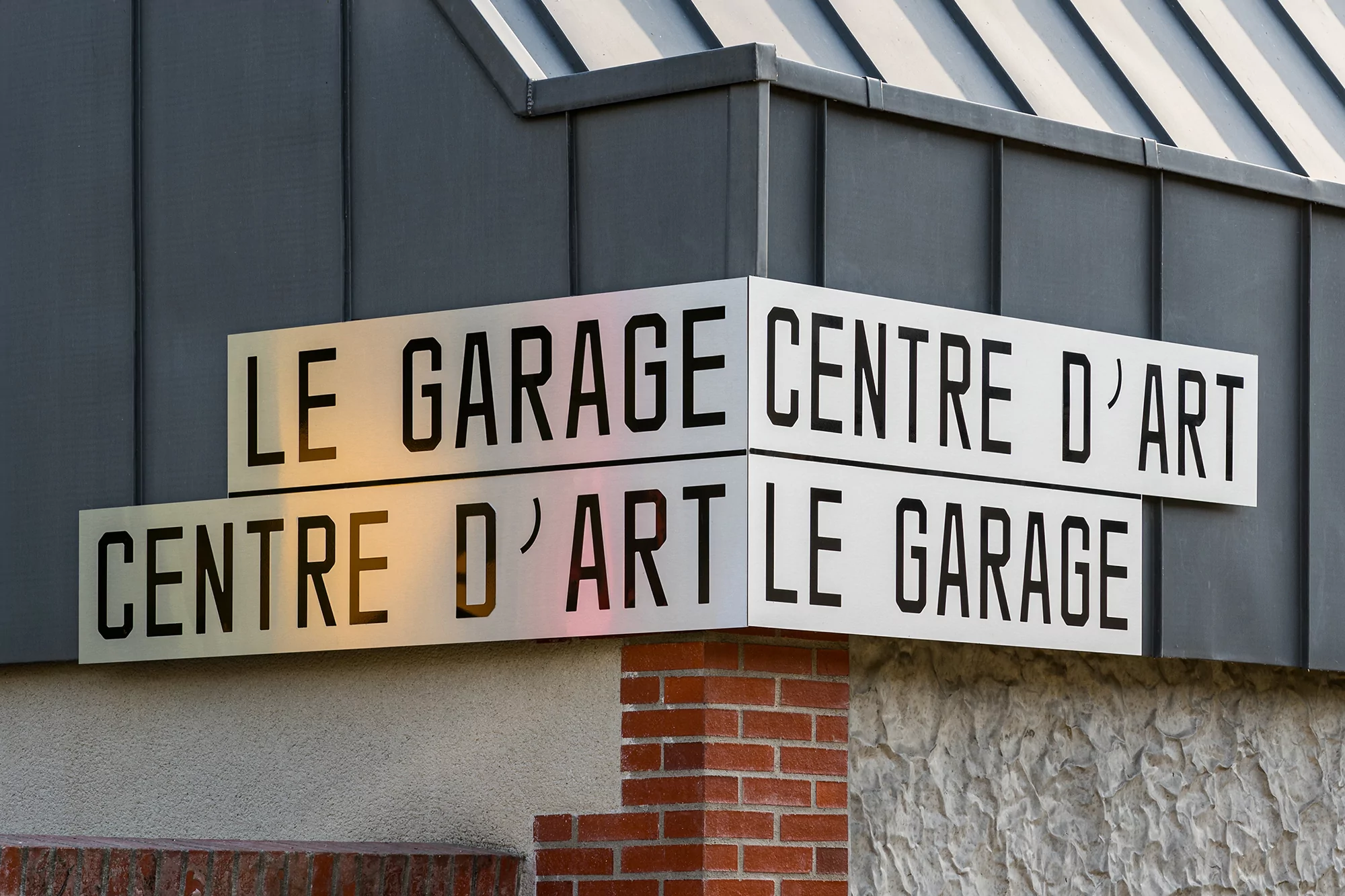
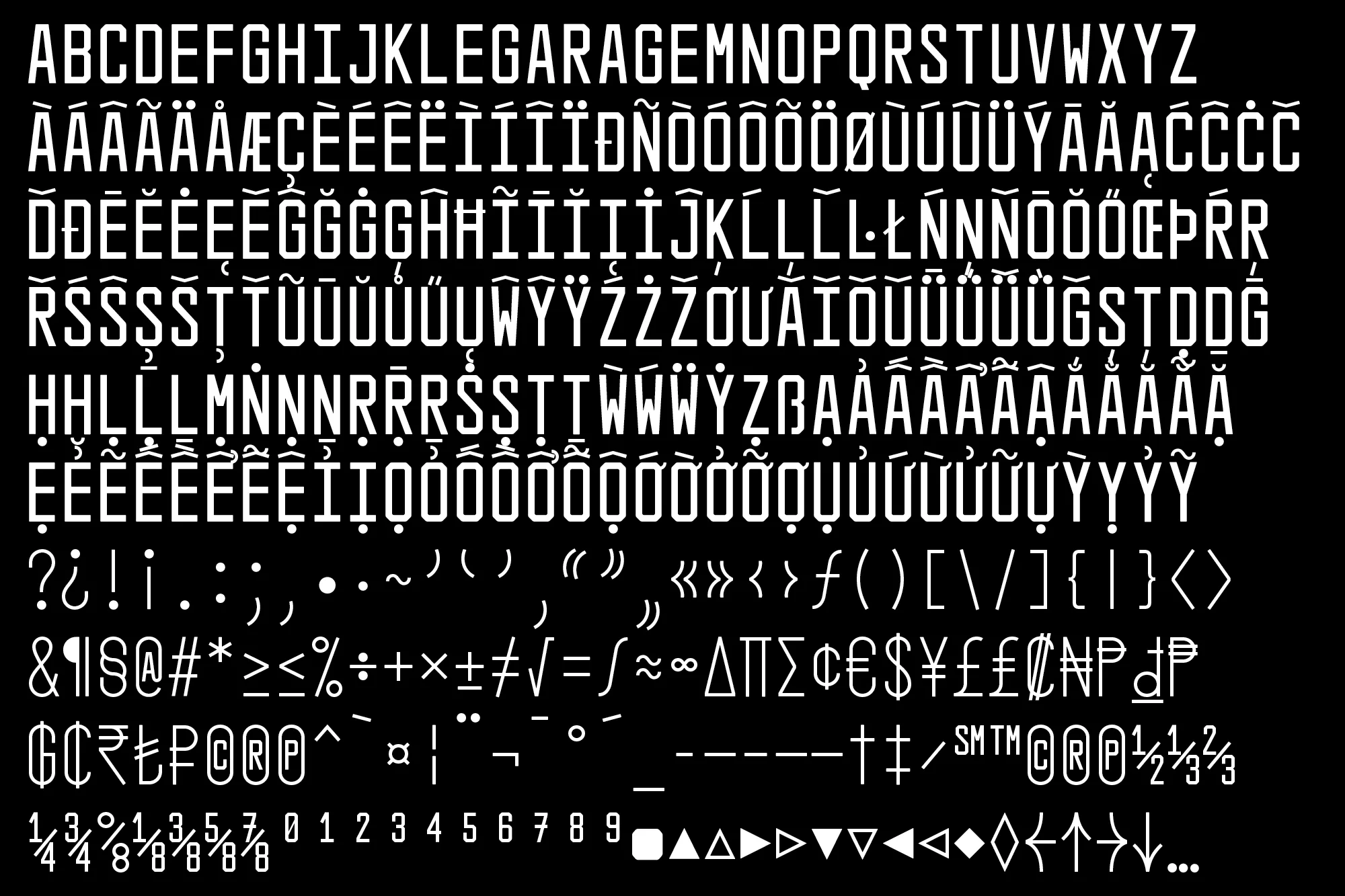
The brand identity for Le Garage Centre d'Art in Amboise stands as a masterclass in institutional minimalism, balancing raw industrial utility with high-contrast graphic precision. Executed by the studio Building Paris, the system transcends standard corporate aesthetics by embracing a stark, functional geometry that anchors the art center within its urban environment. The project is defined by a bold, sans-serif typographic framework that repeats across physical signage, digital specimens, and exhibition ephemera to create a cohesive visual language. By layering clean white letterforms against deep black or vibrant yellow fields, the design ensures maximum legibility while lending a contemporary edge to the building's rugged concrete and brick facade. The inclusion of vibrant orange industrial doors and meticulously organized grid-based layout elements—from language toggles to architectural floor plans—demonstrates a rigorous attention to detail. This corporate identity succeeds by grounding the experimental nature of the art center in a structured, professional, and highly scalable graphic system. The work effectively uses natural light and documentary-style environmental photography to capture the synergy between the institution’s physical space and its digital assets. Through the expert use of vector-based typography and deliberate color-blocking, the branding serves as a flexible, robust toolkit that elevates the center's presence while maintaining an authentic, modern industrial aesthetic that remains both approachable and intellectually rigorous for the local Amboise community.