
LaborGras
Brand Identity
Feb 2018
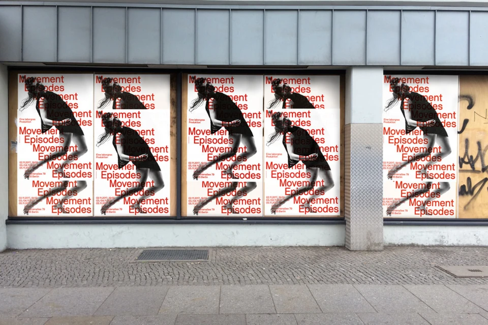
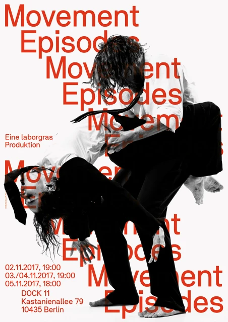
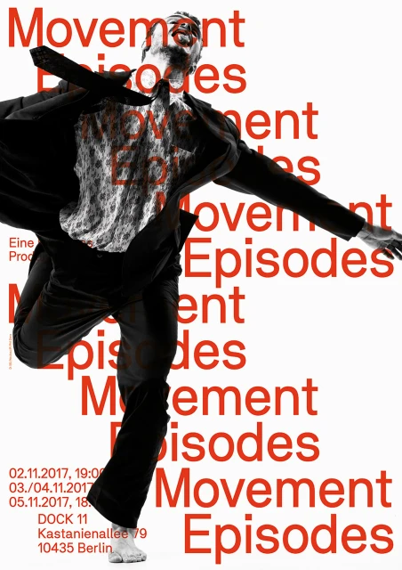
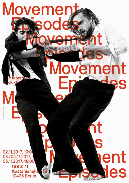
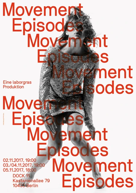
The brand identity for LaborGras centered around the Movement Episodes project masterfully bridges the gap between performance art and commercial communication. By blending documentary-style portraiture with a disciplined editorial aesthetic, the design team at Neubau has cultivated a visual language that feels both kinetic and structured. The identity leans heavily into the tension between static image and fluid motion, utilizing high-contrast, black-and-white photography of dancers in gravity-defying poses. This raw, cinematic imagery is systematically grounded by the bold, repeating application of red sans-serif typography, which functions as a rhythmic overlay across the collateral. Whether displayed as street-level posters on urban storefronts or contained within the stark isolation of a white background, the typographic system enforces a sense of urgency and deliberate repetition. By integrating these graphic design elements with natural light photography, the project captures the physicality of the performances at Dock 11 in Berlin with uncompromising clarity. The result is a cohesive brand identity that avoids the clutter of traditional event marketing, opting instead for a minimalist, high-impact approach that communicates the energy of the stage directly to the viewer. This project succeeds by treating the human form as a geometric component, ultimately positioning Movement Episodes as a landmark series within the festivals and events landscape, defined by its sharp lines and evocative, rhythmic compositions.
Editorial, Clean, Vertical, Graphic
Typography
White Seamless
Advertising Campaign
