Korean Bros
Brand Identity
Apr 2026
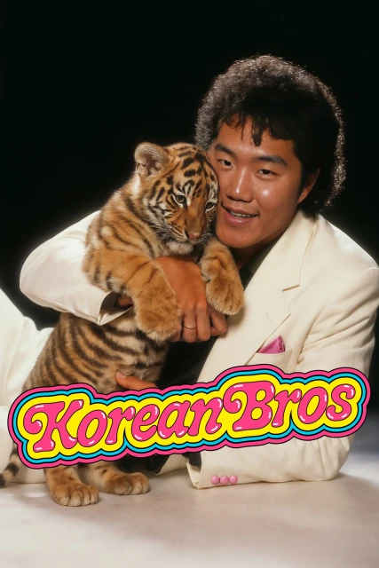
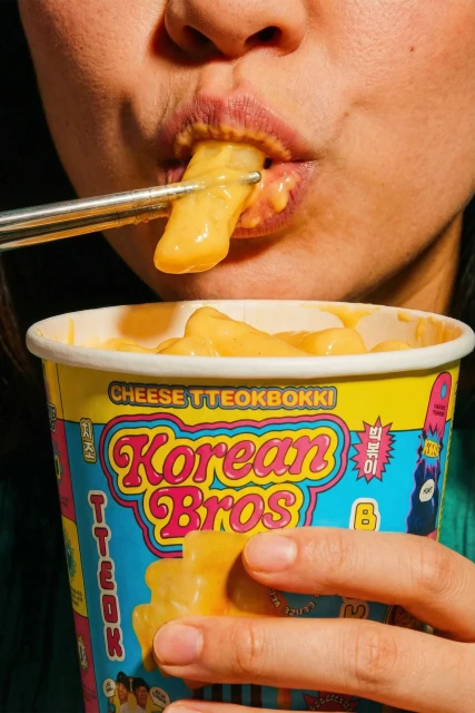
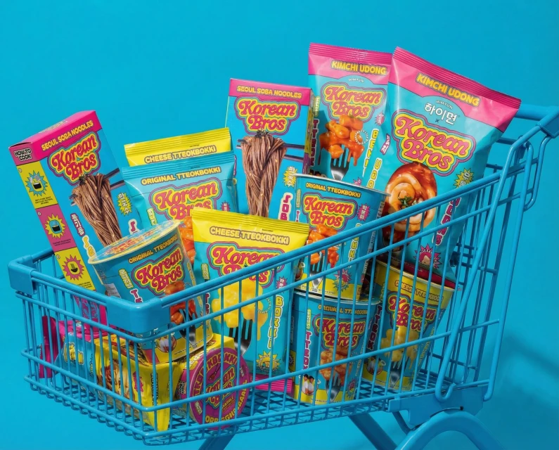
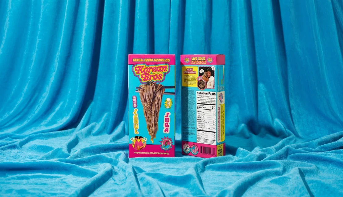
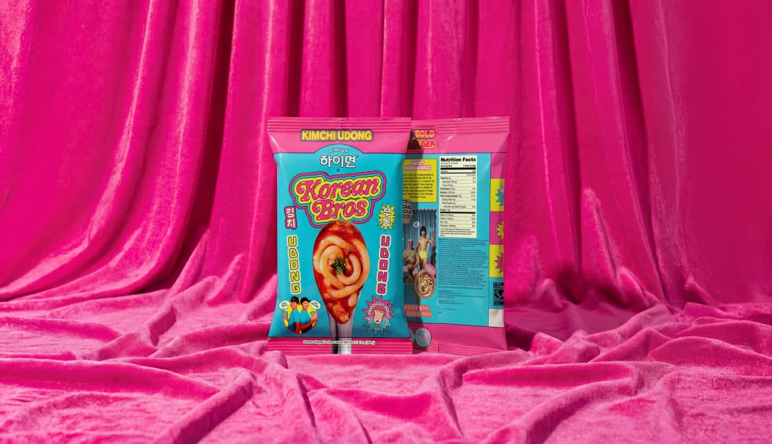
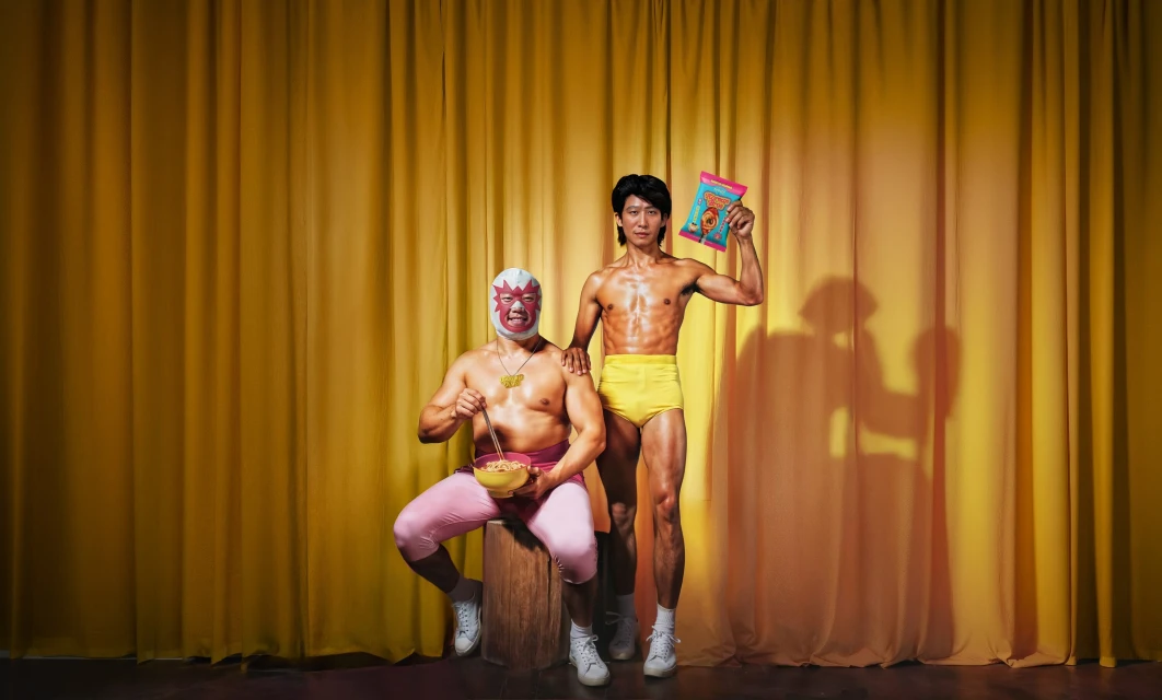
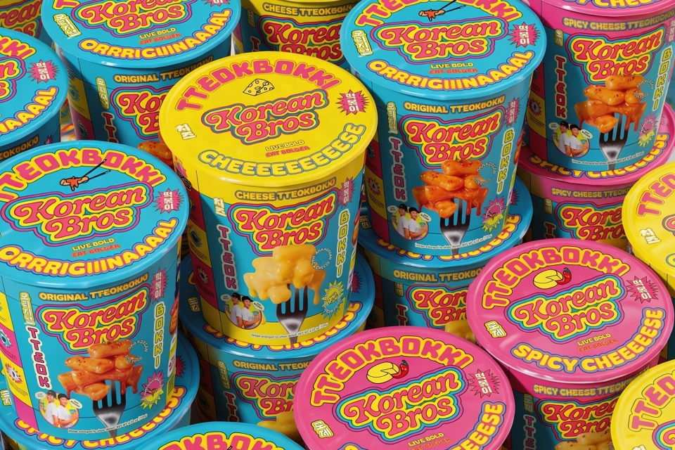
The brand identity project for Korean Bros marks a bold evolution in the CPG and packaged food sector, leaning into a maximalist, high-energy aesthetic that defies traditional supermarket shelf conventions. Through a vibrant synthesis of lifestyle photography and commercial product staging, the campaign establishes a distinct visual language defined by saturated magenta, cyan, and yellow color palettes. This graphic, pop-art style approach to food branding is meticulously executed using studio strobe lighting, which brings a clean, sharp edge to the playful, cartoonish typography adorning each noodle and tteokbokki package. The identity is brought to life through a series of striking compositions that range from controlled product portraits on velvet backgrounds to eccentric, live-action techniques featuring theatrical talent in stylized studio settings. Photographers Audrey Ma and Danielle Campbell capture this tension between culinary indulgence and high-fashion eccentricity, ensuring the brand feels both accessible and iconic. By pairing the tactile, gooey texture of the food with the rigid geometry of the packaging, the design team at Truffl creates a cohesive, high-contrast visual identity. Every element, from the stacking of branded cups to the curated interplay of color, works to elevate the product from a pantry staple to a vibrant, design-forward experience that demands attention in the competitive beverage and snack market.
Horizontal, Commercial
Motion Graphics
CPG / Packaged Food
Brand Film / Corporate Video