
Kein & Aber: Brand Identity
Apr 2025
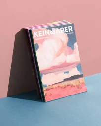
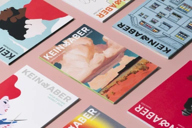
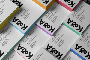
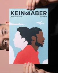
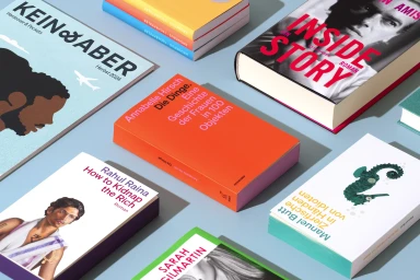
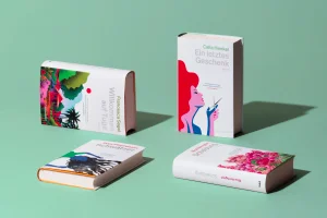
The brand identity for publisher Kein & Aber, developed by Scholtysik, centres on a modular visual system that balances minimalist typography with vibrant, illustrative book design. The project encompasses a comprehensive digital and print overhaul, manifesting in responsive website interfaces, clean business stationery with coloured edge-painting, and a cohesive suite of book covers. At the core of the identity is a rigorous approach to graphic design, using bold black type against high-contrast solid backgrounds to establish consistency across disparate literary titles. Motion graphics integrate the brand's typographic system, using fluid animations to transition between logomark elements and layout structures. Through a combination of clean composition and diverse artistic palettes, the identity system frames the publisher's catalogue within a modern, minimalist aesthetic.
Horizontal, Commercial, Clean
Solid Colour
Advertising Campaign
