
Kaibosh
Brand Identity
Feb 2017
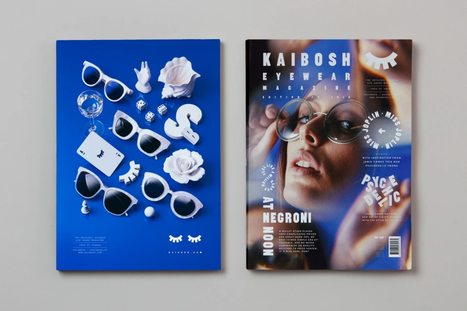
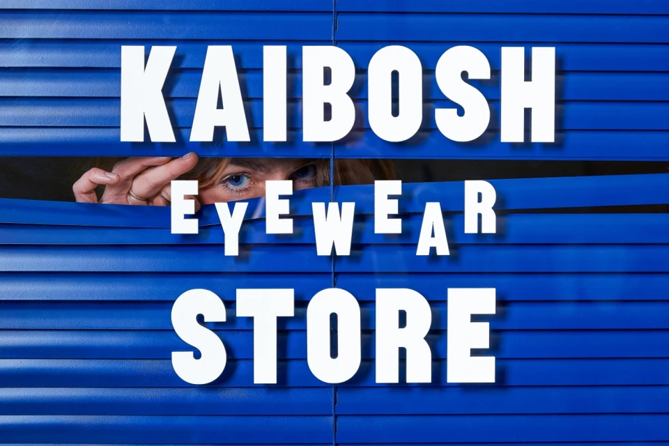
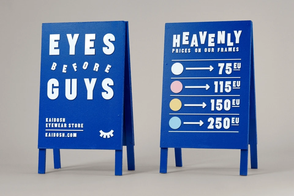
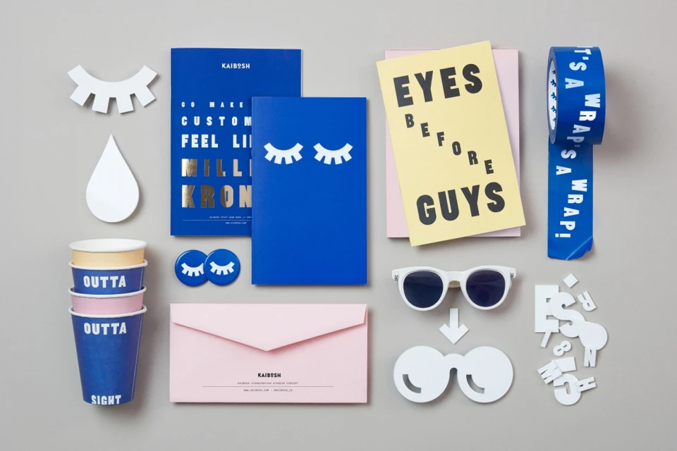
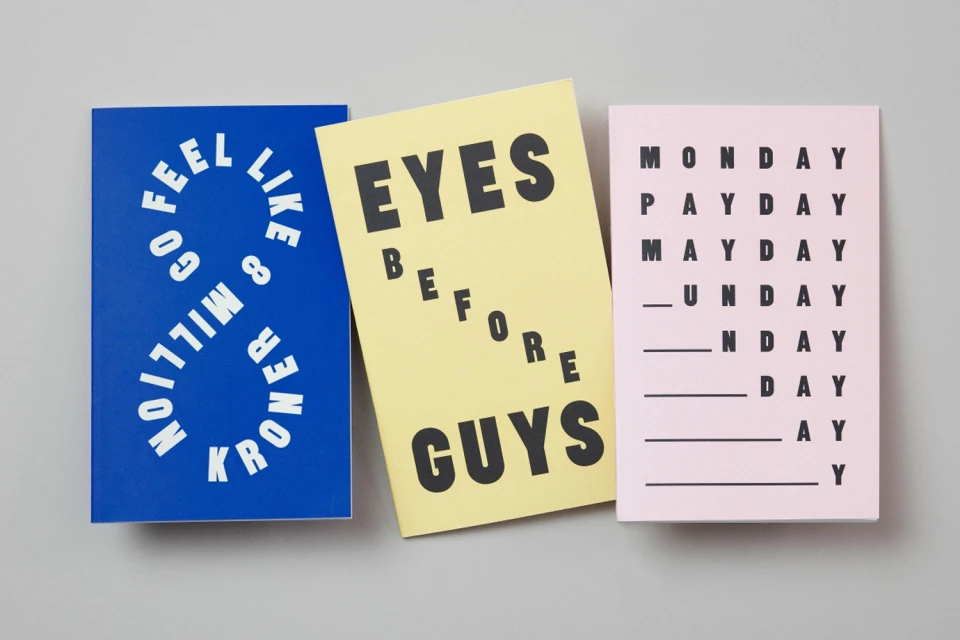
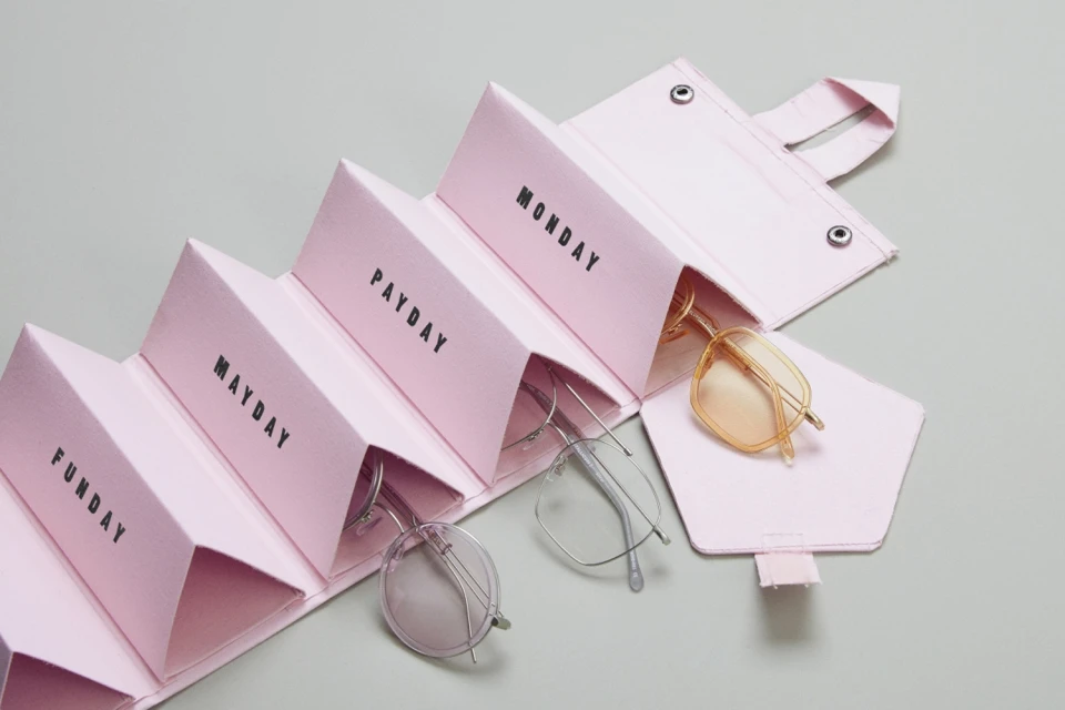
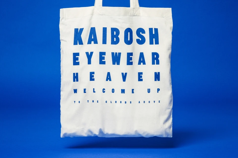
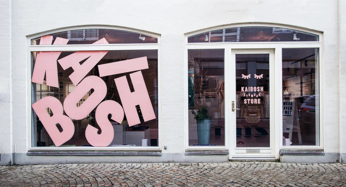
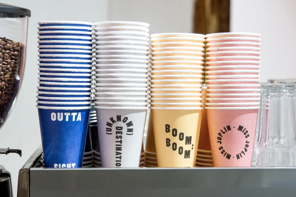
Kaibosh has successfully redefined its market presence through a comprehensive brand identity project that masterfully blends eyewear functionality with a sharp, fashion-forward sensibility. Spearheaded by the design firm Snask, this identity leans heavily into a bold, minimalist aesthetic that feels both playful and meticulously considered. Across a suite of collateral—ranging from retail storefront signage and branded tote bags to curated editorial magazine covers—the project utilizes a high-contrast palette of deep blue, soft pink, and sunny yellow to establish immediate visual recognition. The design strategy employs heavy, sans-serif typography as a primary graphic element, often treated with a wit that mirrors the brand's youthful, irreverent voice. By incorporating elements like eye-chart inspired messaging and surreal still-life photography, the work successfully elevates simple retail touchpoints into a cohesive brand experience. Technically, the execution shines through a versatile mix of controlled studio strobe lighting for precise product shots and airy natural light for human-focused editorial pieces. This project is a masterclass in visual consistency, demonstrating how thoughtful graphic design can unify physical retail environments, packaging, and accessories into a singular, iconic language. Whether through the clever, grid-based layouts of their notebooks or the structured symmetry of their eyewear organizers, Kaibosh creates an unmistakable imprint, transforming utilitarian objects into essential lifestyle components that resonate deeply within the contemporary fashion landscape.
Horizontal, Commercial, Clean
Typography
Eyewear
Advertising Campaign
