
James Newton: Brand Identity
Oct 2018
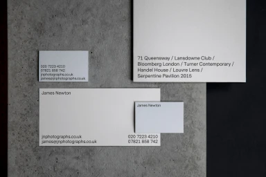
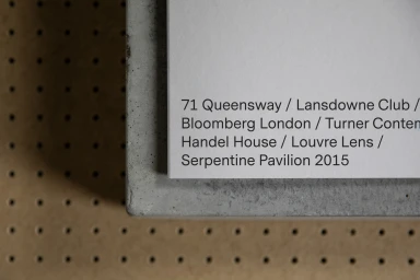
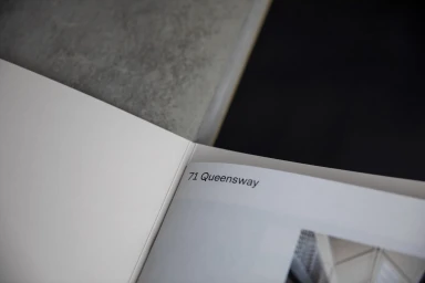
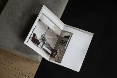
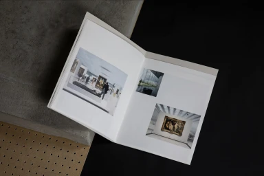
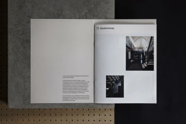
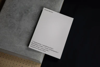
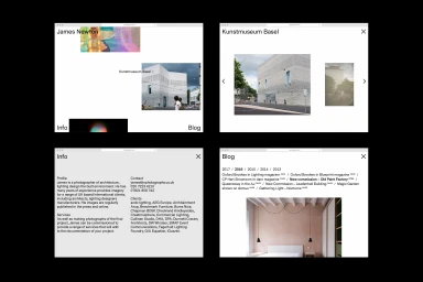
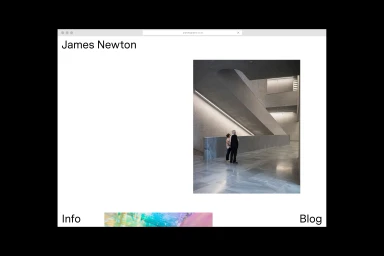
This refined brand identity project for James Newton successfully bridges the gap between architectural photography and corporate communication. Created in collaboration with Narrate, the identity leans into a sophisticated editorial minimalism that mirrors the precision of Newton’s own portfolio. The visual system relies on a stark, architectural interplay of materials, frequently utilizing concrete blocks, perforated pegboards, and deep black surfaces to ground the clinical purity of white stationery and printed booklets. By utilizing a disciplined sans-serif typography, the design establishes a clear, professional hierarchy that guides the viewer through location data and professional credentials with ease. The branding strategy effectively treats the physical collateral as an extension of the photography itself, employing a consistent, high-contrast aesthetic that feels both modern and timeless. Whether captured in soft light or through high-key commercial layouts, the work emphasizes structural materiality and generous negative space to communicate the photographer's mastery of light and form. The digital components, including the clean browser interface design, further extend this cohesive language, ensuring that the brand remains legible and authoritative across both physical and digital media. This project represents a masterclass in corporate branding, demonstrating how a restrained, grid-based approach can elevate a professional portfolio into an immersive, high-end visual experience that commands attention.
Horizontal, Commercial, Clean, Minimalist
Typography
