
Hjem: Brand Identity


Mar 2025
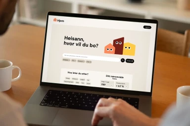
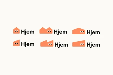
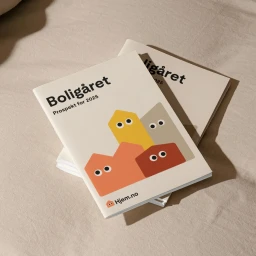
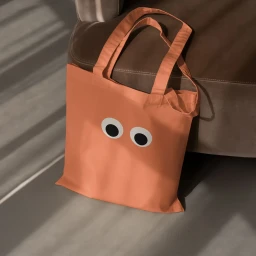
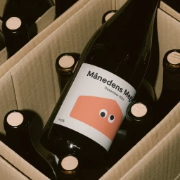
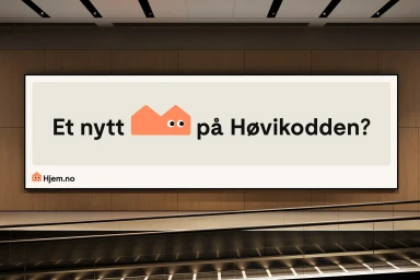
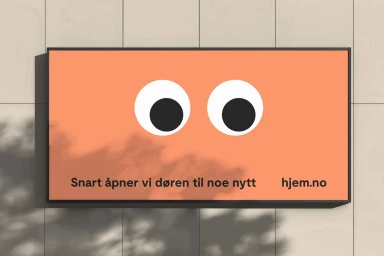
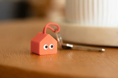
The brand identity for Hjem, a real estate venture, centers on a playful and approachable visual system that merges modern utility with distinct character design. Developed with graphic design by Netlife and animation by Ole Magnus Saxegård, the identity utilizes a warm palette of terracotta, orange, and yellow to create a cohesive, friendly presence across both digital and physical touchpoints. At the heart of the project is a minimalist, house-shaped icon brought to life through expressive, googly-style eyes. This motif is woven into the brand's mobile application interface, signage, and printed prospectuses, balancing clear, bold typography with a clean, vector-based aesthetic. The execution leans into subtle animation and intentional negative space to emphasize a modern, consumer-facing approach to property information and local housing market data.
Horizontal, Commercial, Clean, Minimalist

