
Helix-DB
Brand Identity
Apr 2026
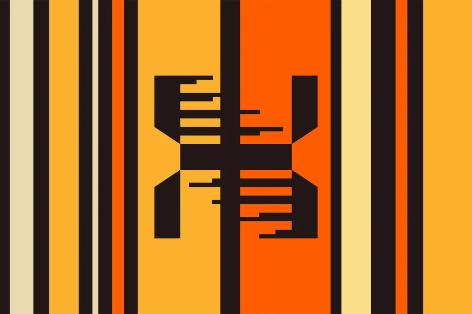
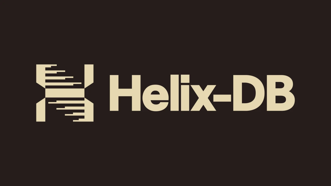
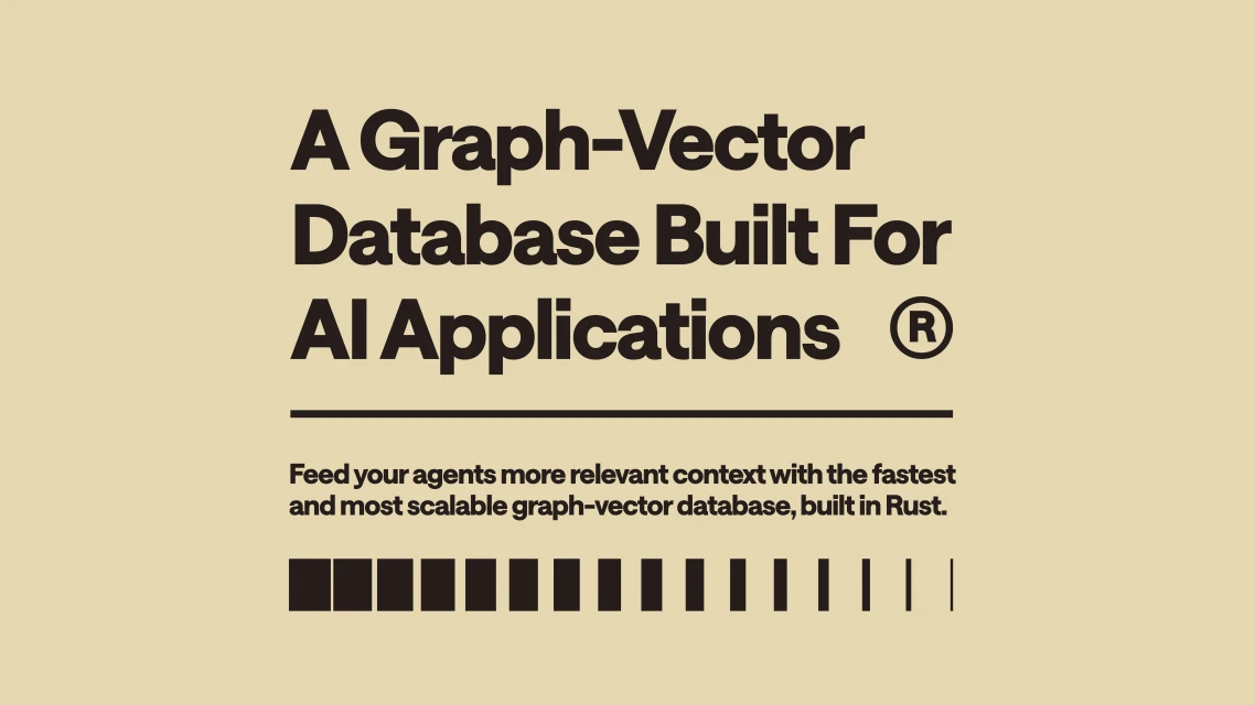
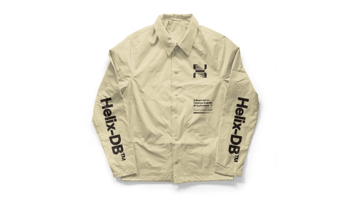
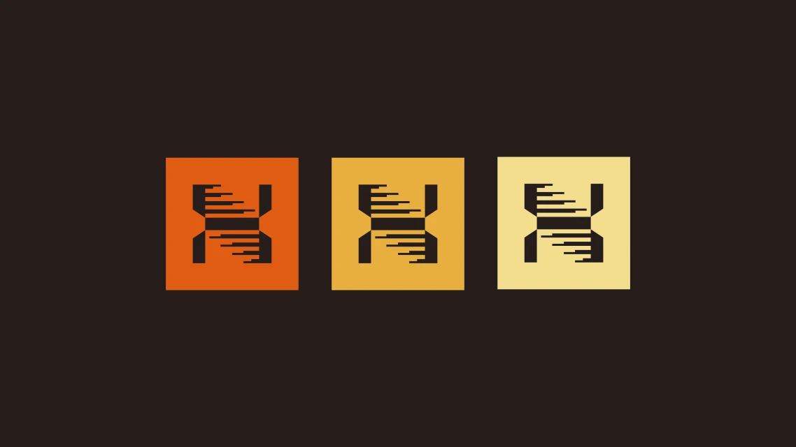
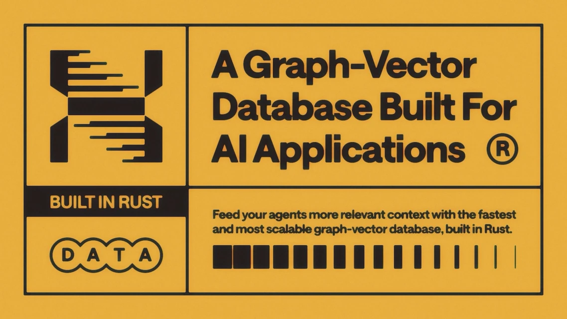
In the crowded landscape of Enterprise and B2B Software, Helix-DB emerges with a brand identity that eschews tired corporate cliches in favor of a sharp, high-contrast aesthetic rooted in minimalist precision. Developed by Brass Hands, the design system centers on a sophisticated logo mark that cleverly synthesizes a double-helix structure with rhythmic, digital-like horizontal gaps. This visual shorthand for biological complexity serves as a powerful metaphor for the database's role in fueling AI applications with relevant context. The execution leans heavily into a deliberate, warm color palette, contrasting deep chocolate brown with vibrant orange and golden yellow accents, which brings a sense of energy to the technical messaging. Across various collateral, from bold vector icons featuring subtle glitch effects to clean, typography-led promotional pieces, the project maintains a disciplined grid that speaks to the technical robustness of a database built in Rust. Even in apparel applications, the studio strobe photography emphasizes the brand's commitment to clean geometry and clear information architecture. By balancing abstract vector artistry with functional, legible layout design, the identity system successfully bridges the gap between deep-tech utility and a modern, high-fashion sensibilities. It is an exercise in restraint that manages to communicate velocity and scalability through nothing more than clever line work, motion-inspired motifs, and a confident, distinctive typographic hierarchy.
Commercial, Minimalist, Graphic, Horizontal
Vector
Solid Colour
