Grinning Face: Brand Identity

Apr 2019
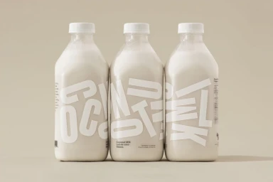
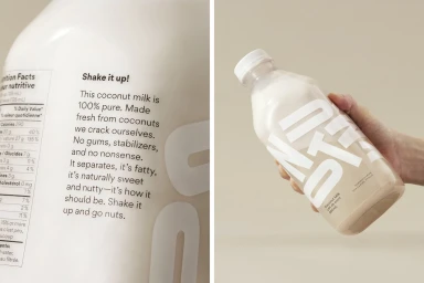
The new brand identity for Grinning Face coconut milk masterfully redefines the shelf presence of CPG beverages by stripping away the noise of traditional dairy alternatives. Executed with the sophisticated precision of the team at Leo Burnett Design, this branding project leans into a philosophy of editorial minimalism that prioritizes clarity and texture. By utilizing a muted, warm beige palette and high-contrast, oversized sans-serif typography, the design creates a contemporary visual language that feels both premium and approachable. Each composition emphasizes the geometric elegance of the square glass bottles, using soft directional light and natural light techniques to cast deliberate, grounding shadows that pull the product forward. This commercial approach to packaging design effectively highlights the product’s inherent purity, turning the white coconut milk itself into a central visual element. The typography wraps around the bottles in a way that encourages physical interaction, seamlessly blending essential nutritional data with playful, human-centric copy. The resulting identity is a cohesive study in balance, where clean, orderly layouts communicate the freshness of the product while establishing a modern, authoritative voice in the competitive food and beverage market. Through this considered design, Grinning Face successfully elevates a commodity product into a tactile, visually striking experience that resonates with a design-conscious audience seeking transparency and style in their daily nutrition choices.
Commercial, Clean, Minimalist, Horizontal
White Seamless
E-commerce / Product