
Grand Pacific Group: Brand Identity

Apr 2020
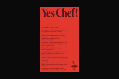
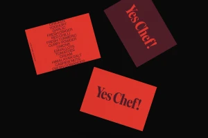
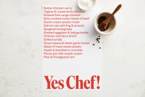
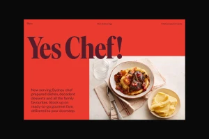
For the Grand Pacific Group, the latest brand identity project establishes a sophisticated visual language that effortlessly bridges the gap between professional culinary standards and spirited hospitality. Conceptualized by Toohey Creative, the identity centers on the evocative mantra Yes Chef!, utilizing a bold, high-contrast aesthetic that leans into the intense, rhythmic energy of a professional kitchen. The design system makes masterful use of color blocking, grounding its presence in a striking palette of vibrant red and deep burgundy set against stark, monochromatic backdrops. By incorporating elegant serif typography alongside clean minimalist graphic icons, the project achieves a modern, high-end restaurant aesthetic that feels both traditional and current. The execution effectively balances these strong graphic elements with tactile, high-key photography featuring natural light and organic culinary textures, such as peppercorns and linen, to add a layer of warmth. Whether appearing on physical menu cards produced by Carbon8 or through dynamic digital interface layouts, the work maintains a consistent, disciplined composition. This brand identity reflects a clear, confident strategy, using sharp typography and vector-based precision to anchor the Grand Pacific Group within the competitive landscape of the food and beverage industry. The resulting look is sharp, readable, and distinctly professional, proving that a restrained approach to layout and color can deliver maximum impact for a modern culinary brand.
Graphic, Horizontal, Commercial
Typography
Advertising Campaign

