
Giobatta: Brand Identity
Sep 2025
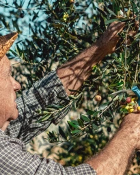
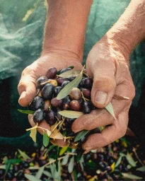
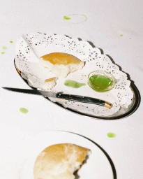
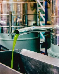
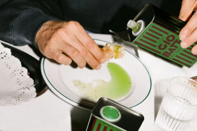
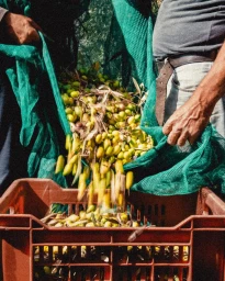
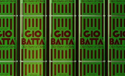
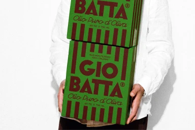
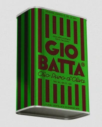
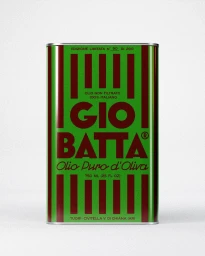
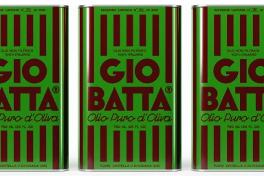
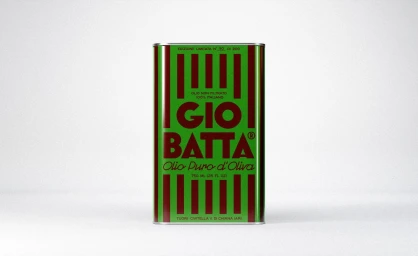
The brand identity for Giobatta explores the intersection of artisanal agriculture and contemporary packaging design. Through a series of editorial and commercial assets, the project bridges the gap between the tactile, raw reality of the harvest and the clean, structured aesthetic of modern retail. Featuring graphic design by Andrea Ricciarini, the visual identity leans into a retro sensibility, utilizing bold typography and vertical striping on product tins to establish a distinct market presence. The execution moves between documentary-style imagery of orchard harvests and minimalist studio shots, capturing the product in both its natural, industrial, and consumer-ready states. The work utilizes a grainy, analogue film aesthetic to emphasize the heritage quality of the olive oil while maintaining a clean, professional finish across print and motion graphics.
Vertical, Commercial, Clean
Advertising Campaign
