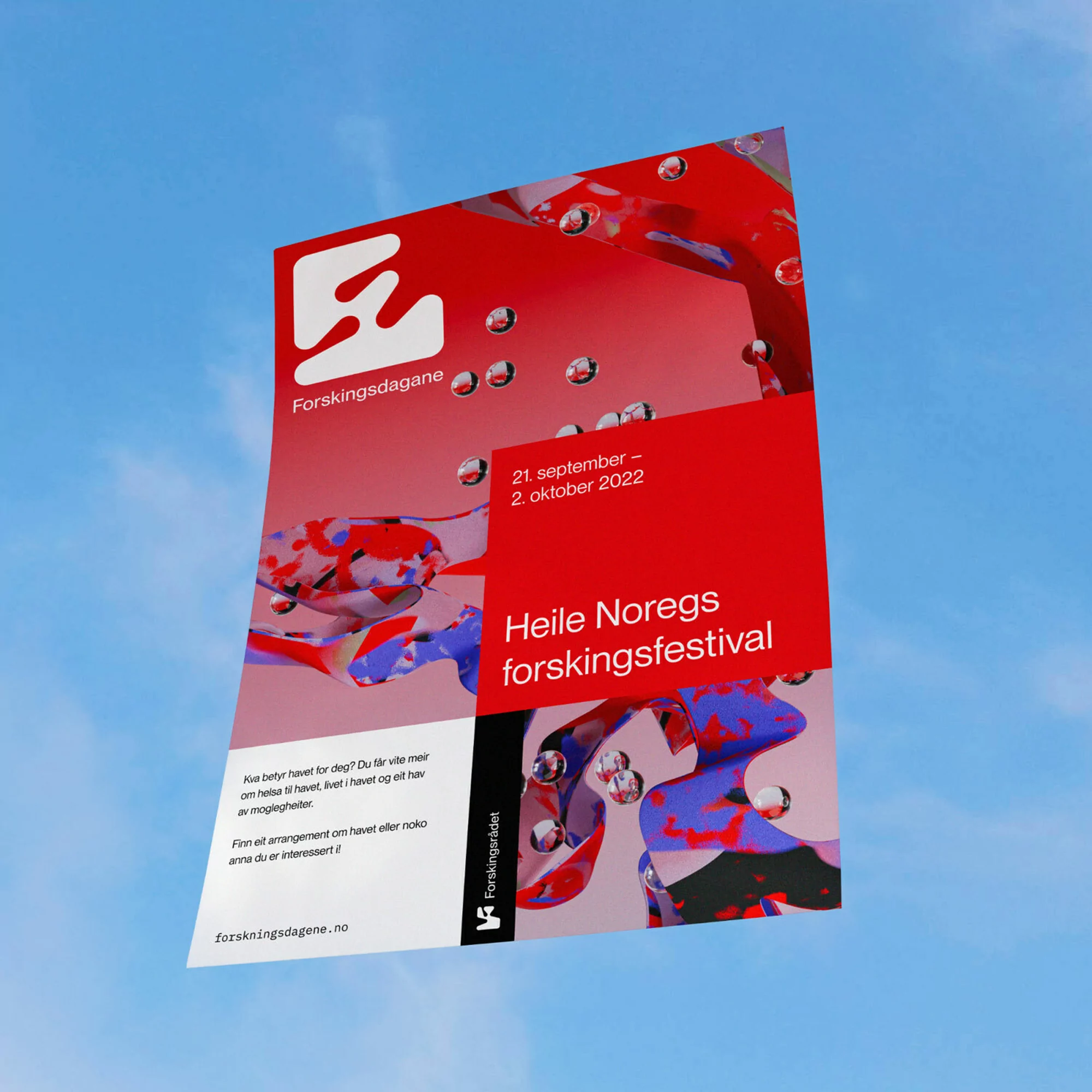
The brand identity for Forskningsrådet, developed by design agency ANTI, establishes a comprehensive visual language for the Norwegian research council. The project utilizes a systematic approach to typography and abstract geometric forms to represent complex scientific concepts. Across print and digital applications, the aesthetic leans into high-contrast palettes, employing bold reds, purples, and blues alongside minimalist vector illustrations.
Execution spans a diverse set of media, ranging from physical merchandise and posters to complex 3D-rendered motion graphics. The design system incorporates fluid shape transformations and data-driven animations to highlight various research domains, including technology and health. This versatile framework ensures consistent branding across mobile interfaces, outdoor billboard displays, and specialized event collateral.