
Florencia Owen
Brand Identity
Aug 2017
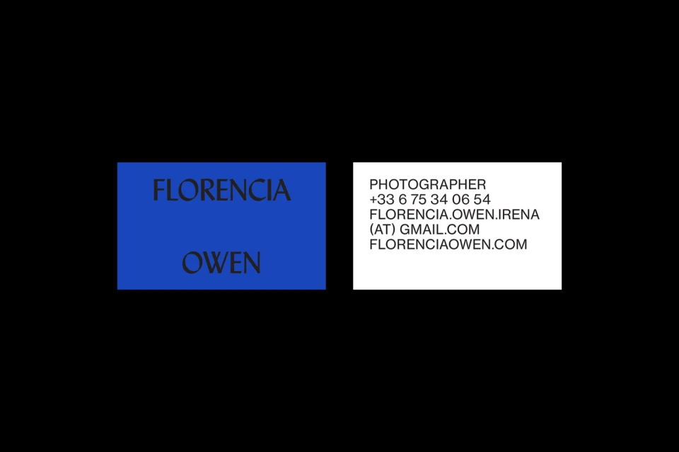
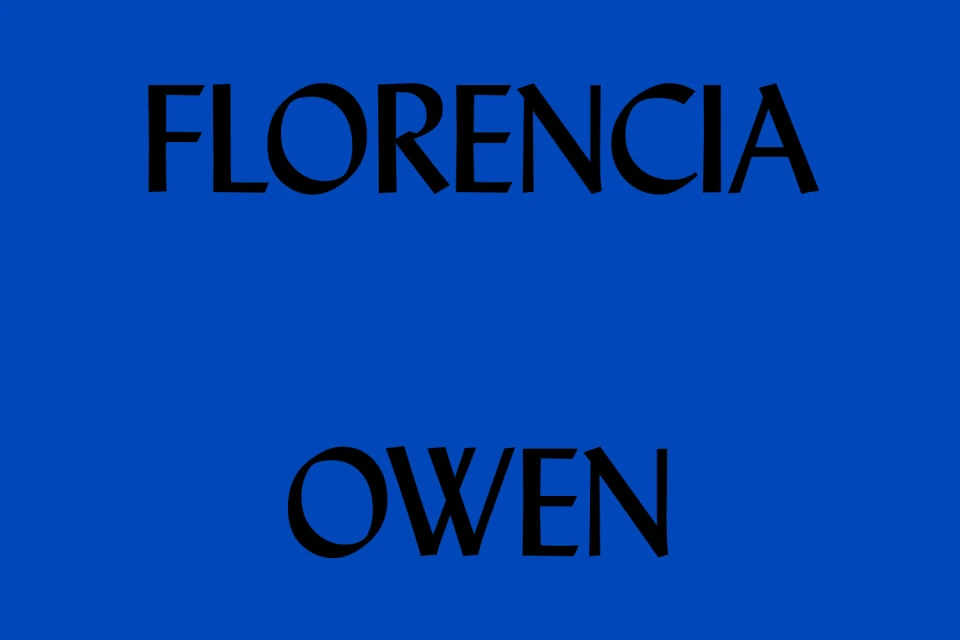
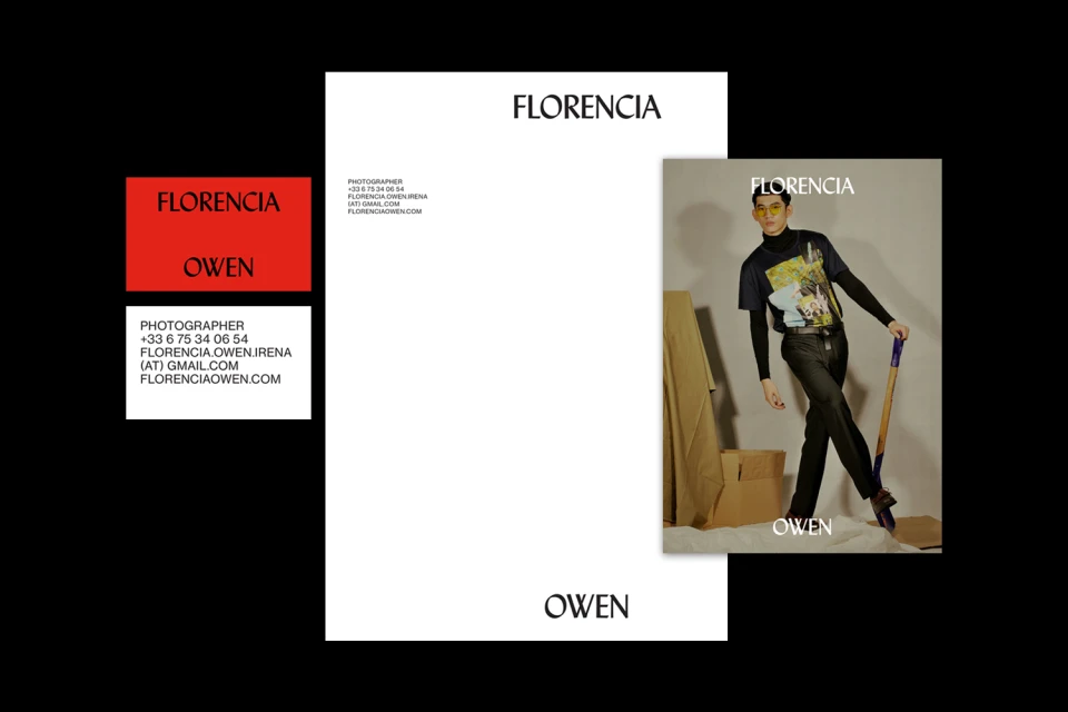
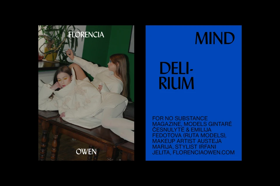
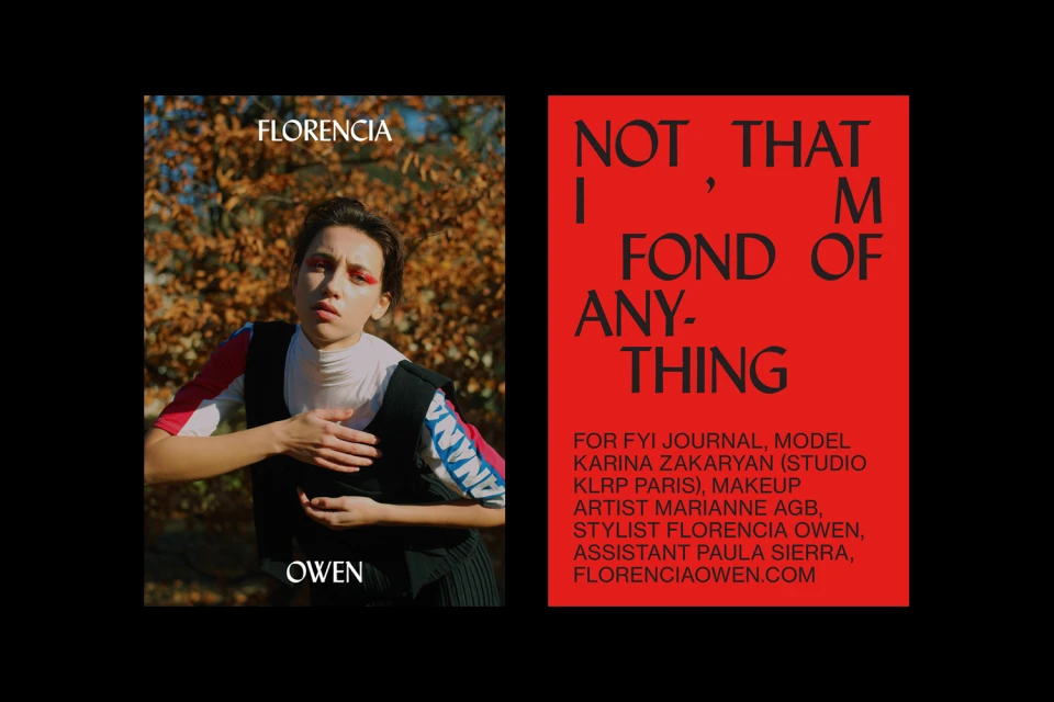
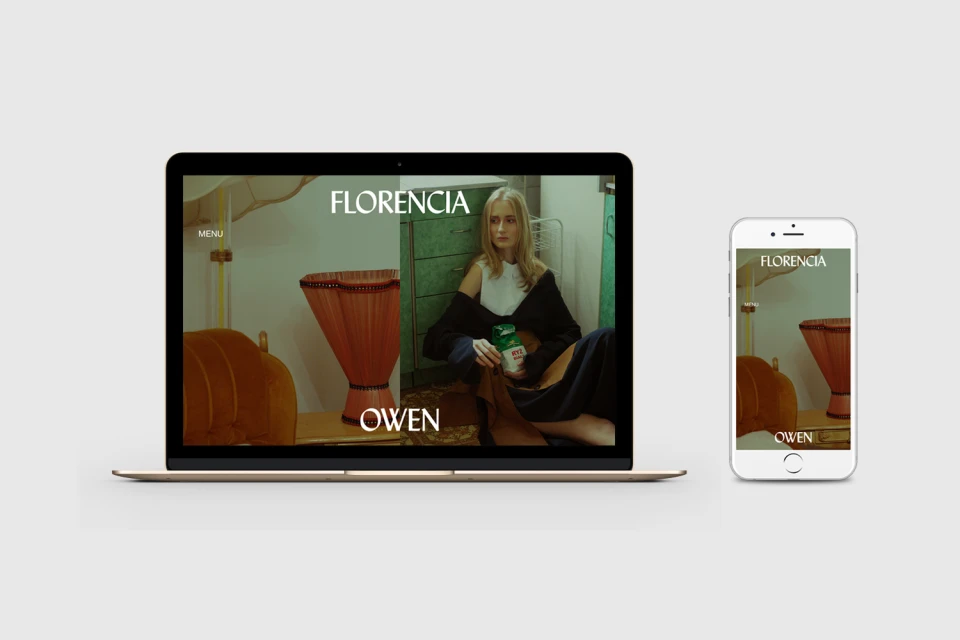
The brand identity for photographer Florencia Owen manifests as a masterclass in editorial minimalism, bridging the gap between functional corporate design and high-end artistic expression. Executed with a sharp eye for visual hierarchy, the project leans into a bold, high-contrast aesthetic that utilizes vibrant blocks of color—specifically striking reds and electric blues—to frame sophisticated typography. Robertus Alexander anchors the visual language in precise, modern serif and sans-serif typefaces that ensure clarity across diverse platforms, from tactile stationery to responsive UI illustrations. By integrating organic portraiture with rigid, geometric graphic elements, the branding captures a duality that feels both accessible and distinctly elevated. The work utilizes natural light to emphasize texture and mood, particularly in the lifestyle and portrait assets where human subjects are presented against curated, colorful environments. Whether displayed on a laptop screen or printed on premium business cards, the identity maintains a rigorous professional consistency that speaks to a fashion-forward sensibility. This is a deliberate, cohesive system that moves beyond standard corporate identity, opting instead to communicate the photographer’s vision through an editorial lens. Through this seamless marriage of structure and art, the Florencia Owen brand effectively establishes a contemporary presence that is as technically sound as it is visually arresting and commercially versatile.
Horizontal, Commercial
Typography
