
Esquivel: Brand Identity

Jun 2021
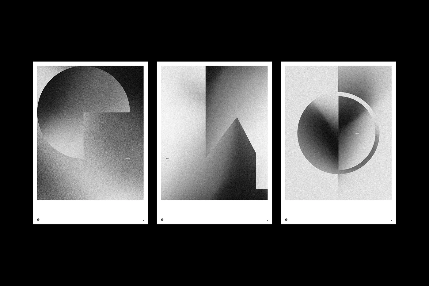
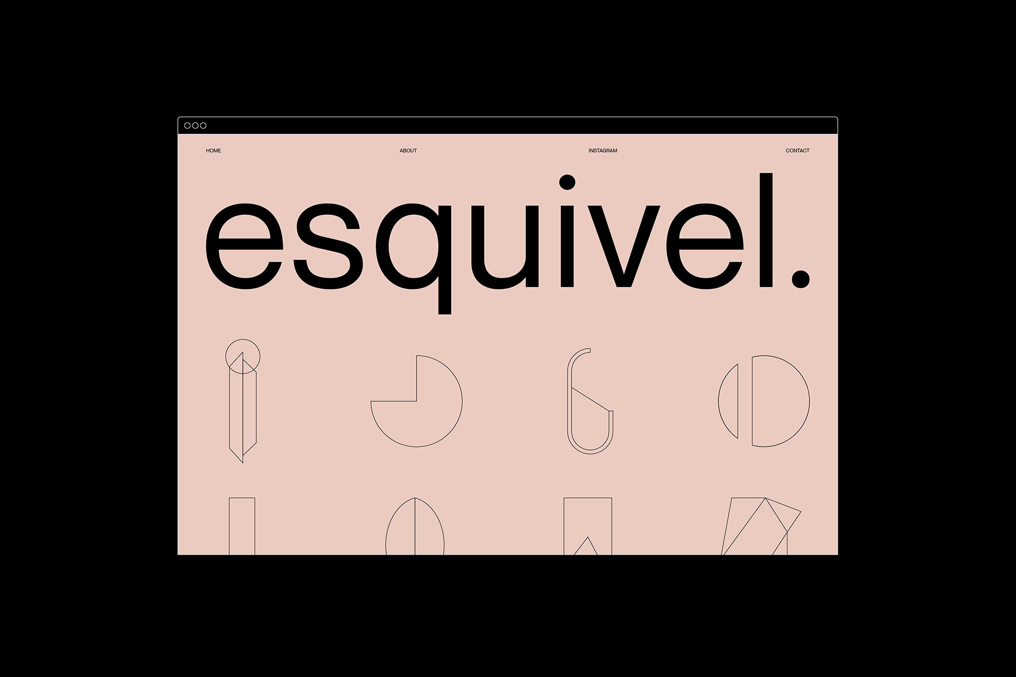
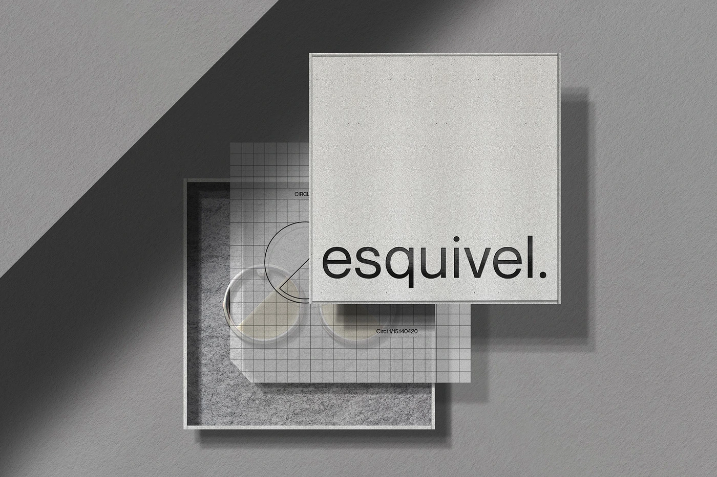
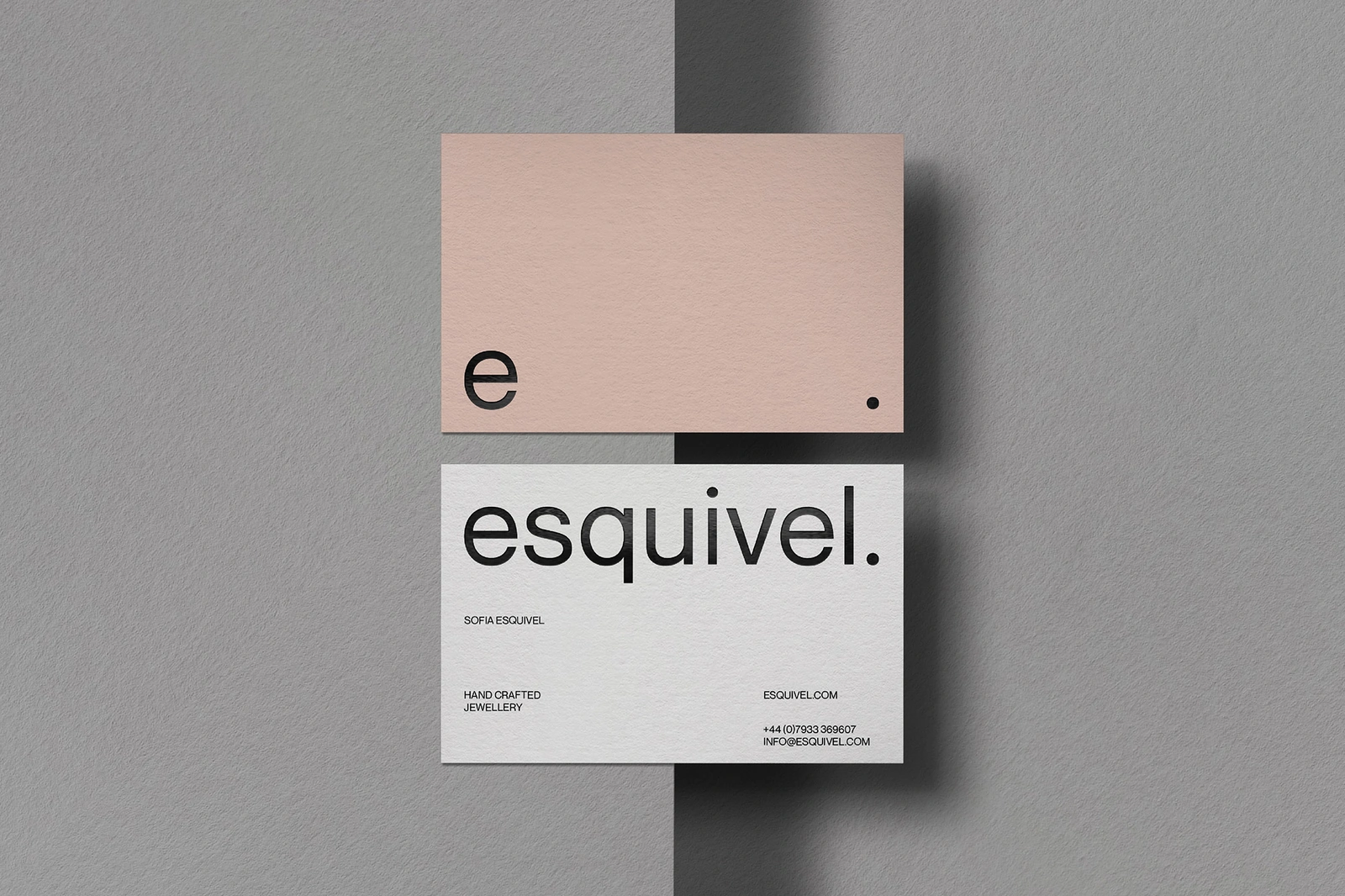
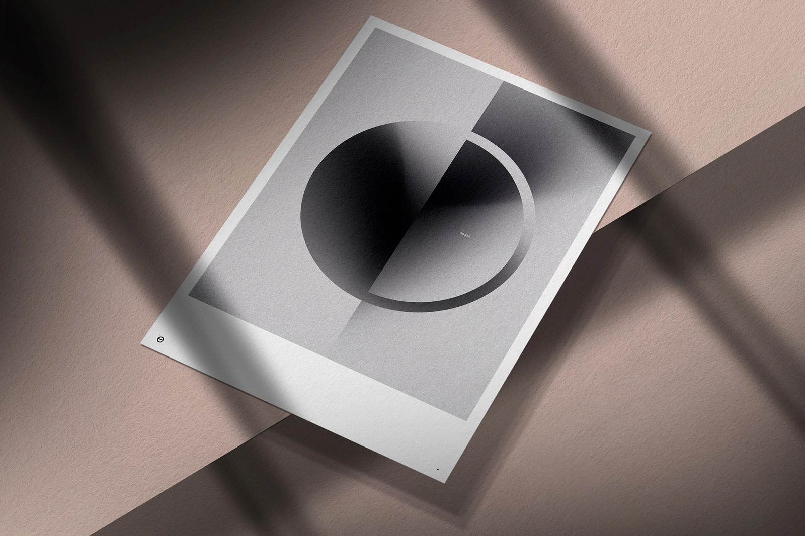
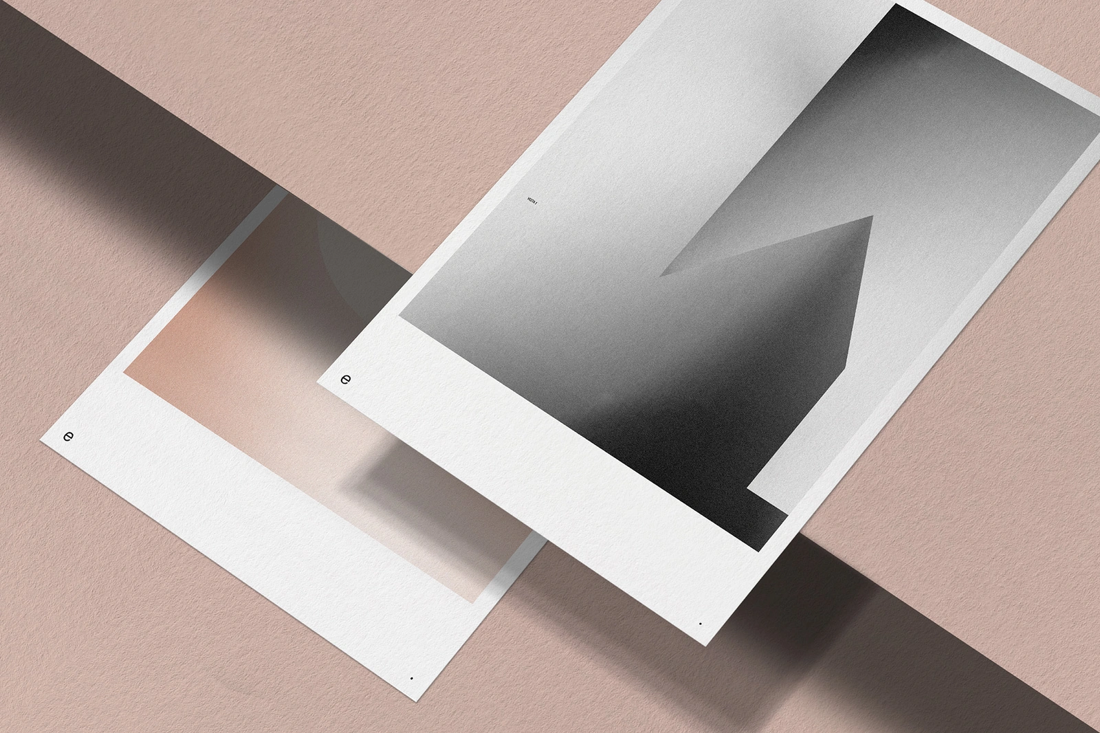
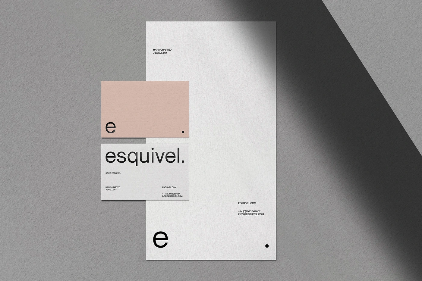
The brand identity for Esquivel, developed by graphic designer Chris Page, centers on a minimalist aesthetic that relies on high-contrast monochrome design and refined typography. The visual system explores geometric abstraction, using grainy halftone textures and negative space to establish a distinct, modern presence across both digital and physical touchpoints. The project spans a diverse array of collateral, ranging from web interfaces and UI elements to tactile stationery and packaging. By employing techniques like screen print effects and 3D rendering, the identity emphasizes material contrast and structural precision. The work leans into a clean, contemporary visual language, utilizing muted palettes and subtle gradients to maintain cohesion across all applications.
Artistic, Horizontal, Minimalist, Clean
Typography
Advertising Campaign
