DOPA: Brand Identity



Jun 2020
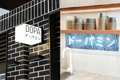
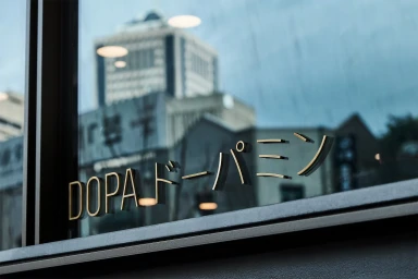
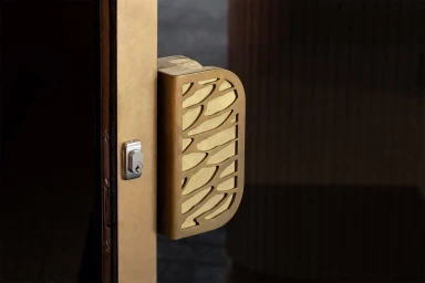
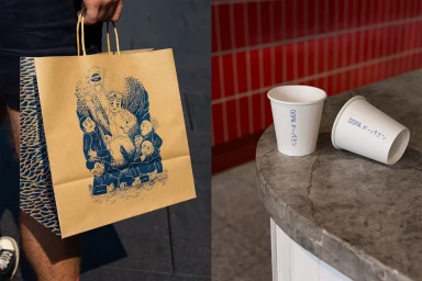
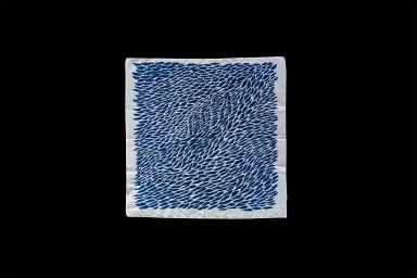
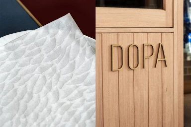
The brand identity for DOPA presents a sophisticated, multi-layered approach to culinary design that feels both grounded in tradition and strikingly modern. By seamlessly weaving together commercial aesthetics with a tactile, organic sensitivity, the project captures the essence of a contemporary restaurant environment. The identity leverages a diverse material palette, from brushed brass architectural hardware and matte-finish ceramic bowls to textured paper goods, each bearing the DOPA logotype. Under the graphic design leadership of The Colour Club, the visual language utilizes embossed metallic typography and clean, high-contrast layouts that feel both refined and accessible. The inclusion of bespoke illustrations by Andrew Yee adds a dynamic, manga-inspired edge, providing a playful counterpoint to the more structured environmental elements. Captured with a mix of cinematic lighting and documentary-style live-action techniques, the project documents every facet of the brand, from the gritty energy of a professional kitchen to the quiet, macro details of custom-cut door handles and repeating indigo brushstroke patterns. The result is a cohesive, immersive identity that relies on the interplay of light and texture to define the brand. By utilizing soft light to accentuate the natural grain of oak and the tactile depth of embossed paper, the studio has crafted a sensory-forward narrative that elevates standard restaurant collateral into a compelling piece of total brand design.
Horizontal, Commercial, Clean
Advertising Campaign