
Divario: Brand Identity
Feb 2020
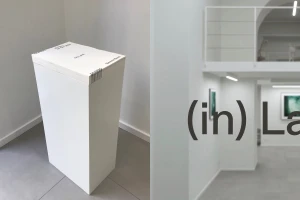
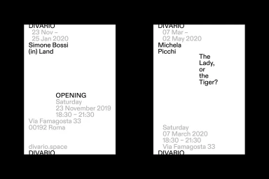
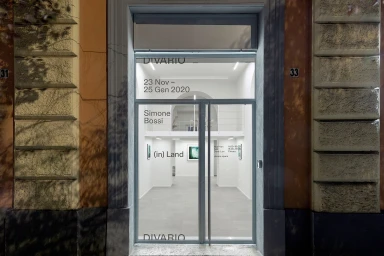
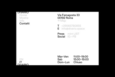
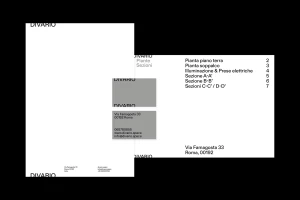
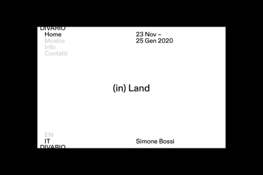
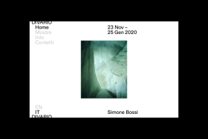
The brand identity for Divario emerges as a masterclass in architectural restraint, blending the precision of corporate design with the curated elegance of a contemporary art institution. Helmed by the creative vision of Julia Studio, the project leans into a sophisticated, minimalist aesthetic that feels both timeless and highly functional. By utilizing a strictly monochrome palette and a disciplined sans-serif typeface, the visual identity establishes a clear information hierarchy that guides the viewer with ease. This corporate brand identity project relies on the strategic use of negative space, allowing structural details—such as architectural floor plans and gallery site information—to breathe within a stark, high-contrast framework. Whether manifesting in the tactile presence of a physical exhibition schedule, the clean lines of a storefront facade in Rome, or the digital fluidity of a website interface, the design consistently channels a sense of professional clarity. The application of soft light and precise UI illustration techniques ensures that every touchpoint, from the gallery pedestal to the digital landing page, feels like a seamless extension of the architecture itself. Through this careful orchestration of typography and spatial awareness, the Divario brand identity transcends simple utility, offering an editorial experience that is as intellectually rigorous as it is visually polished, perfectly capturing the intersection of artistic exhibition and corporate professional services.
Horizontal, Commercial, Clean, Minimalist
Typography
White Seamless
Website / Web
