
Diome: Brand Identity

May 2026
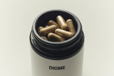
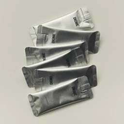
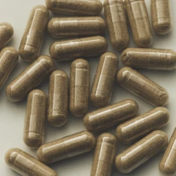
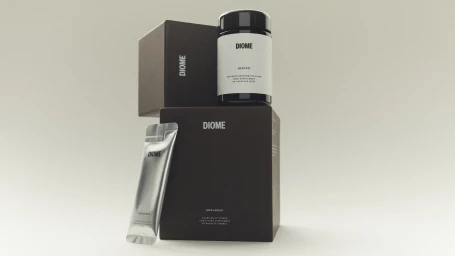
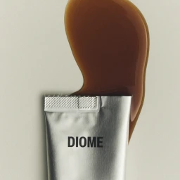
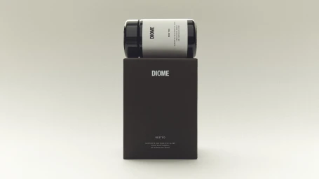
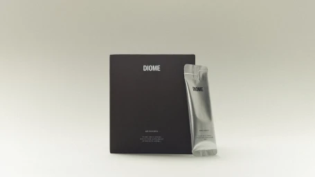
In the highly saturated wellness sector, Diome is establishing a distinct presence through a refined approach to visual storytelling that prioritizes clinical precision and editorial minimalism. This brand identity project moves away from traditional lifestyle tropes, instead leaning into the raw, tangible elements of the product itself. Through a series of carefully orchestrated studio strobe sessions, the imagery elevates standard supplement and skincare packaging into the realm of high-end design objects. By isolating metallic silver tubes, matte black boxes, and translucent capsules against neutral, light-gray backgrounds, the team behind Diome creates a sense of scientific rigor and professional transparency. The photography employs macro techniques to capture the tactile quality of the contents, from the granular texture of powders within clear shells to the viscous, glossy consistency of serums. Each composition is anchored by bold, sans-serif typography, reinforcing the brand's commitment to clarity and modern utility. The interplay between sharp, geometric packaging and fluid, organic elements such as serum droplets or scattered capsules communicates a sophisticated narrative of restoration and precision. This commercial work successfully translates abstract health benefits into a tangible, high-key aesthetic, proving that even the most clinical medical products can be presented with the elevated polish typically reserved for premium beauty campaigns.
Commercial, Clean, Minimalist
Soft Light
E-commerce / Product

