
Cursor: Brand Identity
Nov 2025
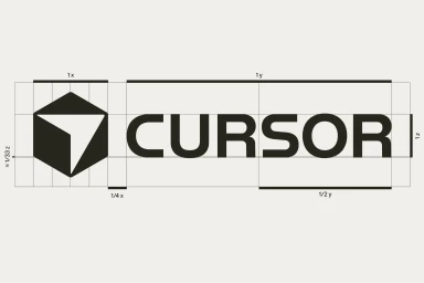
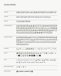
The brand identity for Cursor, a technology platform for software development, establishes a sophisticated visual language through minimalist graphic design and precise typography. The system centers on a geometric cube logo and the custom Cursor Gothic typeface, both of which serve as the foundation for a versatile design language that spans digital interface elements and motion graphics. Developed by Kimera, Justin Jay Wang, Yannik Wenk, and Rohil Borole, the project emphasizes a clean, monochrome aesthetic. The visual approach utilizes constructivist grid lines and vector-based animations to reflect the technical nature of developer tools. Beyond static assets, the brand identity incorporates kinetic typography and 3D logo motions, ensuring clarity and consistency across both light and dark application environments.
Horizontal, Commercial, Clean
Brand Film / Corporate Video


