
CORE COFFEE
Brand Identity
Jul 2026
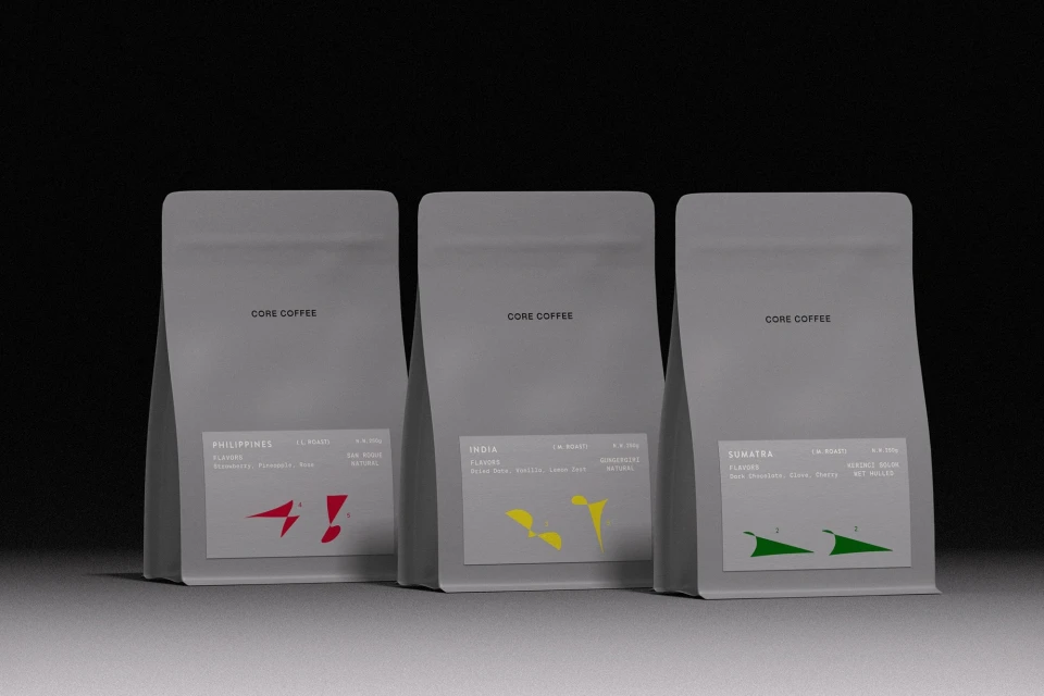
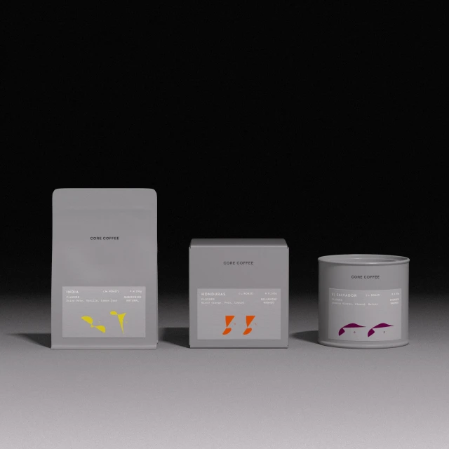
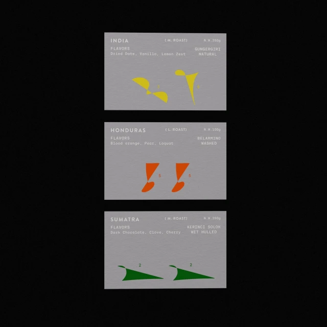
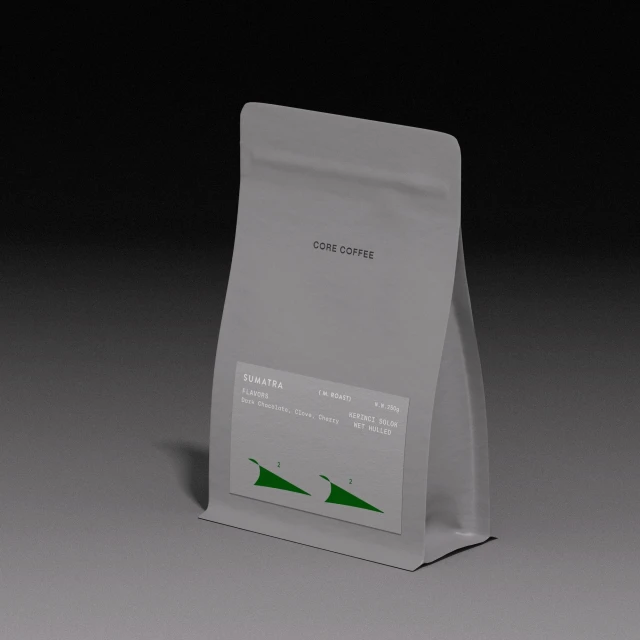
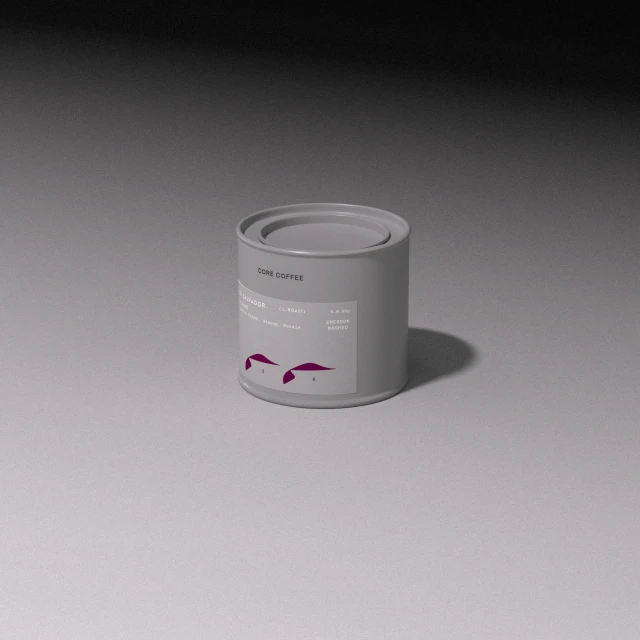
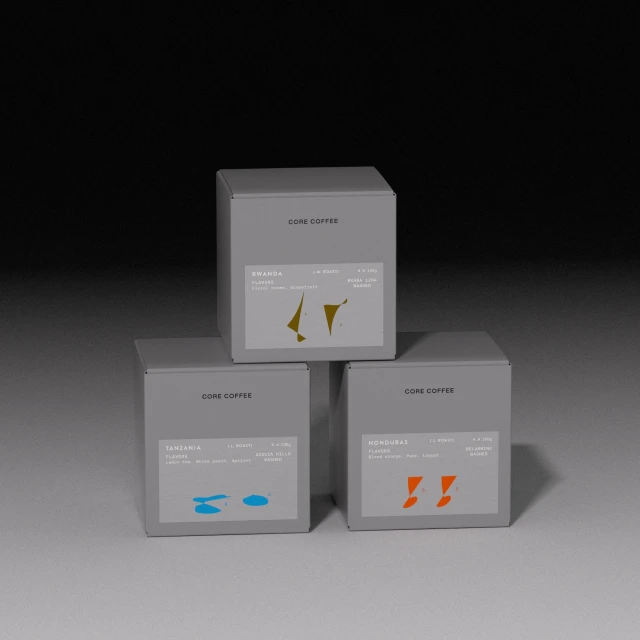
In a market often crowded by excessive visual noise, CORE COFFEE cuts through the clutter with a brand identity that leans into a disciplined, contemporary design language. Developed with strategic design input from taoSTUDIO, this project reimagines the CPG packaging landscape by prioritizing minimalism and negative space. The aesthetic centers on a sophisticated, monochromatic palette of matte grey vessels—ranging from pouches to cylindrical tins—that serve as a neutral canvas for clean, sans-serif typography. The intentionality behind the identity is anchored by the use of distinct, abstract geometric icons that provide an intuitive visual shorthand for diverse flavor profiles and origins. Every composition, captured using professional studio strobe lighting and precise cinematic framing, emphasizes a highly clinical yet approachable shelf presence. This is a study in restrained information design, where the balance of grid-like layouts and muted tones communicates both quality and origin with clarity. By eschewing over-design in favor of architectural, modern, and minimalist elements, the identity positions CORE COFFEE as a premium player in the food and beverage sector. The resulting product photography serves as a masterclass in how to elevate standard packaging through strict composition, cohesive typography, and a deliberate, high-end commercial focus that feels both timeless and undeniably forward-thinking in its execution.
Commercial, Clean, Minimalist, Square
3D render / CGI
Beverages
E-commerce / Product
