
Connected Wight: Brand Identity



Jun 2024
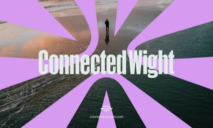
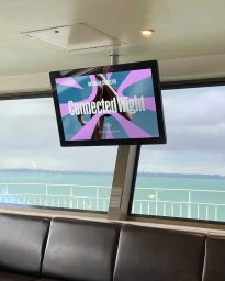
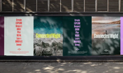
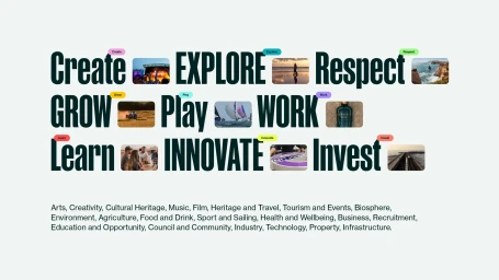
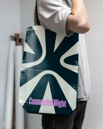
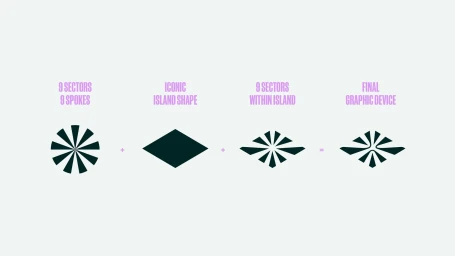
Connected Wight represents a comprehensive brand identity system designed by Thump Studio, centered on a visual language that balances clean, minimalist graphic design with the organic textures of its regional coastal environment. The identity integrates bold typography and a vibrant color palette of purple, dark green, and yellow across a diverse range of touchpoints, including digital interfaces, outdoor signage, and branded collateral. Photography by Isle of Wight Stock anchors the system, providing atmospheric imagery that spans agricultural landscapes, coastal cliffs, and active outdoor scenes. The project utilizes motion graphics and drone footage to emphasize a connection to the environment, while the underlying grid and vector-based logo construction highlight a focus on systematic, functional design. Through this combination of typography and photographic integration, the brand establishes a clear, cohesive presence across both physical and digital media.
Horizontal, Commercial, Clean

